Wild colors and lots of gradients: How the Biden design team finished the election
Biden's visual brand blossomed in the campaign's closing days
The Biden campaign design team did some of its best and most innovative work at the close of the campaign, and the Biden logo is now cool. Also in this week’s issue:
The unceasing visual repetition of the last days of the Trump 2020 campaign
Is Biden’s hat a MAGA hat clapback?
How one magazine reacted to Trump taking office vs. Biden beating him
Yours,
The unceasing visual repetition of the last days of the Trump 2020 campaign
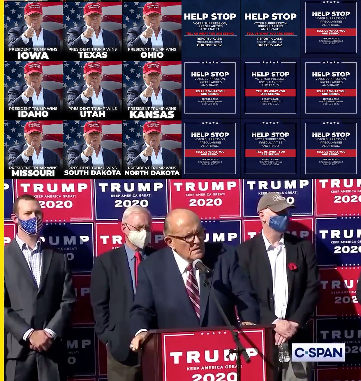
Since election night, the Trump campaign Instagram account @teamtrump transformed from a campaign rally highlight reel into a visual spam account, pummeling followers with repetitive graphics.
The account celebrated state victories with a graphic of President Trump giving a thumbs up in front of a flag. The graphics were posted after states were called for Trump, but before Pennsylvania was called, the account posted an inaccurate graphic falsely claiming Trump won the state. Pennsylvania would later be won by President-elect Biden, but the false post remains up on the account (the comments on the post have turned from celebratory to trolly since Biden surpassed the 270 Electoral College vote threshold).
On Friday, @teamtrump pivoted next to posting graphics calling on followers to “HELP STOP” by reporting claims of alleged voter suppression, irregularities, and fraud. These graphics have been posted more than 60 times on the account in the past five days, though to diminishing returns, with like counts dropping over time. Widespread voter fraud is a myth, and the campaign’s hotline has been swamped with prank calls and it had to change its number.
Like Trump’s Twitter feed, his campaign’s insane email program, and the DIY Trump sign backdrop put up for Rudy Giuliani’s now-infamous press conference at Four Seasons Total Landscaping, the Trump brand and experience has always been loud, repetitive, and often inaccurate, all the way up until the end. President Trump Wins! President Trump Wins! Help Stop! Help Stop! Trump 2020! Like a jackhammer of capitalized slogans, stars, and misinformation.
For some of Trump’s critics, his loss felt like his silencing. “all you hear when trump tweets now is the charlie brown grownups,” tweeted kilgore trout, four seasons appreciator. The photo of the kid mowing the White House lawn with the yelling Trump Photoshopped out tweeted by Cooper Lawrence captured a collective sense of relief.
Wild colors and lots of gradients: How the Biden design team finished the election
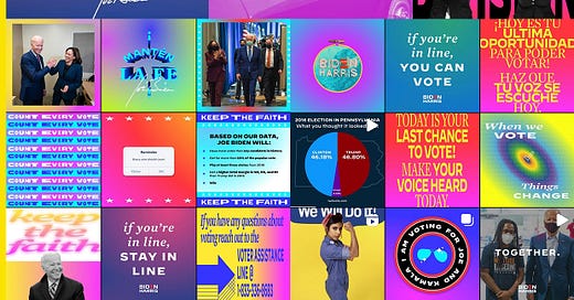
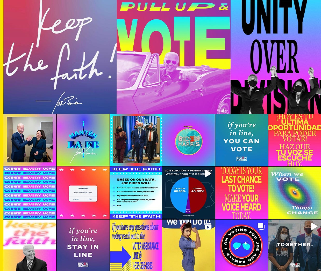
Without full election results on election night, Biden told his supporters to “keep the faith” that they would win. The phrase was turned into a handwritten graphic that the campaign posted across the internet, including a red-and-blue gradient version on Biden’s Instagram account. The colors matched the eventual president-elect’s victory promise that he wouldn’t see red states or blue states, “but a United States.”
The Biden design team’s output in the campaign’s closing days was optimistic and colorful, echoing Biden’s message. If you wanted to see the weird, inventive, creative stuff the team got into this fall, the account to follow has been @votejoe. It’s a little brighter and more experimental with color, type, and gradients than the main @joebiden account.
During a design team livestream event with supporters last month, Biden senior creative advisor Robyn Kanner spoke about preferring a “naive, childlike approach to making things.” “I think mistakes are the best parts of design,” Kanner said. The campaign’s visual identity was loose with brand guidelines, it tried new things, and it imagined a new political visual language that draws from sources like popular music and culture as much if not more than politics (check the campaign’s totally Chromatica Biden X Gaga rally promo and the Hailey Bieber-certified World Stage tee by designer Joe Perez).
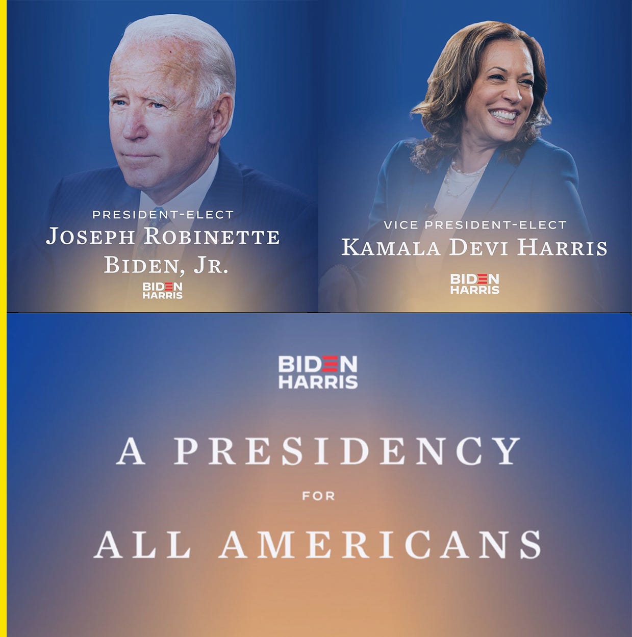
When the election was called for Biden, the campaign rolled out a special victory identity that included a blue-and-yellow “victory gradient,” as Kanner called it.
The gradient was used in the victory rally staging in Wilmington, Delaware, as well as on the campaign website and in graphics of Biden and Vice President-elect Harris made by Biden lead brand designer Jessica Lucia.
The campaign also flipped their Hoefler&Co.-made fonts for the victory identity. They used the serif Mercury, usually their secondary typeface, as the primary typeface for the night instead of the standard primary typeface, the sans serif Decimal, Kanner said.
In the aftermath of Biden’s win, artists and designers turned to his campaign logo for inspiration to make their own celebratory designs and graphics. The striped-E logo has become a progressive pop hit, like the Obama O before it. Guys, Biden’s logo is cool now.
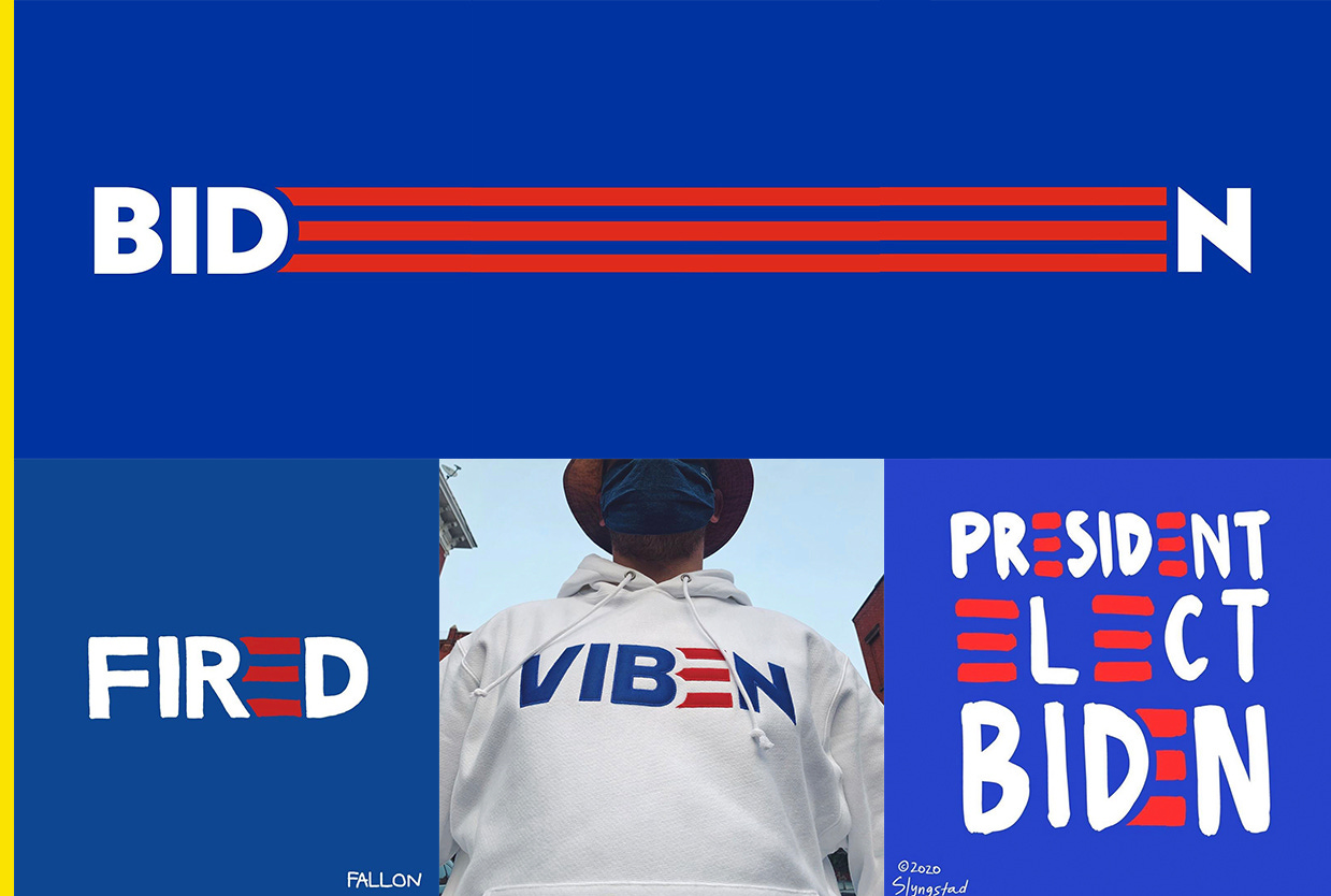
Biden logo designer Aimee Brodbeck stretched out the E for emphasis over three grids on Instagram. Illustrator Pete Fallon used the striped E in a “FIRED” graphic, designer Alex Center used it for a limited-edition “VIBEN” hoodie sold for $60 on joeviben.com, and cartoonist Benjamin Slyngstad spelled out “President-elect Biden” with five striped Es.
Though the logo was critically panned when Biden announced his campaign (for the record, I wrote that actually it was fine, and noted how it paid homage to past Biden logos) Biden’s visual brand has evolved over the course of the campaign, adding new typefaces and introducing a new logo when Harris joined the ticket. Throughout it all, the striped-E element has held the brand together. It works especially well for supporters who want to make their own images, because E is the most common letter in the alphabet.
In its final campaign iteration, Biden’s visual identity broke the mold of modern political design. His design team threw out the brand style guide and built something new.
Is Biden’s hat a MAGA hat clapback?
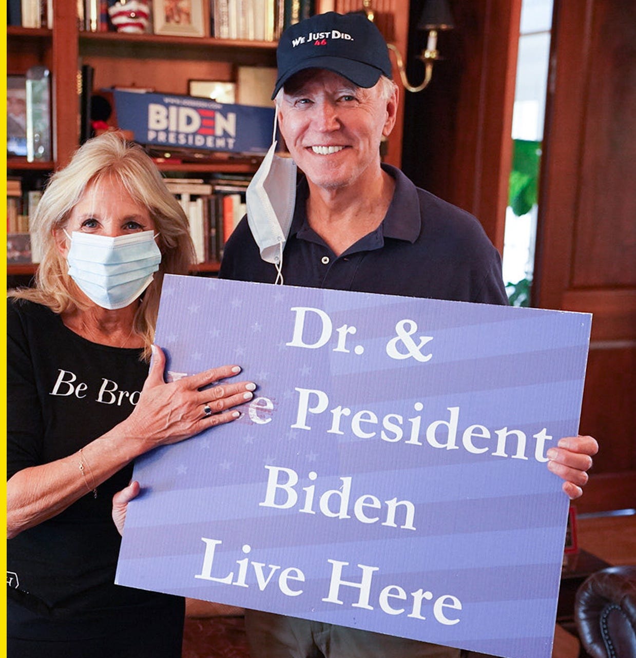
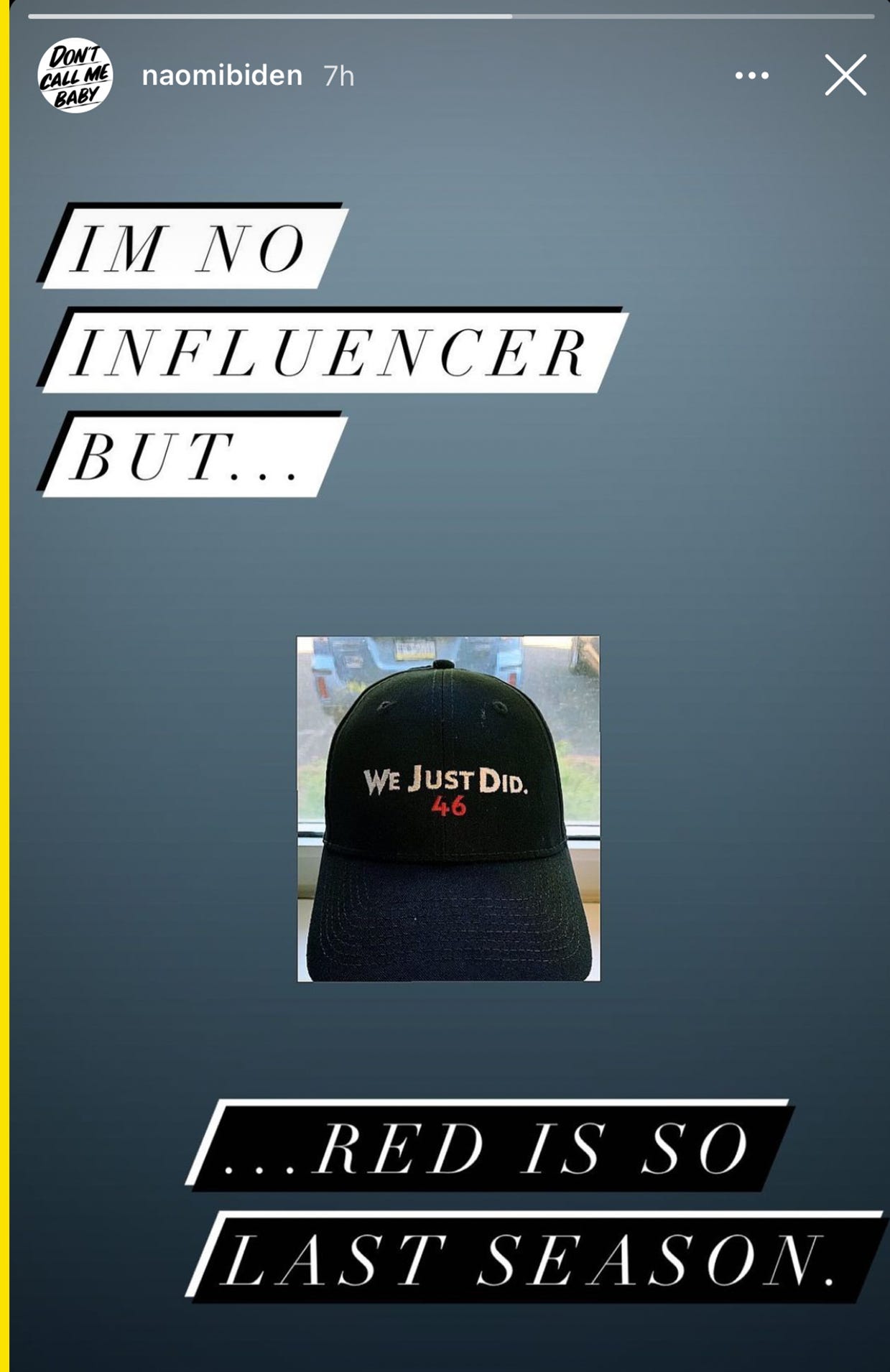
After future first lady Jill Biden posted a celebratory photo with her husband wearing a baseball hat that read “We Just Did. 46,” outlets including GQ and Cosmopolitan wondered whether the hat was a response to Trump’s “Make America Great Again” hat. While we don’t know for sure, Biden’s granddaughter Naomi Biden posted a photo of the hat on her Instagram Story and wrote, “I’m no influencer, but… red is so last season.” That’s the tea. 🍵
The hat is not currently available for sale on the Biden campaign shop. After Trump won in 2016, he started wearing a new red hat that read “USA 45.”
How one magazine reacted to Trump taking office vs. Biden beating him
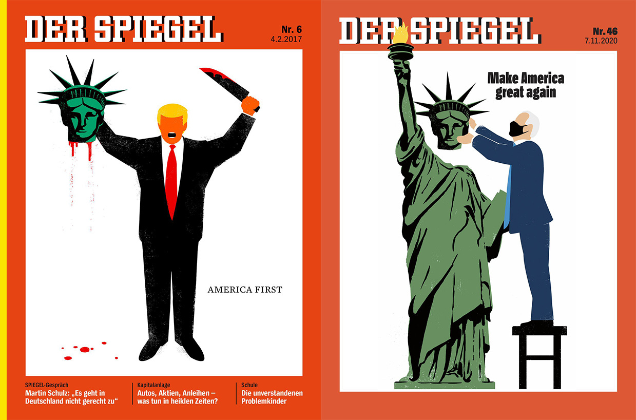
Artist Edel Rodriguez illustrated the cover of German language-magazine Der Spiegel last week showing a masked Biden putting the Statue of Liberty’s head back on. 🗽The cover was a callback to a 2017 cover published after Trump took office, in which Rodriguez showed Trump with a knife and severed Statue of Liberty head.
Rodriguez has been one of the most prolific political illustrators of the Trump administration. His orange, eyeless, open-mouthed Trump interpretations have been used on magazine covers, including Time. Like Shepard Fairey with Barack Obama, Rodriguez has visually captured Trump in a way few contemporary artists have captured a modern president. Rodriguez’s work is some of the most defining of the Trump era.
Subscribe to Yello for the latest news on the culture, branding, and visual rhetoric of politics, delivered each week:
One more thing…
A new permanent Bob Ross exhibition and painting workshop series called the “Bob Ross Experience” has opened in Muncie, Indiana, where Ross filmed his PBS show. The workshops are taught by certified Bob Ross instructors. Amazing. 🎨
Correction: This post has been updated to credit work by Biden lead brand designer Jessica Lucia.

