What not to do with political memes
The political meme group Meme 2020 has learned some lessons about what works when it comes to using memes to shift public opinion. Also in this week’s issue of the Yello newsletter:
How JFK used big data
That viral Tokyo 2020 logo isn’t the actual logo
Tampa’s “Back The Blue” mural is not easy to read
Yours,
What not to do with political memes
Credit: @kalesalad/Instagram
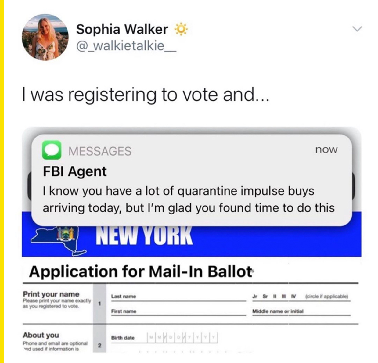
Meme 2020, the group behind the sponsored meme ads that ran on major meme accounts in February in support of former New York City Mayor Michael Bloomberg’s presidential campaign, is back.
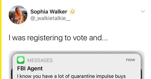
The group partnered with the anti-Trump Republican political action committee Project Lincoln and the progressive viral media company Rhyme Combinator and they’re out with new ads about mail-in voting (above), according to the New York Times.
The group plans to take aim at President Trump, but they’ve learned some things about what to do and what not to do with memes after testing different formats with data scientists and statisticians.
“We found that memes that were intended to be explicitly anti-Trump weren’t as persuasive as those that weren’t so explicit,” Meme 2020 founder Mick Purzycki told the Times. “People have become so good at identifying when the voice of the meme feels like it’s coming from the left, and it forces the right to entrench. Memes that are cloaked in a way to slightly make fun of the left first, then lean into a hard critique of Trump, end up moving both moderates and Republicans in the intended direction.”
One of their since-deleted posts on the Meme2020 Instagram account, for example, used the Trying Kombucha for the First Time meme format to compare being grossed out to vote for Trump, Kanye West, and former Vice President Biden.
How JFK used big data
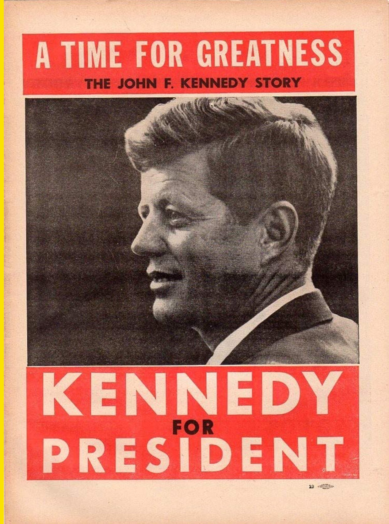
More than 50 years before Cambridge Analytica or Facebook microtargeting, a company called the Simulmatics Corporation used voter data to advise John F. Kennedy’s 1960 campaign for the White House. A new article in the New Yorker tells the story of the company and how it foreshadowed the data-driven advertising of today.
Founded in 1959, the Simulmatics Corporation compiled data from election returns and public opinion surveys since 1952 to sort voters into 480 categories and issues into 52 categories. They were then able to run simulations to test how voters might respond to various actions taken by a candidate.
Simulmatics found Kennedy had a weakness among Black and Jewish voters and determined that by drawing attention to Kennedy’s Catholicism he could shore up support among those groups.
“A straightforward attack on prejudice will appeal to these minorities since they are ideologically inclined to oppose such prejudices,” the Simulmatics team said. “The simulation shows that Kennedy today has lost the bulk of the votes he would lose if the election campaign were to be embittered by the issue of anti-Catholicism. The net worst has been done.”
If Kennedy was able to run simulations like that in 1960, imagine how much better political data simulations have gotten today.
Subscribe to Yello for the latest news on the culture, branding, and visual rhetoric of politics, delivered each week:
That viral Tokyo 2020 logo isn’t the actual logo

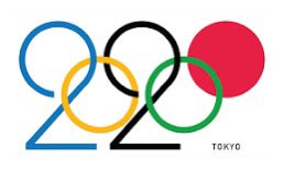
With the 2020 Olympics in Tokyo postponed until next year, there’s a viral tweet going around suggesting the Games’ logo is ruined. The only problem? It’s not the actual Tokyo logo.
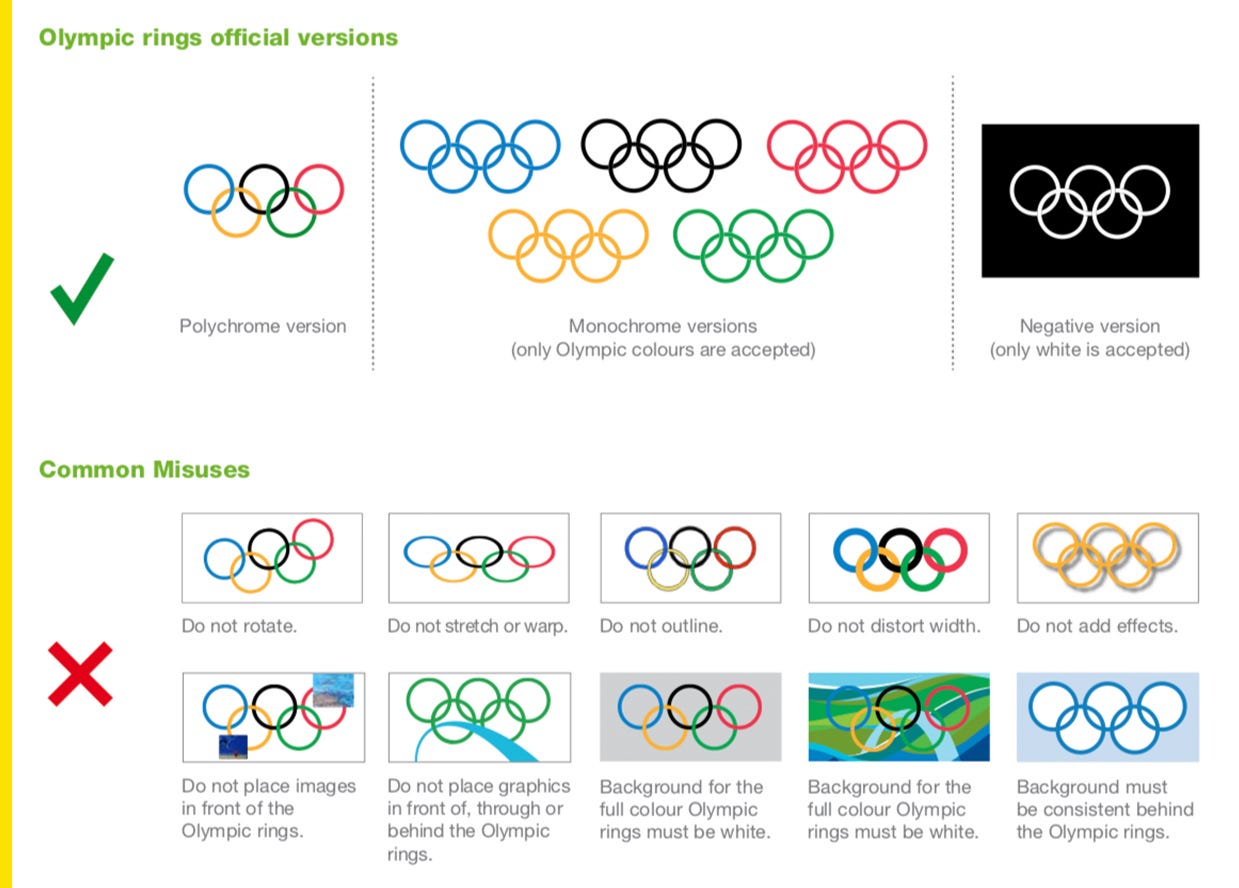
Designed by UK-based designer Daren Newman, this unofficial 2020 logo is “like the New Year's Eve sunglasses of fake logos,” as Josh Billinson tweeted to me. The first problem with this logo is the Olympics are very protective of their rings and they wouldn’t allow a city to manipulate them into a numerals for a logo. Here’s the official Olympics style guide for how to use the rings along with some common misuse examples:
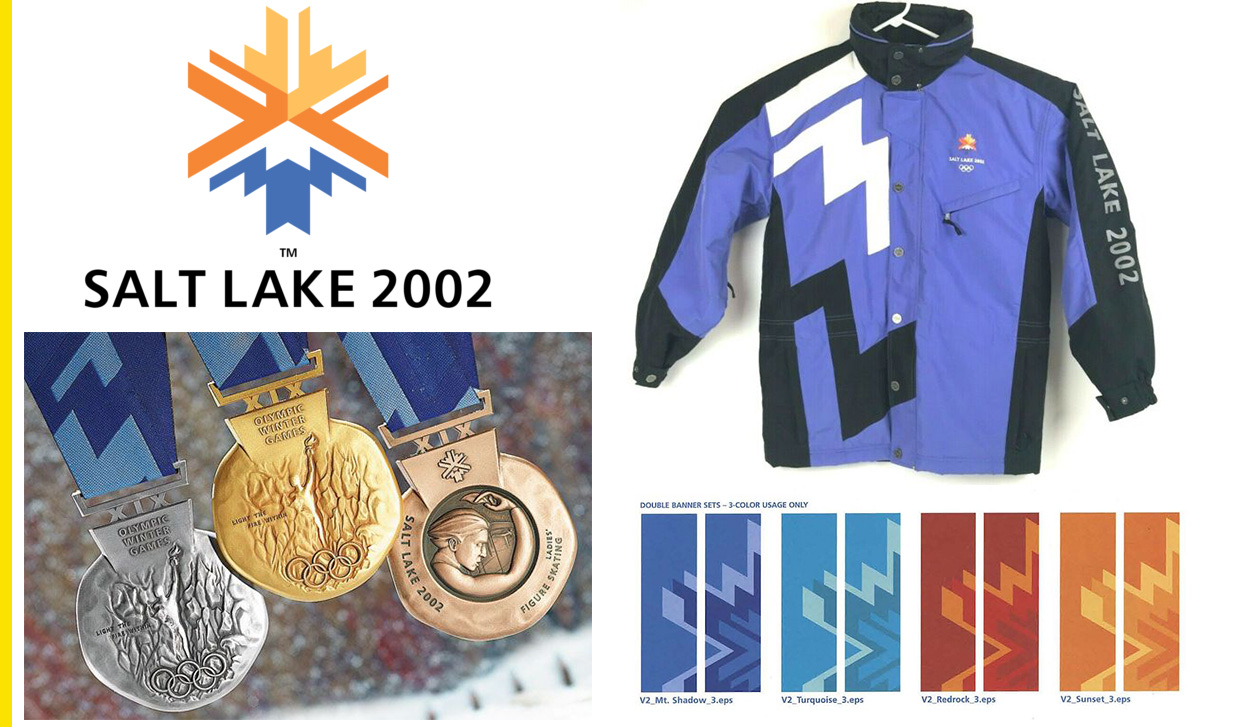
The other problem is city-specific Olympics logos are used to build out a whole visual identity for the Games. The logo is used as the basis for signage, clothing, merchandise, medals and more, and a simple 2020-rings mash-up is ill suited for that. For the 2002 Salt Lake Games, for example, elements of the snowflake icon were cropped for use in different assets:
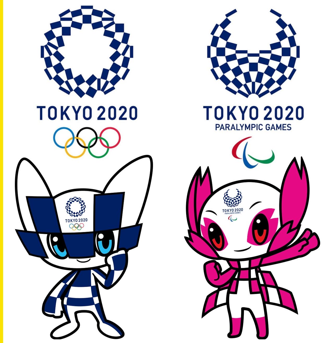
The actual Tokyo Games logo, a chequered emblem designed by Japanese artist Asao Tokolo, was designed to be spun off into other elements. The Tokyo Paralympic Games logo is easily identified as a sister logo, and the chequered pattern is also used on the Tokyo 2020 mascots, Miraitowa and Someity.
These Mississippi flag designs are big GraPhiC deSiGn Is mY PasSiOn energy
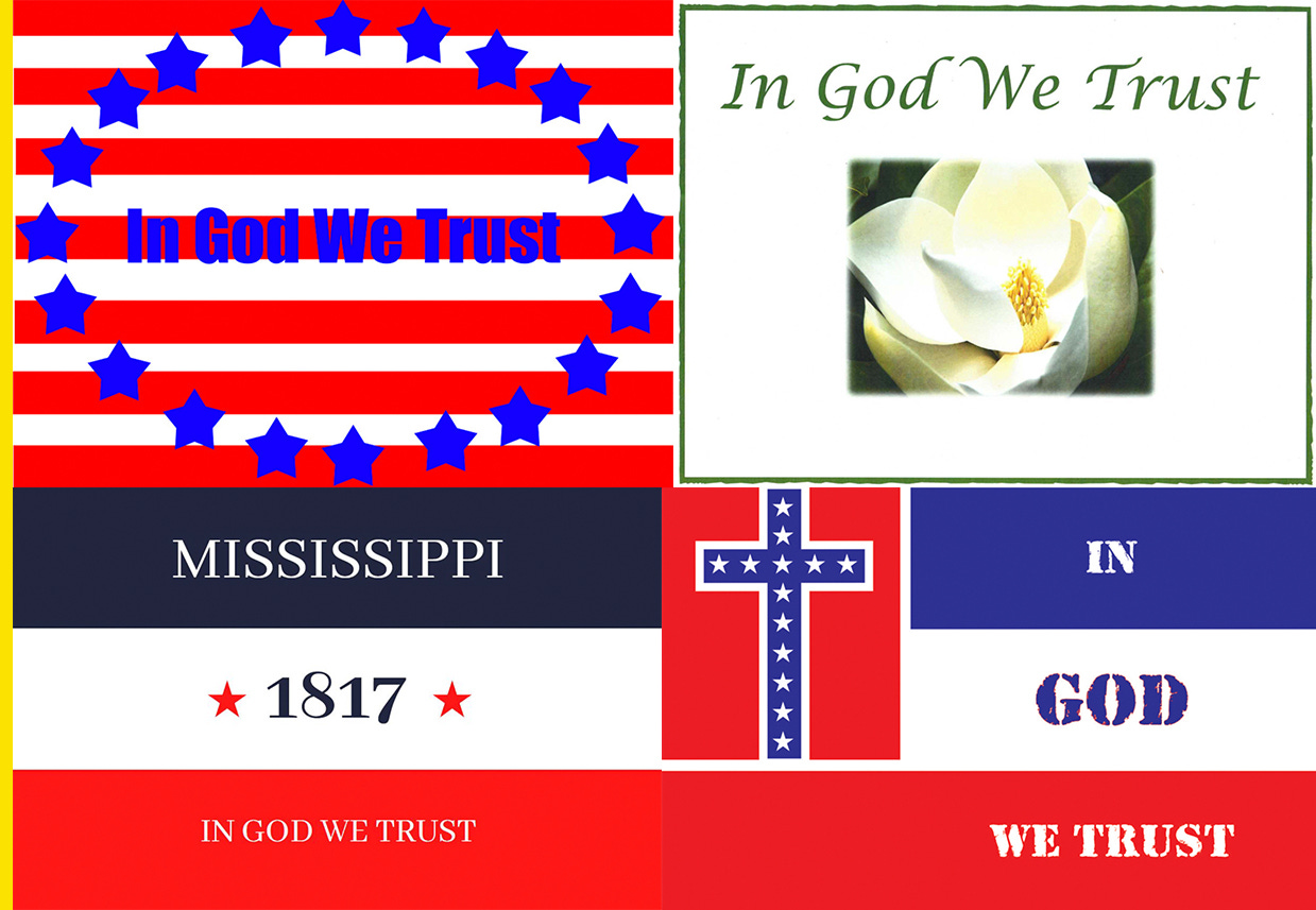
The Mississippi Department of Archives and History has released more than 2,000 submissions for a redesigned state flag. The only rule is they have to say “In God We Trust” somewhere. Most of them would make terrible flags.
There are a bunch that look like they were designed by kids, which is great and fun and good! But there are also a lot that look like they were designed by adults on Microsoft Paint and they hurt my eyes. A few obvious troll designs were submitted, like this, and a few are actually good.
You can view all the submissions here. Do you have any favorites?
The NBA’s social justice jerseys let players speak out on (some) issues
The NBA season resumed last week at the Walt Disney World Resort in Florida, and 300 out of 350 players returned with social justice messages on their jerseys in lieu of last names.
Players couldn’t just put whatever they wanted on their jerseys, though. They had to pick from a pre-approved list of phrases settled on by the NBA and NBA Players Association.
The approved phrases were: Black Lives Matter; Say Their Names; Vote; I Can't Breathe; Justice; Peace; Equality; Freedom; Enough; Power to the People; Justice Now; Say Her Name; Sí Se Puede (Yes We Can); Liberation; See Us; Hear Us; Respect Us; Love Us; Listen; Listen to Us; Stand Up; Ally; Anti-Racist; I Am A Man; Speak Up; How Many More; Group Economics; Education Reform; and Mentor.
Equality was the most popular choice. The move was nice in theory, but also…

Tampa’s “Back the Blue” mural is not easy to read
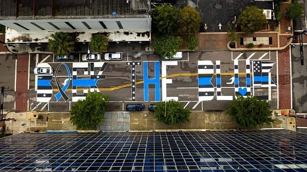
Sometimes the best design is simple. That’s the takeaway from a pro-police mural painted outside Tampa Police Department headquarters over the weekend. It uses a ribbon for the A, a blue line going through the C, and I have no idea what’s going on with the E at the end. It makes it… difficult to read. BOEK THE BLUF? BIEK THE BLUP?
The mural wasn’t approved by the city, but Kristen Krutz, an organizer, told the Tampa Bay Times they decided to paint it anyways because Black Lives Matter murals were also painted in the city without permission.
The police are “being defunded and things that they need and require to do their job are not going to be provided anymore,” Krutz said. “Obviously, that would make anybody feel unappreciated, unwanted, and that’s the opposite of what we wanted them to see with the mural on the street.”

