What Mike Pence's serifs tell us about his candidacy
It’s classic white Wonder bread. A new pair of gray New Balance sneakers on Father’s Day morning. It’s Mike Pence.
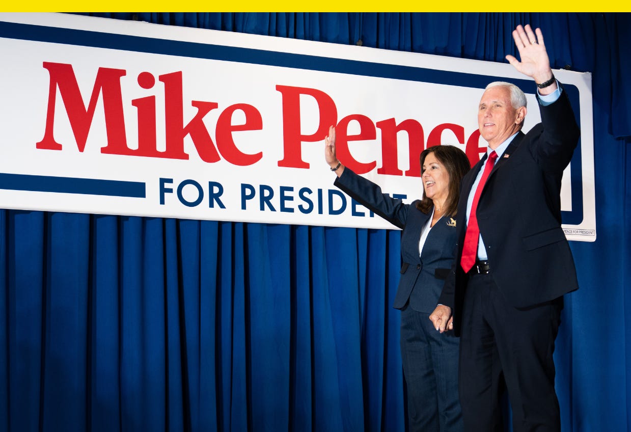
Former Vice President Mike Pence is running for president as a conservative, and you can tell just by looking at his font.
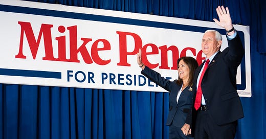
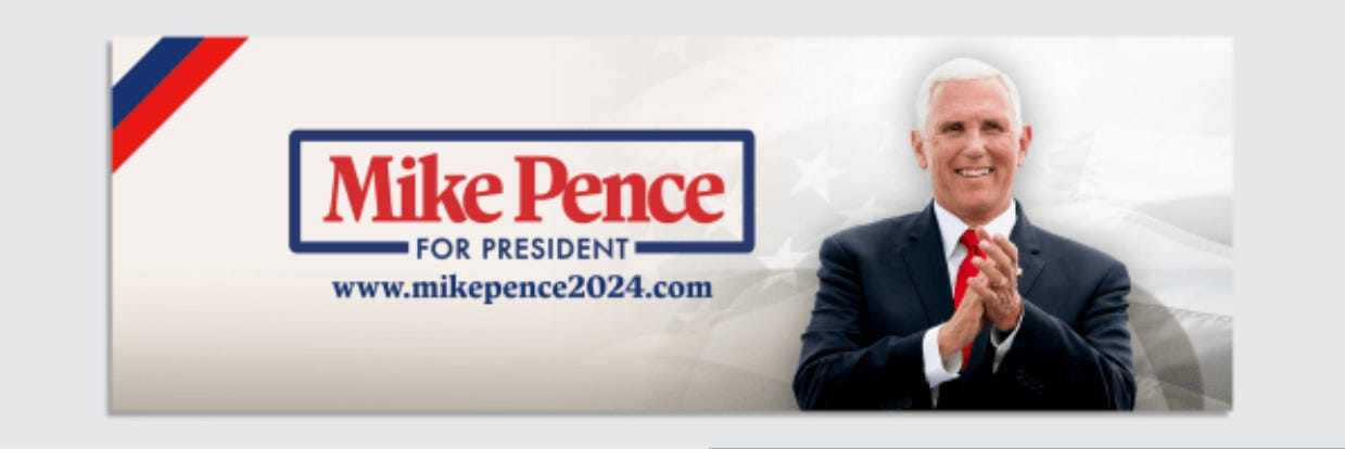
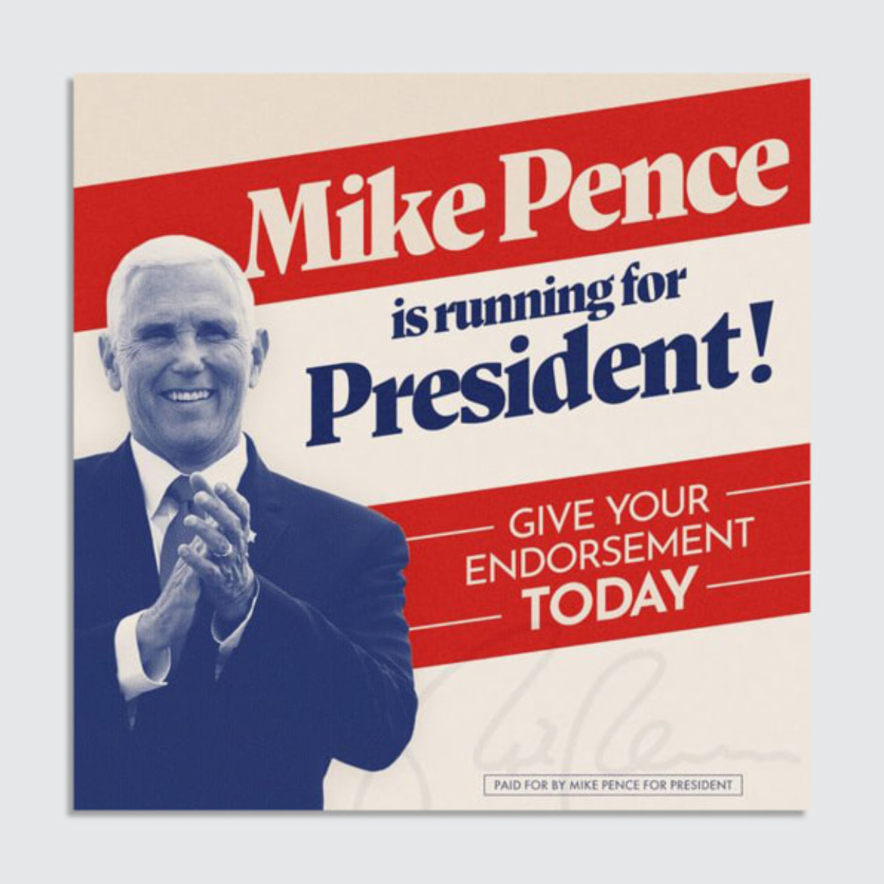
Pence announced his campaign last week in Iowa, joining an increasingly crowded field with visual branding that stands apart from most of his competitors. The hallmark of Pence’s identity is a wholesome serif typeface called Antonia. Released in 2020 by the Austrian type foundry Typejockeys, Antonia looks familiar and warm, with smiling lowercase e’s and legs shaped like butter knives, like on the k in “Mike.”
It’s exactly what you’d expect for a former Indiana governor who calls his wife “mother” and describes himself as a Christian, a conservative, and a Republican—in that order. Online commentators compared it to a logo for sour cream or mayonnaise. It’s classic white Wonder bread. A new pair of gray New Balance sneakers on Father’s Day morning. It’s Mike Pence. His designers nailed the brief.
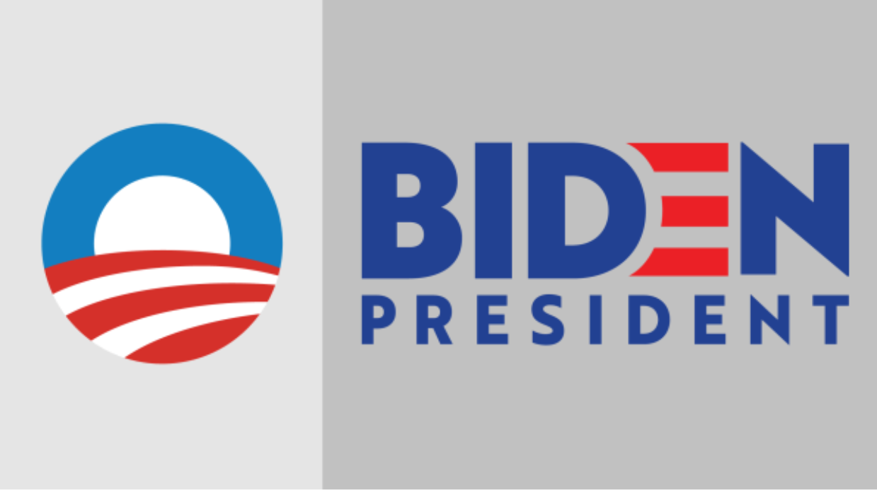
Pence’s name is wrapped in a border, not unlike the logo of his former boss, and those of legions of other politicians. It’s common for former vice presidents running for the top of the ticket to pay homage to their earlier logo as running mate. George H.W. Bush’s 1988 logo stacked his and running mate Dan Quayle’s names in serifs between parallel horizontal lines, like the 1984 Reagan-Bush campaign logo; and the red stripes in the E for Joe Biden’s 2020 campaign logo were originally a reference to the red stripes in former President Barack Obama’s O logo, designer Aimee Brodbeck told me.
Unlike Bush and Biden, though, Pence is also running against his ex-boss. He finds himself in the unenviable and unprecedented position of defending the Trump-Pence record while making the case that he’s the best suited to continue it (not to mention navigating the time Trump sent a mob to the U.S. Capitol who shouted, “Hang Mike Pence” after being told, inaccurately, that he had the power to overturn an election).
On the campaign trail, Pence is direct, calling January 6, 2021, “a tragic day in the life of our nation” and characterizing Trump’s actions as disqualifying. He hits Trump from the right, arguing he’s insufficiently conservative on issues like abortion, criminal justice reform, and standing up to Russia. Pence even frames January 6 in terms especially suited for voters with thin-blue-line decals on their trucks, telling a CNN town hall he has no interest in pardoning people who assaulted police officers.
As president, Trump broke traditional conservative Republican orthodoxies on things like trade and foreign policy, throwing what it means to be Republican into question. Pence is running with an answer, as a true conservative, and his font choice reinforces his message.
Serifs are conservative, at least in theory. While sans serif type is used in fashion or commerce to look minimalist and modern, serifs evoke tradition, a trait usually associated with conservatism. Researchers at Virginia Tech found that people view serif and bold typefaces as more conservative, as opposed to more “liberal” sans serifs and italics, and Republican candidates are more likely to use serif fonts in their campaign logos.
In practice, though, sans serifs are the standard of U.S. politics. They’re used by most congressional candidates from both parties, the campaign logos for all four presidents elected in the 21st century so far, as well as the majority of this year’s Republican contenders. But it wasn’t always that way.
In between Richard Nixon’s Futura and the big, blocky sans serifs of Trump and former President George W. Bush was Ronald Reagan, one of Pence’s personal heroes, who rebranded in 1980 with a logo set in the vintage serif Century Old Style to beat then-incumbent President Jimmy Carter. Historically, serifs reference a Republican golden age untainted by Watergate, Iraq, and Trump; and today, they stand out in a field of mostly neutral, under-branded sans serif Republican political design.
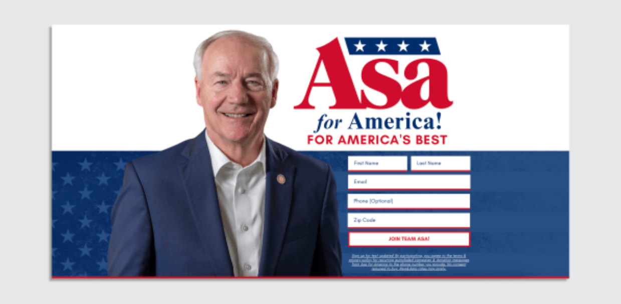
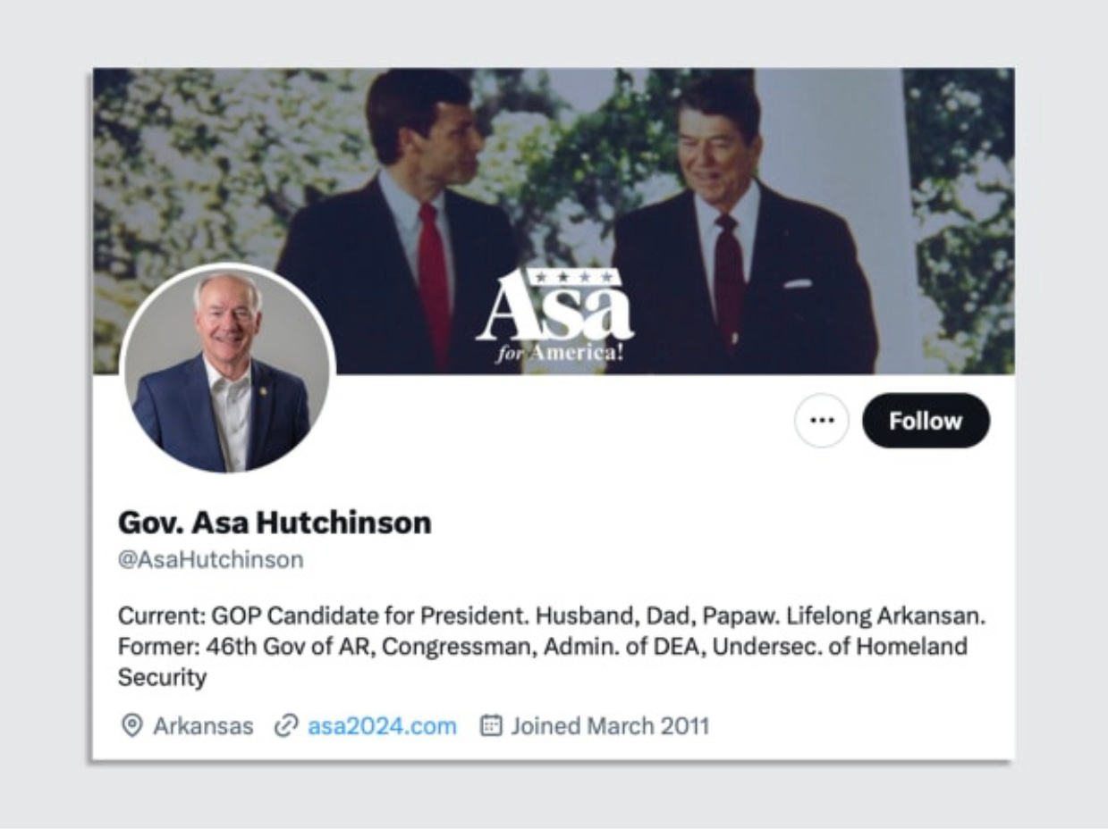
Only one other Republican candidate is using a serif typeface in a campaign logo this year: former Arkansas Governor Asa Hutchinson. Like Pence, he’s a Reagan fan—Reagan appointed Hutchinson to be a U.S. Attorney for the Western District of Arkansas in 1982, and Hutchinson’s Twitter banner image is a photo of him and the Gipper together—and like Pence he’s spoken forcefully against Trump’s attempts to overturn the 2020 election.
Republicans hoping to supplant Trump as the next Republican nominee have mostly responded with sameness in their campaigns’ visual design, in part because Republican design allows for less deviation from traditional tropes. For candidates unafraid to call out Trump for his efforts to overturn an election, though, serifs look throwback, and they’ve proven to be a helpful signifier evoking a return to traditional conservatism.
Like what you see?
Subscribe for more:
This story was first published in Fast Company.
Have you seen this?
After months of searching, a sculpture stolen from a North Dakota art museum has turned up — next to a casino dumpster. “Garden Wheel,” a sculpture by artist Elizabeth MacDonald, was found next to a dumpster at the Southgate Casino, Bar and Grill seven months after being stolen. [Artnet News]
H&M unveils 10 breakthrough innovations in sustainable fashion. The fashion retailer’s H&M Foundation awards startups finding sustainable solutions to fashion. [Fast Company]
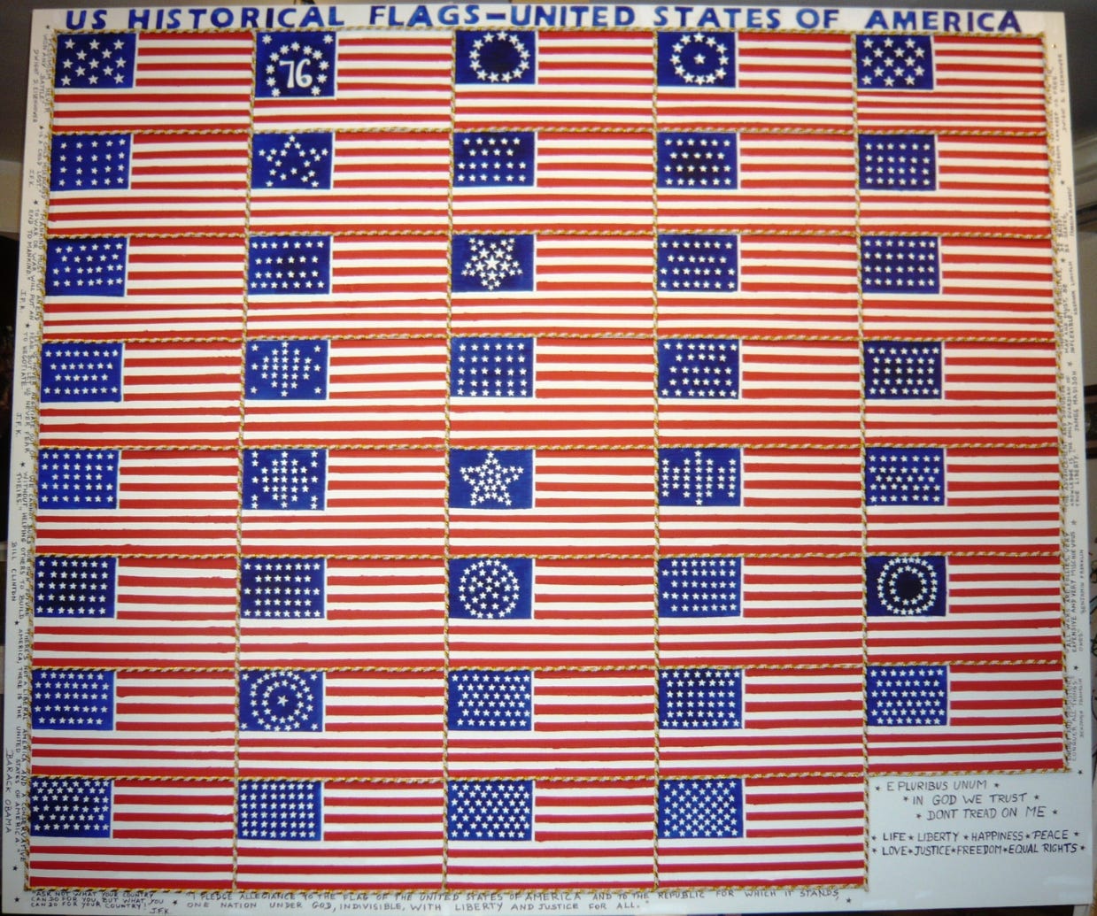
Happy Flag Day. The first U.S. flag was approved on this day in 1777. Our current 50-star flag is the 27th version of the flag used between 1777 to 1960, when Hawaii became a state, and it’s also the longest-used version of the flag.

