What does typography say about American identity? This exhibition explores.
Plus: Trump’s running fundraising ads that specifically asks his supporters not to give him money
Hello, in this issue we’ll look at…
What does typography say about American identity? This exhibition explores.
Trump’s running fundraising ads that specifically asks his supporters not to give him money
Scroll to the end to see: which former FLOTUS just launched a beverage brand 🥤
What does typography say about American identity? This exhibition explores.
When you think of landscape paintings, you probably think of features like mountains, clouds, and trees. Bob Ross stuff. You probably don’t think of fonts. Artist Mark Kelner might have you thinking differently in his new exhibition
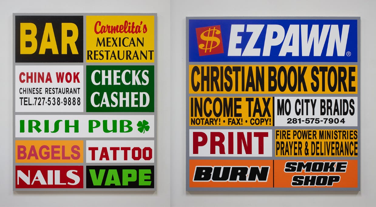
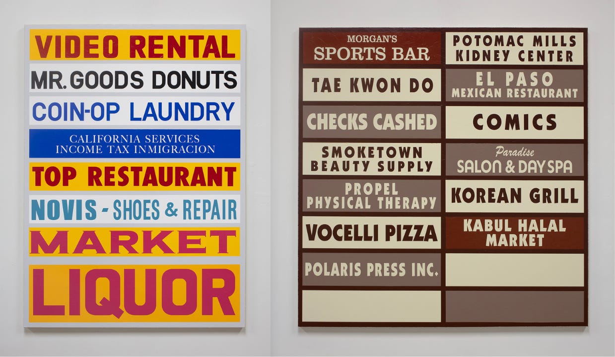
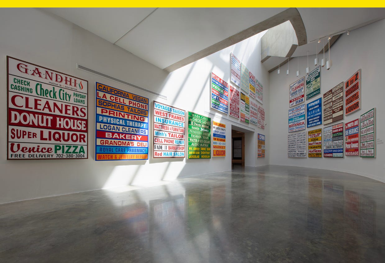
In New American Landscapes at the American University Museum in Washington, D.C., Kelner shows off paintings of typography that defines for him Americana and the American national identity through words, like “donuts” and “checks cashed,” as well as how those words are conveyed. It’s the visual vernacular of the American strip mall, “ubiquitous, but also invisible,” he tells me.

The paintings are named for the cities where the type was sourced, which Kelner either took photos of himself or he found on Google Street View beginning during the start of the COVID-19 pandemic when he couldn’t travel. Using tools to look at Street View going back a dozen or so years helped him find “more material to choose how to best mock up my compositions, color choices, horizon lines, and really incorporate techniques of what I feel is 21st century landscape painting,” he says.
The strip mall is a California invention, and ten pieces in the exhibition are made from type sourced from the greater Los Angeles area. Kelner says it was interesting to note the difference in signage for some cities back East that was uniform compared to signs in a city like Houston, where it seemed like anything goes.
“If I wanted to put up a tacky, big ass sign that had no business being there, I could,” Kelner says. “Certainly, that’s impacted how interesting, how kitschy, and how unintentionally beautiful some of those signs actually are.” Still, he adds, “there’s some sort of comfort in the conformity of signing that is obviously placed with design guidelines in mind, say in Woodbridge, Va., or North Haven, Conn.”

Kelner sees the art as a reaction to his youth growing up in Rockville, Md., and riding his bike around a suburban neighborhood with its share of strip mall signage. “There was and remains an Exxon station across the street from another Exxon station,” he says. “I remember when that happened and it blew my mind then as much as it does now.”
His art brings to mind Edward Burtynsky’s photo of a Pennsylvania truck stop, “Breezewood, PA” (2008), and the work of Barbara Kruger, another artist who works in type. Words from strip mall signs that are verbs, like vape, print, burn, read like ironic Kruger-esque calls to action.
“Signage is important, be it Golden Arches or a handmade painting of a termite that serves as the logo for an exterminator service,” Kelner says. “My project suggests that these signs are actually my version of trees, nature, a personal landscape that evokes a broader American picture.”
New American Landscapes runs until Dec. 8. What’s some of your favorite strip mall typography?
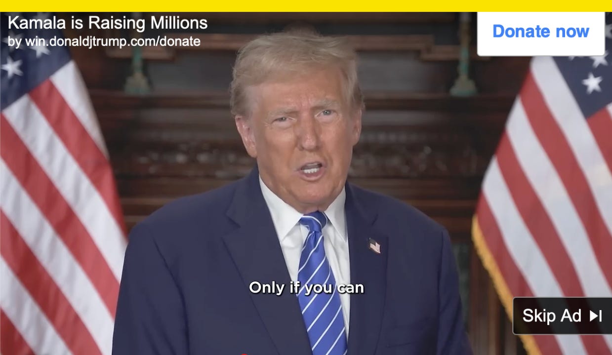
Trump’s running fundraising ads that specifically asks his supporters not to give him money
Former President Donald Trump wants your money, but only if you can afford it.


