Want to build an Olympic brand? There’s an official how-to guide.
Plus: Voting by mail is getting its own Smithsonian exhibition
Hello, in this issue we’ll look at…
Voting by mail is getting its own Smithsonian exhibition
Want to build an Olympic brand? There’s an official how-to guide.
This skateboard brand’s Britney Spears collection is a perfect mix of pop and punk
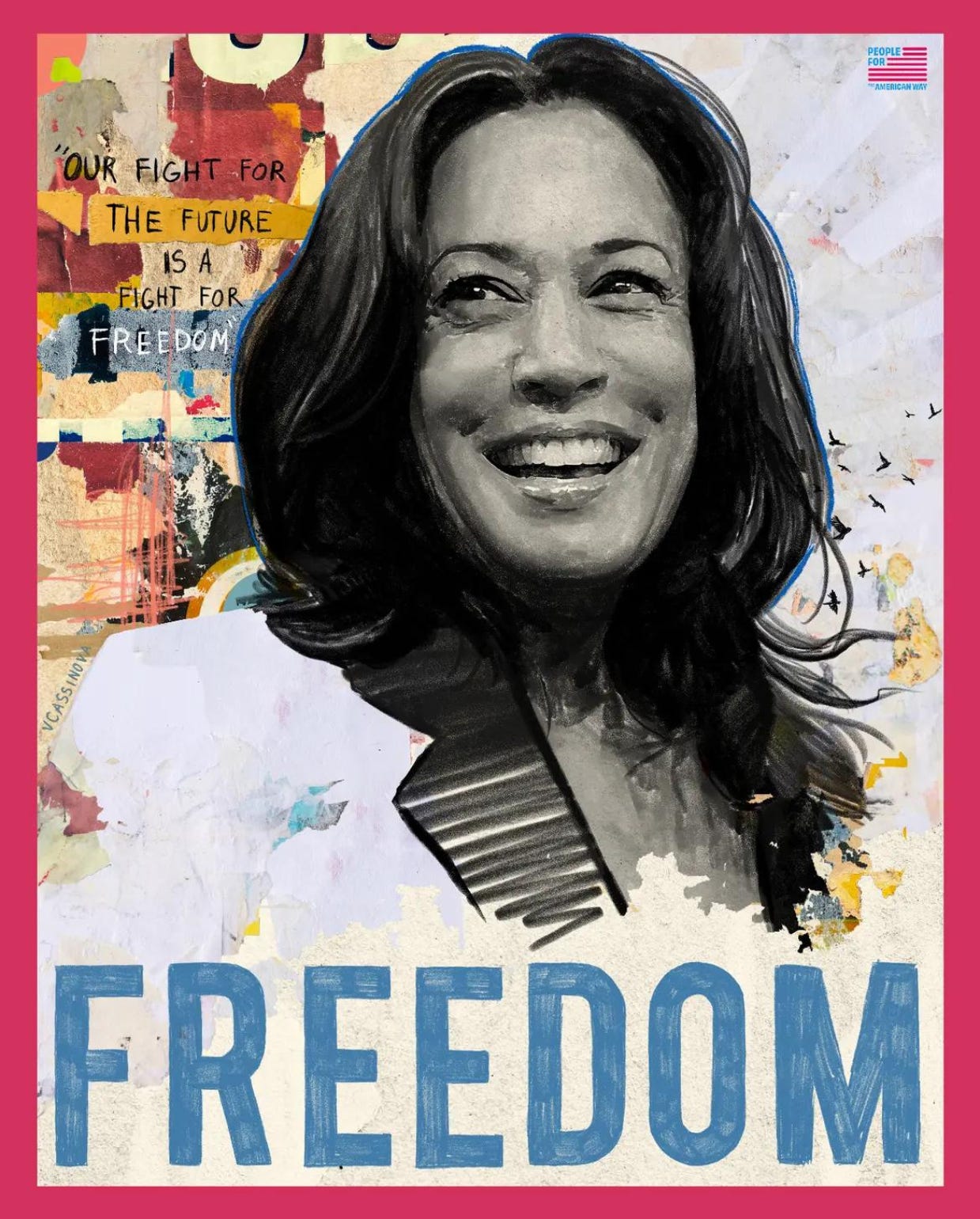
Scroll to the end to see: the new presidential candidate portrait just put out by People for the American Way 🖼️
Voting by mail is getting its own Smithsonian exhibition
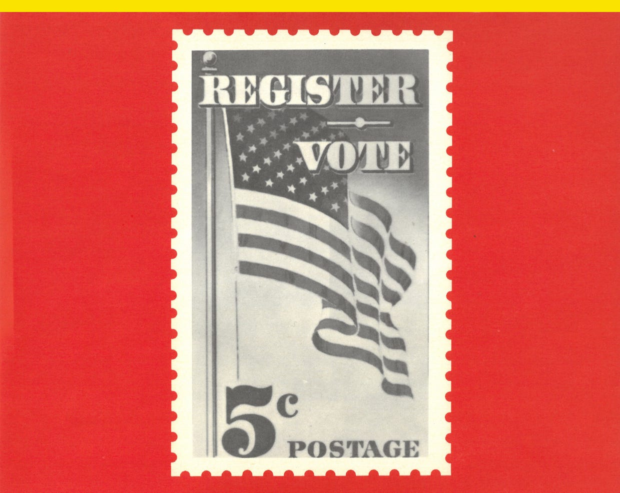
The COVID-19 pandemic brought new focus to mail-in voting, but in the U.S. the practice dates back to the Civil War, as a forthcoming Smithsonian exhibition shows.
Voting by Mail: Civil War to Covid-19 explores the past and present of mail-in voting with artifacts like an 1864 envelope for a deployed soldier to vote in an Ohio state election during the Civil War and a 1944 postcard ballot during World War II. The exhibition opens Aug. 24 at the National Postal Museum in Washington, D.C., and runs until Feb. 23, 2025.
Some states temporarily established or expanded absentee voting during wartime for military members, and in 1901, Kansas became the first state to offer it for civilians, though in a limited way. At the time, Kansas only offered mail-in voting for railroad employees who were traveling and away for work, according to the museum, but the postal system has now become a major part of the way we vote in the U.S.
“The history of mail as an official conduit of election information and election voting materials has long been part of our nation’s history,” museum director Elliot Gruber said in a statement.
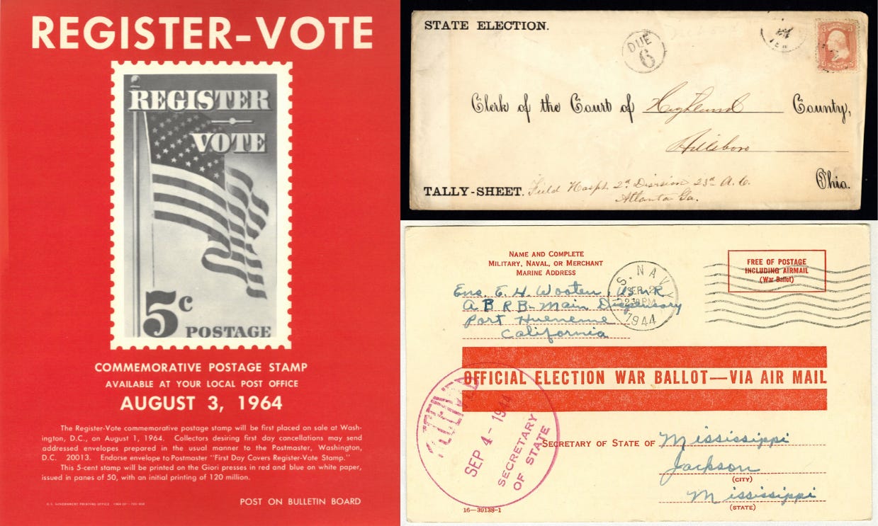
The exhibition will also have modern items, including notices announcing elections, official election information guide, and an absentee ballot. There are eight states and Washington, D.C. which have all-mail voting and 28 states have "no-excuse" absentee voting, according to the National Conference of State Legislatures.
Nearly half of all U.S. voters voted absentee or by mail-in ballot in 2020, the Pew Research Center found, but President Joe Biden’s voters were more likely to do so at 58% compared to just 32% of former President Donald Trump’s voters. Trump criticized early voting during the 2020 campaign, but this year, his campaign is participating in an early voting initiative with the Republican National Committee called “Swamp the Vote.”
Want to build an Olympic brand? There’s an official how-to guide.
Every two years, designers unveil limited-time brands created for the host cities of the summer or winter Olympic Games. Somehow they manage to simultaneously look both distinct to the host city and yet fit into a larger Olympic family. How do they do it? Well, having a 135-page brand guideline certainly doesn’t hurt.
The International Olympic Committee, or IOC, says its brand guidelines are “intended to help bring the Olympic brand to life – a visual identity inspired by our heritage and driven by our vision of building a better world through sport.”
The guidelines, dated September 2023, break down the Olympic brand into 10 parts: 1. Olympic symbol, 2. color, 3. logo system, 4. typography, 5. graphic devices, 6. photography, 7. illustrations, 8. pictograms, 9. infographics, and 10. composition.
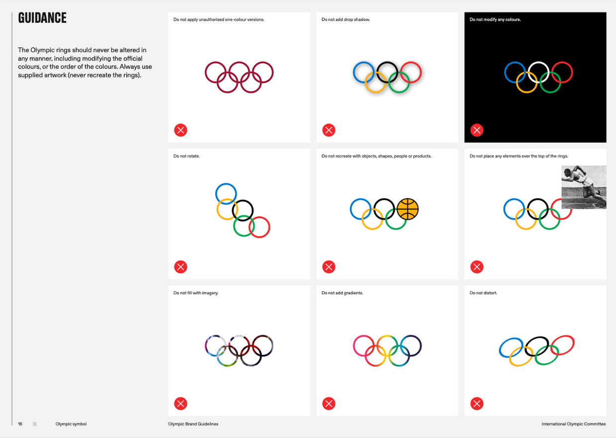
The five-ringed Olympic symbol is, of course, central to the entire brand. The rings represent Africa, the Americas, Asia, Australia, and Europe, and it was designed by Pierre de Coubertin, the founder of the modern Games. The IOC has strict rules around the symbol’s use. You’re not allowed to rotate it, distort it, apply unauthorized one-color versions, modify the colors, add a drop shadow, add a gradient, or recreate part or all of the symbol with objects, shapes, people, or products.
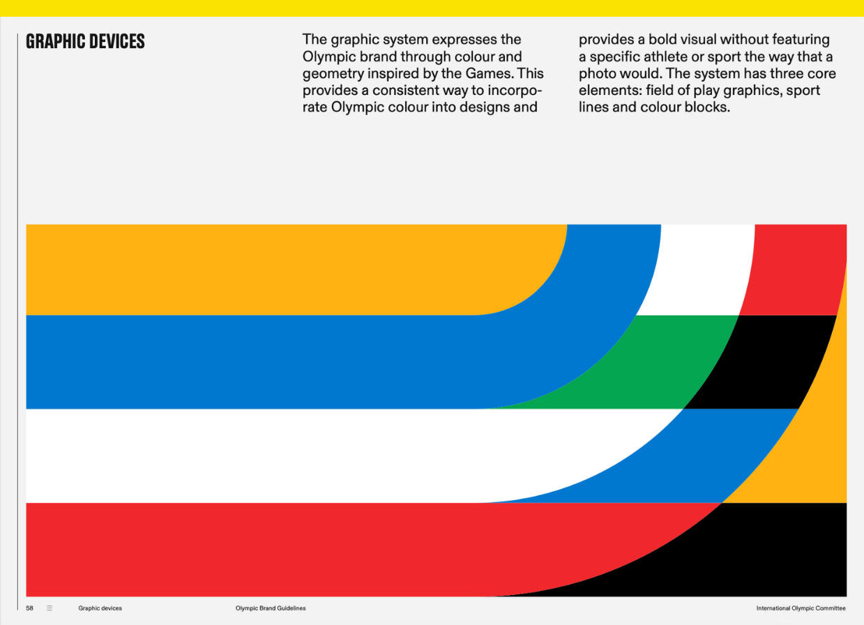
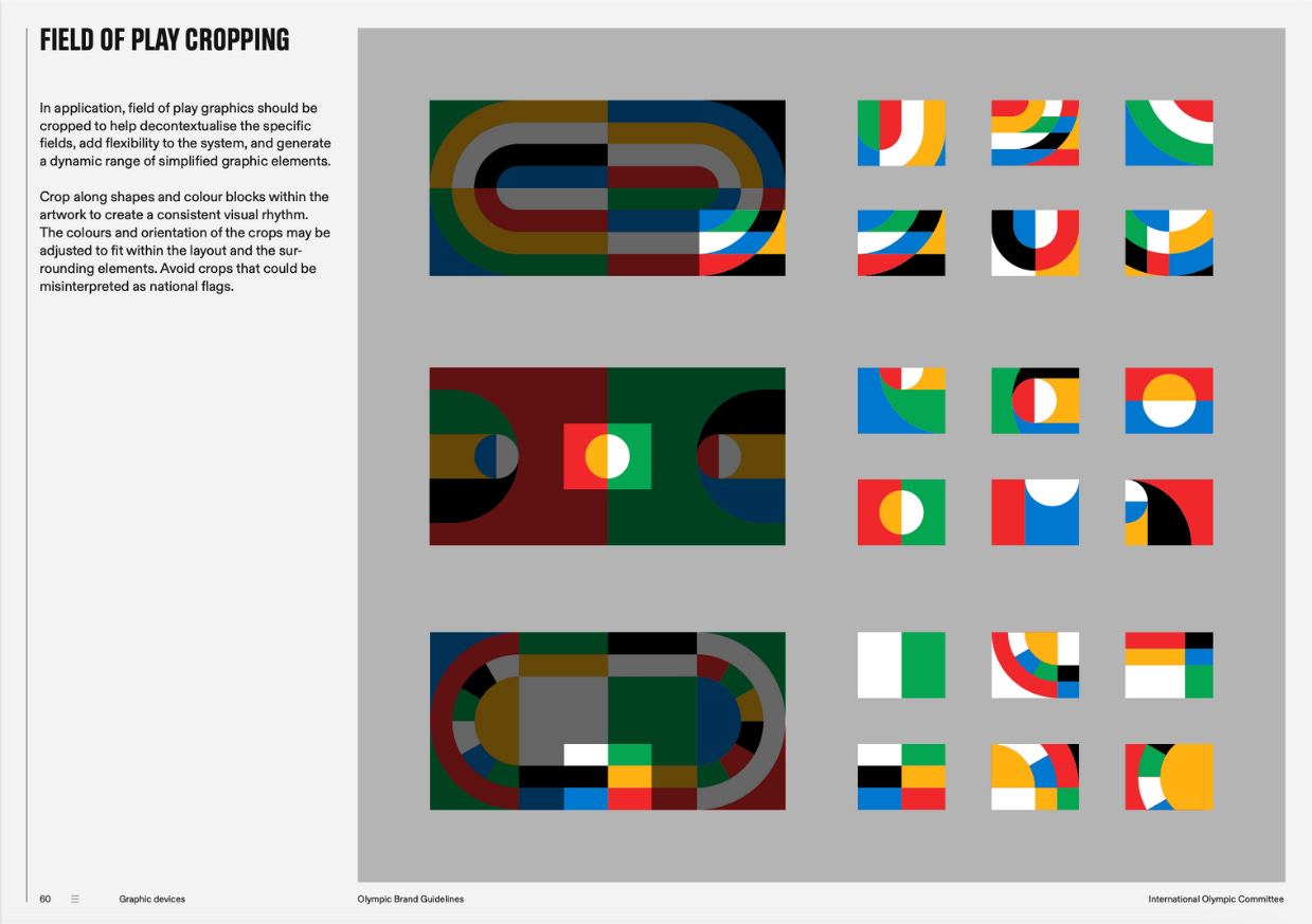
The graphic devices of the Games are the funnest part and built around three elements: field of play graphics, sports lines, and color blocks. These systems use geometry and color inspired by the Games to provide “a consistent way to incorporate Olympic color into designs” without focusing on individual athletes or sports, per the guide.
As you see in the Paris Games visual identity, the graphic devices are inspired by things like tracks and courts, but they’re cropped “to help decontextualise the specific fields, add flexibility to the system, and generate a dynamic range of simplified graphic elements.” Abstracted, these images then become building blocks that can be mixed and matched with each other creating what the guidelines describe as a “consistent visual rhythm.”
The IOC calls for photography that depicts people with respect; provides a balanced ratio of subjects by gender, ethnicity, and geography; and is bold and striking. The same goes for illustrations.
Reading through the guidelines, it’s clear Paris organizers didn’t follow all the rules. The pictograms section specifically calls for using the human form, rather than the sports pictograms used in the 2024 Games. But all in all, what you see in Paris is largely consistent with what the IOC calls for.
The IOC says its visual system “balances consistency and flexibility,” giving host cities the framework to build their own distinct brands that capture their local and national spirit while still fitting within the larger Olympic family. The authors of the IOC’s brand guidelines gave a sports analogy for why that matters, writing that in graphic design as in sports, “there are lines to stay within, but those margins aren’t meant to stop the exceptional; they simply frame it.”
This skateboard brand’s Britney Spears collection is a perfect mix of pop and punk
The best Britney Spears collabs bring together the most distinctive parts of her pop star persona with something new, like the funky coed remix of her 2001 song “Boys” with Pharrell Williams or her 2010 photo shoot with Japanese pop artist Takashi Murakami for Pop magazine.
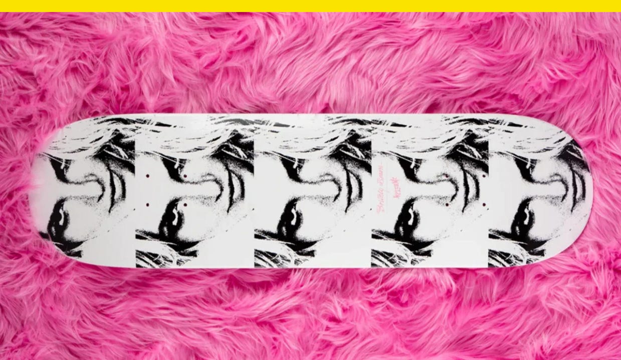
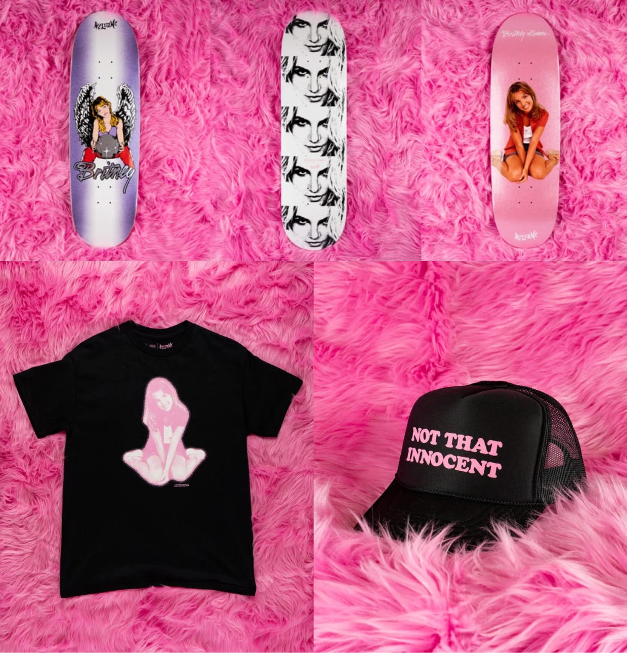
California-based Welcome Skateboards managed to get that balance right, mashing up pop star nostalgia with punk rock streetwear for its Britney Spears x Welcome collection. The 25-piece capsule brings vintage Britney graphics to $90 hoodies and $85 skateboard decks, and features catchphrases from songs like “Give Me a Sign” and “I Still Believe” from “…Baby One More Time” on $40 tees.
The Princess of Pop’s references and influence often show up in fashion and apparel. She was the face of French luxury house Kenzo’s 2018 denim-heavy capsule collection, and, more recently, younger pop stars have looked to her for inspiration. Halsey wore a nude diamond bodysuit to reference “Toxic” in the music video for her new song, “Lucky,” that samples the Spears song of the same name. Tate McRae recently wore a “Sexsi” crop top for a Pop magazine photo shoot à la Spears in the early 2000s. And Ice Spice showed up to last year’s MTV Video Music Awards in an outfit reminiscent of one Spears wore to the ceremony 20 years earlier (itself a reference to a look made iconic by Madonna in the 1980s).
Spears’ debut album is now 25 years old, but the fight to end her conservatorship plus her bestselling 2023 memoir, The Woman In Me, have brought her story and music to new audiences. No wonder Britney nostalgia is in full swing. Welcome’s collection taps into that nostalgia with just the right level of subversion.
The collection features visual callbacks to early Spears hits and albums, too. One such illustration of Spears is based on a photo from the “…Baby One More Time” music video, with added angel wings and a sparkling orb to reference a fairy motif from the packaging of some of her early CDs. Skateboard decks show the image of Spears posing on a pink background from the cover of her debut album or performing “I’m a Slave 4 U” with a snake at the 2001 MTV Video Music Awards. “Not That Innocent,” a line from “Oops!… I Did It Again,” appears on trucker hats like the ones Spears wore in the 2000s.
Although the collection leans heavily toward Y2K, TRL-era Britney, there are references to her later music, including “Work Bitch” and “Till the World Ends,” songs with music videos in which Spears played her womanizer-hunting, bullwhip-cracking femme fatale character. The color palette of the Britney Spears x Welcome Skateboards collection is pink and black, which captures the duality that is Britney Spears.
“This collection is more than an ode to our favorite pop star, it’s a celebration of a generational icon who has influenced music, fashion, and pop culture as a whole for decades, and the enduring resilience required to achieve that,” Welcome Skateboards said in a statement. “It is a testament to the way different subcultures that may seem at odds can coexist and enrich one another.”
The curly, girly “Britney Spears” logo used for her debut album is also the logo chosen for the Welcome Skateboards collection, and it couldn’t look more different in style from Welcome’s own heavy metal-style logo. It’s ironic, yes, but it also works—because the truth is, Spears has always been a little rock ’n’ roll.
Have you seen this?
Harris announces record-breaking $310 million July fundraising haul. Two-thirds of the donations made last month came from first-time donors, according to the Harris campaign. [NPR]
Branding in a cycle of uncertainty. “I do think this sort of AOC style — bold, minimalistic — will continue. I am seeing that sort of style in a lot of creative on the progressive side in particular. A lot of folks are sort of modeling her look. I think the new Harris creative — just with her logo — it’s very simple, streamlined. It’s easy to adapt with different versions of it.” [Campaigns & Elections]
The U.S. Digital Service ten years later: how the agency cuts through web design bureaucracy. The U.S. Web Design System, a style guide and collection of user interface components and design patterns to ensure a consistent user experience across government websites, defines 47 user interface components such as buttons, alerts, search boxes, and forms. [Fast Company]
People For the American Way just released this portrait of Kamala Harris by artist Victoria Cassinova for its Artists For Democracy campaign. “I am using art to show that we all must cast ballots to have the freedom to live, vote, read, love, speak and believe in a way that is authentic to ourselves, and be safe from harm, hate and persecution,” Cassinova said in a statement. [People for the American Way]
I 🩵 the Paris Games branding. The branding for the biggest sporting event of the year looks nothing like we’re used to seeing in sports. [Yello]
History of political design
Brought to you by Whig, my new newsletter about politics and pop culture. Subscribe here.
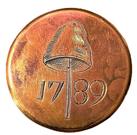
George Washington Inaugural copper engraved button (1789). The button shows a Liberty Cap, also known as the Phryge, which was a symbol of freedom during the American Revolution before it was popularized in France (and eventually used as the 2024 Paris Games mascot).
A portion of this newsletter was first published in Fast Company.
Like what you see? Subscribe for more:


