These are the hottest political design trends of 2020
The top colors, font styles, and design elements of the campaign
Credit: Alexander Drago/Reuters
Political design trends this year took their cues from the logos of high-profile politicians like President Trump and Rep. Alexandria Ocasio-Cortez. Some candidates found new ways to visually identify themselves while a handful of established incumbents made major rebrands.
The Center for American Politics and Design, or CAPD, a research group founded in 2018, updated its database of campaign logos this week with 1,009 new logos from 2020 House, Senate, gubernatorial, and presidential campaigns (check out their database here, which was created in partnership with the New York design and technology studio Channel Studio). CAPD provided Yello with data on the latest logos, and these are some of the big trends of 2020:
Blue is the most popular color
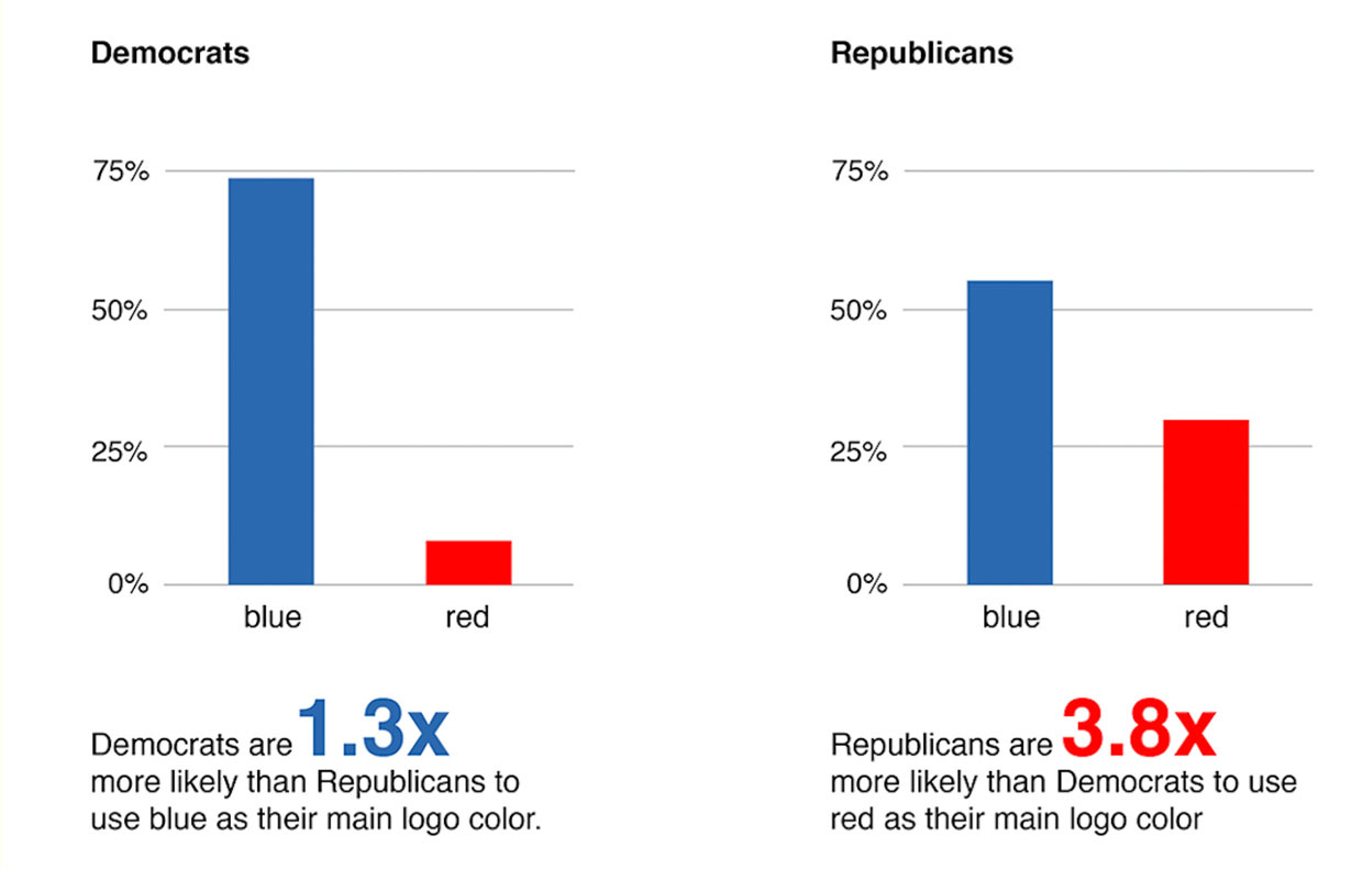
Blue is most popular in Democratic logos, but it’s used widely by candidates of both parties. Blue is used as a primary or secondary color for 86% of Democrats and Republicans, but Democrats are 1.3 times more likely than Republicans to use it as their main color.
There has been a slight increase in the proportion of red logos on the Republican side, which CAPD co-founder Susan Merriam believes could be due to the party becoming more ideologically conservative after a number of Democrats flipped Republican seats in 2018. Republicans are 3.8 times more likely than Democrats to use red as their main color.
The top nontraditional color for Democrats is purple, and for Republicans it’s black
Democrats are 2.7 times more likely than Republicans to use purple as their main color, and 93% of the candidates who use purple are women.
Republicans are less likely to use nontraditional colors than Democrats, but more than 4% use black.
Most logos use sans serifs
Overall, 69% of the new 2020 logos use sans-serif fonts.
Sans serifs are used in 698 logos, serifs are used in 275 logos (including 53 slab serif logos) and scripts are used in 30 logos.
An academic study released late last year found people perceive sans-serif type to be more liberal while serif type is perceived to be more conservative. Obviously, there are plenty of candidates who use fonts that don’t fit that partisan perception (see Trump’s sans serif Akzidenz Grotesk Bold Extended and Bernie Sanders’ slab serif Jubilat), but there is a noticeable difference in type style by party.
While a majority of both Democratic and Republican logos use sans-serif fonts, Democrats are more likely to use them than Republicans:
75% of Democratic logos use sans-serif fonts
66% of Republican logos use sans-serif fonts
24% of Democratic logos use serif fonts
33% of Republican logos use serif fonts
A number of senior Democrats have rebranded
Democrats like Reps. Adam Schiff, Hakeem Jeffries, and Carolyn Maloney have all made changes to their logos, and Merriam wonders if it has something to do with concerns over being primaried.
“Was it just time for a brand refresh or are Solid-D incumbents very concerned about challengers from the left by younger, digitally-savvy campaigns?” she asked.
Maloney, the House Oversight Committee acting chair who serves in New York’s 12th District, for example, made a drastic change to her logo after facing a tough primary from progressive challenger Suraj Patel, whose visual identity was very hip. Maloney’s new logo appears to use Industry, the typeface from Fort Foundry used by Pete Buttigieg.
“Rep. Maloney’s branding in 2020 has drastically changed from the stereotype of a Democratic logo— sans serif type and blue to a black and yellow color scheme utilizing an industrial typeface,” Merriam said.
The Trump-inspired box-with-stars look is increasingly popular with Republicans
The box-with-stars logo has become visual shorthand for “Trump Republican.” I noted in August how Trump’s logo has inspired logos and graphics for a number of Republicans and even some Democrats too, and its growing popularity is visual proof of Trump’s expanded influence on the party. Back in 2018, only two Republicans — Jim Renacci and Johnny Nalbandian — used a Trump-style logo, and this year there are nine.
There are a few logos with a striped E, but Republicans steer clear of looking like Biden
The flag-inspired striped E predates Biden’s 2020 campaign — Republican Scott Walker used one in his 2016 presidential campaign logo, for example — but it’s interesting to see how the accent is used now.
Joe Mackey, an Indiana Democrat, basically ripped off the “Joe” version of Biden’s logo, and I don’t think you’d catch a Republican using a logo like Beverly Goldstein’s in 2018 anymore. The Republicans using a striped E in 2020 have some visual tweaks that differentiate their logos from Biden’s.
The AOC slant is bipartisan
The upward slant of Ocasio-Cortez’s 2018 logo gave it a sense of energy, movement, and excitement, and it subsequently inspired logos around the world. Politicians in Europe have used the “AOC slant,” and in New York City, the style was seen in logos for multiple young, progressive challengers.
Though the AOC slant seemed like it might become the go-to look for young progressives, the logo for David Dudenhoefer, a Republican, shows how the trend has crossed the party divide.
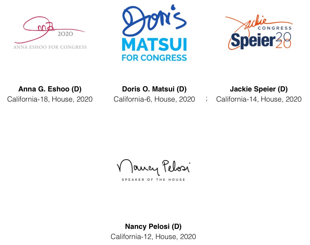
Senior incumbent Democratic women love a signature logo
And honestly, so do I. It’s an easy way to “personalize” a logo, and it’s not terribly common right now.
Doctor candidates are making medical references in their logos
Doctors and other candidates with medical backgrounds are using visual identifiers like DNA, pulses, and stethoscopes to reference their resumes. It may well be a smart move considering health care is the second most important issue for voters behind the economy, according to an August Pew poll.
Jeb didn’t kill the exclamation mark!
Jeb Bush got a lot of grief for his 2016 “Jeb!” logo, but it didn’t scare these three House candidates away from using their own exclamation points. Interestingly enough, all three are Democrats.
We love a star tittle
Bernie Sanders is the king of dotting your I with a star tittle these days, but it’s an increasingly popular design element. There are 31 candidates using a star tittle in their logos this year, up from 25 in 2018.
Gradients are making their way into political design
Gradients have been popular for a few years now (Instagram updated their logo to the current orange, purple, and pink gradient icon back in 2016), but it’s only recently made its way into political design. Tulsi Gabbard used gradients in some versions of her presidential campaign logo and the Biden campaign now uses them across social media, but there are also four House candidates using gradients.
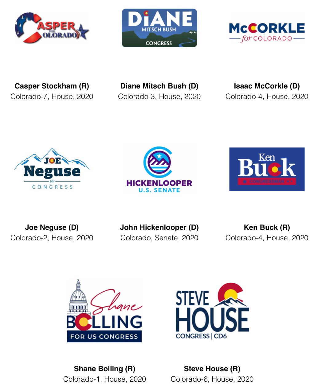
Colorado candidates love referencing their state flag
There are a number of state flags and symbols that show up regularly in logos, like the California bear, the New Mexico Zia, and the Texas Lone Star flag, but no state comes close to the love Colorado candidates give their flag’s C icon.
Subscribe to Yello for the latest news on the culture, branding, and visual rhetoric of politics, delivered each week:
One more thing…
A few other logos that stand out to me: Aaron Swisher’s throwback-style logo, Dan Crenshaw’s portrait logo, Kali Barnett’s I dotted with a sunflower tittle for Kansas’ state flower, Lynnette Grey Bull’s stylized Wyoming flag which honestly belongs in a museum, Mark Elworth’s marijuana leaves, and Nick Rubando, who has an Obama O, but make it Ohio.


