


The newly redesigned New York City subway map is here and it was made with riders in mind
Plus: With “Hands Off,” the Resistance has found a useful new slogan

The newly redesigned New York City subway map is here and it was made with riders in mind
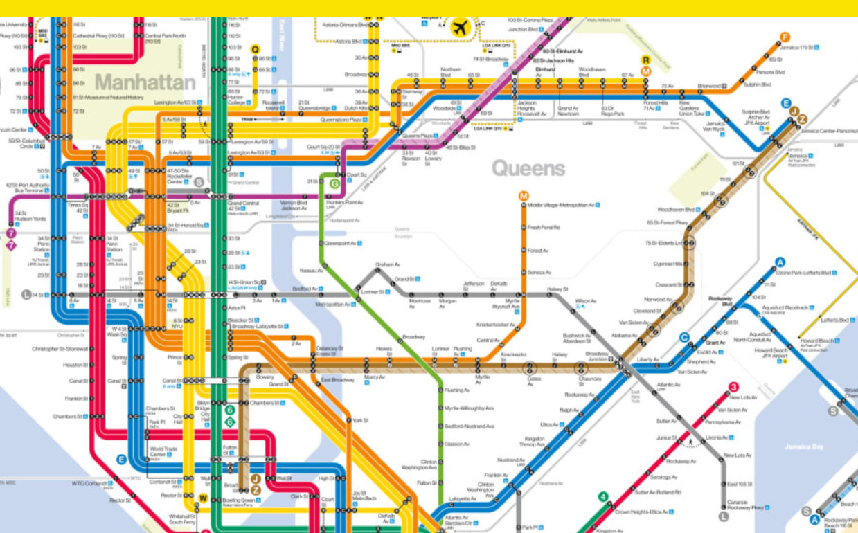
One of the most famous maps in the world just got redesigned.
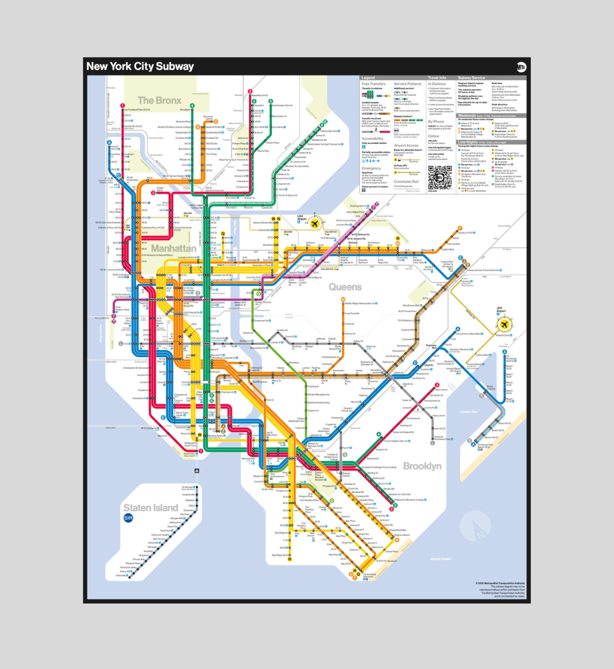
New York City’s Metropolitan Transportation Authority, or MTA, unveiled a new subway map last week for the first time in nearly 50 years. The new map is bolder and brighter than ever before, with thick, straight lines designed to be easy to follow and simple to navigate and an aesthetic that’s a throwback to a famous map introduced in 1972.
“The subway map is both an iconic symbol of New York and a tool that everyday riders and first-time users of our system use to get around,” New York City transit president Demetrius Crichlow said in a statement. “This modern redesign makes it easier to navigate the system — especially during service changes — and has a quintessential New York look that riders will appreciate for years to come.”
The new map was designed by the MTA’s Creative Services Mapping Department, which says that to make the map both more compliant with the Americans with Disabilities Act and easier for people with low vision or cognitive disabilities to read, it was designed with a white background, bold colors, horizontal writing, and black dots. Clarity is key. To make the map’s text more legible, it was kept on a single line as much as possible and given ample white space.
One thing that didn’t change was the basic color scheme of the individual subway lines. The N, R, and Q lines are still yellow, and the A, C, and E are still blue, but while MTA designers kept the official brand colors established in the iconic 1972 map designed by Massimo Vignelli, they also tweaked all the hues to new bright pop art shades. The new map takes inspiration from Vignelli’s map’s geometric, diagrammatic style.
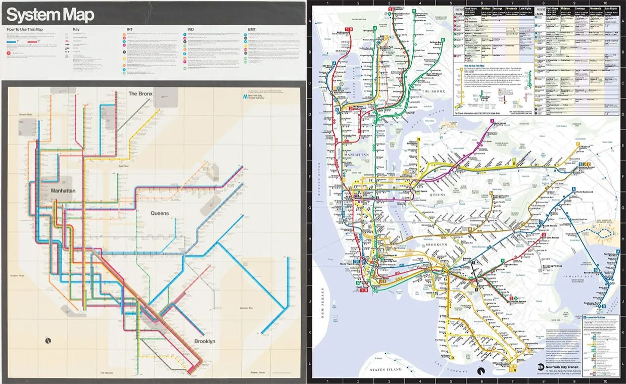
Vignelli’s map was designed for riders, not cartographers looking for a realistic geographic representation of New York. It distorted parts of the city for the sake of clarity. The most recent map, used from 1979 until this year, took a more realistic route and packed in station names even if it meant writing them out at an angle. It’s crowded.
In 2021, the MTA piloted a redesigned map inspired by Vignelli’s in a handful of stations and asked for feedback, and judging by the differences between the first public draft and the new final map four years later, it seems riders wanted a design that was bolder and brighter with more white space. It’s ultra minimalist while still being information heavy.
“The new MTA is focused on a quality, 21st century customer experience, and it’s about time our map caught up,” MTA Chair and CEO Janno Lieber said in a statement. “The new version is much easier to read while also reflecting all the enhancements we’ve made over the years.”
There are few works of civic design as well known or iconic as the MTA’s map, and by improving it, the agency is visually communicating to the city and those who visit that it prioritizes riders’ needs and accessibility.
Despite facing negative perceptions in recent years, the agency’s approval has recently improved, with a 2024 rider survey finding an overall subway line satisfaction rate of 58%, up 4% from the previous year. The new map could help the MTA build upon that growth by making information more accessible and clear. And by following design with deeds and finding additional ways to serve riders’ concerns and needs, the MTA could continue to repair its relationship with the public and pull off a comeback possible only in New York.
Previously in Yello:

With “Hands Off,” the Resistance has found a useful new slogan
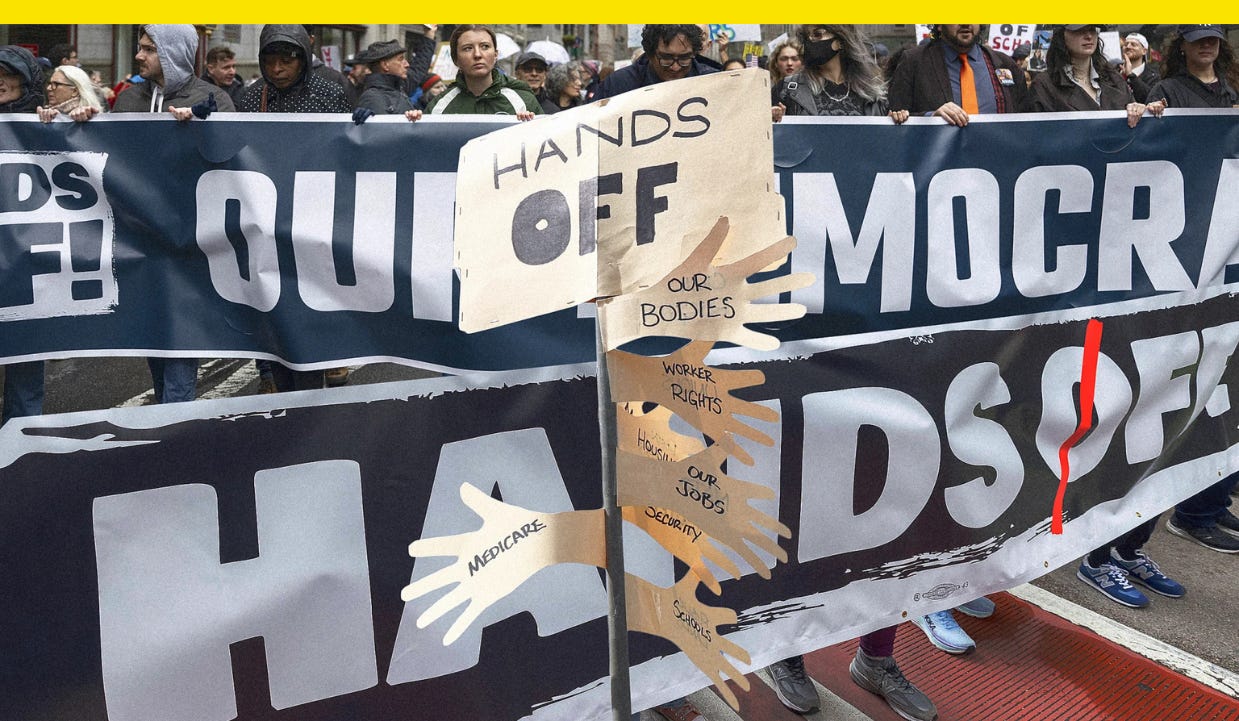
With Saturday’s Hands Off protests against President Donald Trump and billionaire Elon Musk, Resistance 2.0 has arrived with a handy new slogan.
Held at more than 1,300 locations in all 50 states and Washington, D.C., the protests were organized by a coalition of groups including the American Civil Liberties Union, Greenpeace, Human Rights Campaign, People for the American Way, Planned Parenthood, and others. Hundreds of thousands of people attended.
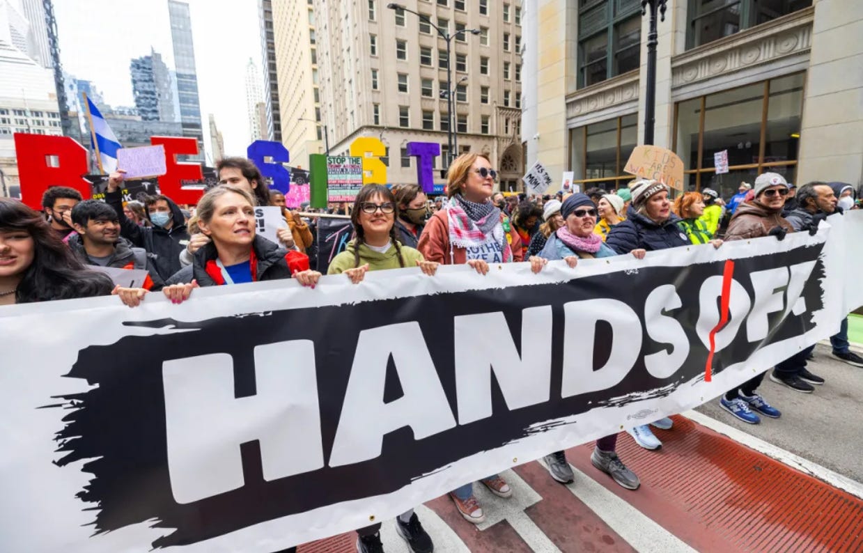
The “Hands Off” slogan lent itself to a simple but powerful image that gave protesters a ready-made framework for expressing their grievances against the current administration: posters bearing all-caps lettering reading “Hands Off!” with a red line dashed through the “O” for emphasis. Signs at protests across the U.S. read “Hands off our bodies,” “Hands off our schools,” “Hands off our Social Security,” and “Hands off our free speech.” It was both the name of the protests and the rhetorical scaffolding that protesters could make their own.
Unlike Trump’s first term, which was met by a massive Women’s March the day after his 2017 inauguration, Trump’s second term didn’t inspire an immediate protest movement. Musk’s slashing of government workers and agencies via the so-called Department of Government Efficiency, or DOGE, though, sparked organized protests at Tesla showrooms nationwide and provided a first look at the visual rhetoric of a new era of anti-Trump sentiment.
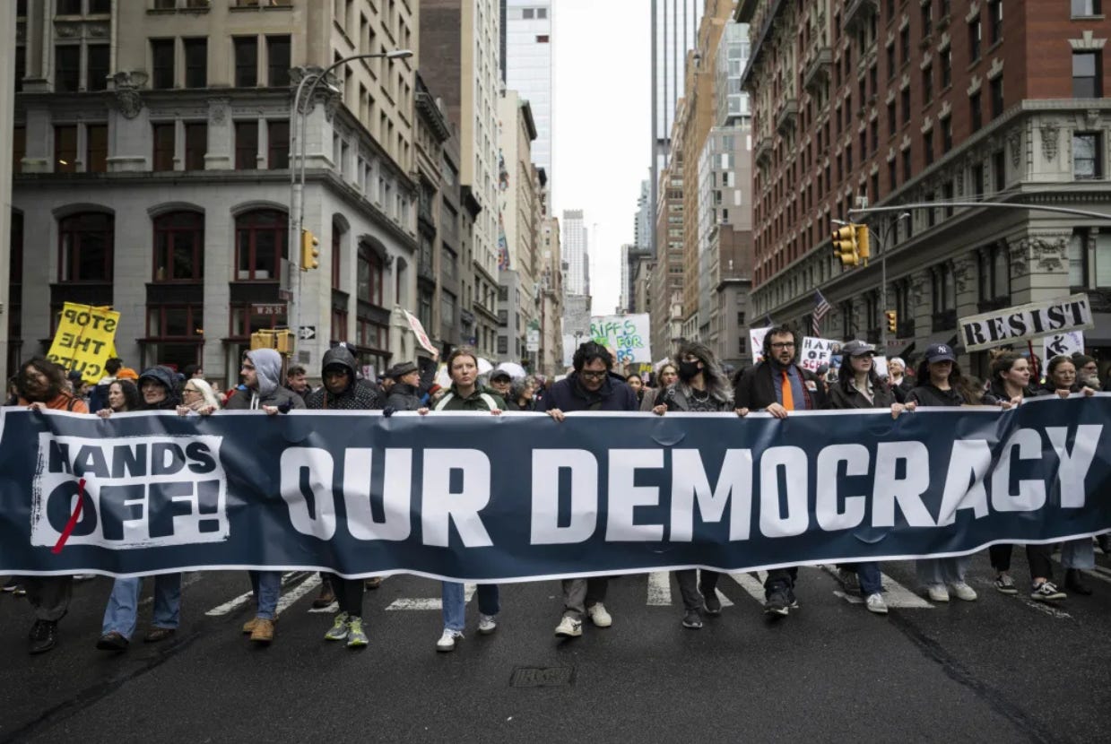
Many of the anti-Tesla protest signs featured pro-democracy messages and showed the image of Musk saluting at Trump’s inauguration with anti-fascist and anti-Nazi slogans. Those sorts of images and messages still appeared at Hands Off protests, but the unifying slogan streamlined the effort. These weren’t protests against an abstract threat of fascism, but against a current and ongoing expansion of executive authority.
The protests also came at an inflection point. Trump’s tariffs have sent markets into free fall and increased the possibility of a recession. Musk’s efforts, meanwhile, appear not only to be unpopular but also poison to his electric car company, which announced last week that sales were declining. All of this gave fuel to the first true protest of the Trump administration, at a time when Trump and Musk continue to push the bounds of their power.
Have you seen this?
Obama wants you. Former President Barack Obama photobombed a family photo in D.C. and said “the most important office in this democracy is the citizen.” [Whig]
Kentucky Gov. Andy Beshear has some advice for Dems on hammering Trump over tariffs. Beshear argued Democrats’ best recourse is to wage a public information campaign against Trump’s trade agenda, highlighting how the president was elected on a promise to lower costs but instead may make life more expensive for Americans. [Politico]
Two famous athletes battled over the number 8. A font helped them call a truce. Who gets to own a number? That’s the question at the heart of a dispute between football star Lamar Jackson and Dale Earnhardt Jr.’s NASCAR team. [Fast Company]

History of political design
Hagstrom Map Company New York City subway map (1947). This early map was more georealistic and included instructions for riders, like “Help keep the subways clean,” “Do not rush — Let ‘em off first,” “Move away from the doors,” and “Always be courteous.” Click through to see other NYC subway maps through the years.

A portion of this newsletter was first published in Fast Company.
Like what you see? Subscribe for more: