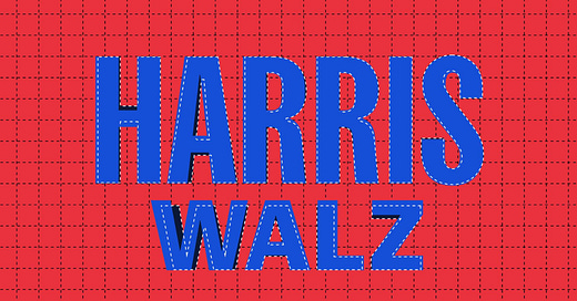
The Harris-Walz logo just got a haircut, but you can barely tell
Plus: Actually, celebrities do influence elections, this case study shows
Hello, in this issue we’ll look at…
The Harris-Walz logo just got a haircut, but you can barely tell
How the Harris campaign is playing editor with news articles as ads
Actually, celebrities do influence elections, this case study shows
Scroll to the end to see: some of the graphic design that welcomed Democrats to Chicago for an earlier convention there 🫏
The Harris-Walz logo just got a haircut, but you can barely tell
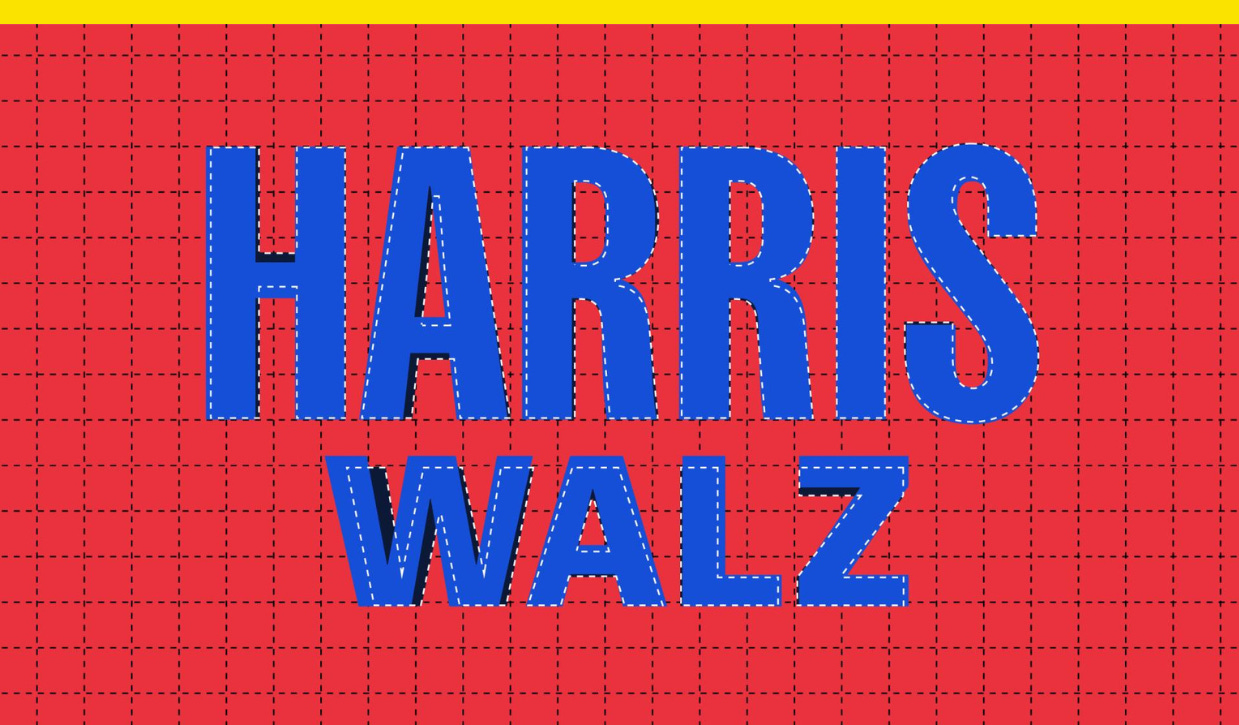
The new logo for Vice President Kamala Harris’s campaign was ever so slightly redesigned this past weekend. Voters are unlikely to tell the difference, but design nerds will be happier.
The crossbar in the H in “Harris” has been centered, and the legs in the Rs were reshaped, while “Walz” got a little taller. Type designer Jonathan Hoefler, who wasn’t involved in the redesign but shared an image on Threads showing an outline of the redesigned logo over the original, likened it to a “haircut.” It’s so subtle that most voters won’t notice.
That a presidential campaign logo would be tinkered with just a week after its debut speaks to both the breakneck speed of political design work and Harris’ unconventional path to the nomination. Unlike corporate design, which usually has the benefit of long-term planning and strategy, political design has extra-tight deadlines amid a super-short timeline since its expiration date is Election Day in November. For Harris’s design team, that timeline is even more compact than usual.
For something like a general election logo that adds in a vice presidential nominee, designers have to work within the constraints of the letterform of the running mate’s name. Candidates pick their VP nominee based on factors like the demographic groups or swing states they could help deliver, not how their surname might look in a logo.
Harris’ team worked with Wide Eye, the creative agency behind her 2020 campaign identity. The agency has also done work for the Biden-Harris administration and top Democrats. Neither Wide Eye nor the campaign’s creative team received advance notice of the running-mate selection, so they had to make variations of the logo for eight potential running mates whose last names vary greatly in length, the campaign tells me.
The Harris-Walz logo sets Harris in Fearless, an adapted and renamed version of Sans Plomb (which translates to “unleaded”), a sans-serif typeface from Lift Type that’s inspired by 1980s French roads and gas station signs; it’s a callback to the tall, condensed type of Harris’s 2020 campaign design. Walz is set in Balto, a versatile sans-serif Gothic font.
The logo’s facelift counters some of the early criticism toward its kerning, or the space between characters, and the difference in heights between the two names. The logo was also criticized by some for being boring, but the campaign tells me that simplicity was the goal. It was designed to be straightforward and easily adapted for different uses, like a camo hat, and took inspiration from vintage all-type campaign logos like that of Shirley Chisholm in 1972.
“Our visual research for presidential campaigns extended way back before Obama (the campaign-branding gold standard), looking at campaign brands that were really just type—back from a time when our politics was less about entertainment,” Ben Ostrower, the founder of Wide Eye who worked on creative direction for the logo, tells me. “We wanted to be self-conscious in creating an identity that didn’t feel unnecessarily showy or flamboyant like Trump. Just simple, identifiable from far away—strong and to the point.”
Ostrower worked on the logo with type designer and Balto creator Tal Leming, as well as Elizabeth Bawol, Alayna Citrin, Grace Abe, and Sebastian Arredondo from Wide Eye.
The logo follows a temporary “Harris for President” logo used in the short window between Harris entering the race and announcing Walz as her running mate, and it’s unique among the past five Democratic nominees. From former President Barack Obama to former Secretary of State Hillary Clinton and President Joe Biden, Democratic campaigns since 2008 have used logos that either turn a single letter into a logo, like the Obama O and Hillary H, or turn a single letter into a visual accent, as the red three-striped flag-styled E in Biden’s logo.
Hoefler, founder of type foundry Hoefler&Co., tells me that the Harris-Walz campaign identity “reflects a more evolved understanding that it’s typography, rather than simply a mark, that’s the most valuable currency of communication.” It’s an idea he said has been gaining momentum since the Obama campaign’s “organized and coherent commitment to one typeface, Gotham,” which he designed with Tobias Frere-Jones.
Hoefler wrote on social media that the new logo is an identity tied to the best of the Biden-Harris White House and rooted in the work Wide Eye did for Harris’s 2020 campaign. He noted that “few letters are harder to corral than W-A-L-Z,” which he said have “obstinate geometries and stubborn kerns.”
“I really think this is a great piece of work, especially given all the constraints of campaign typography and an existing rollout to reckon with,” Hoefler added, noting that the redesign makes “everything better while drawing very little attention to itself.”


