Hello, in this issue we’ll look at…
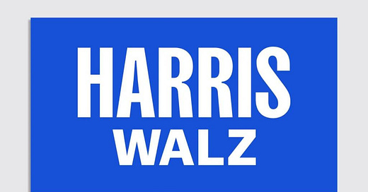
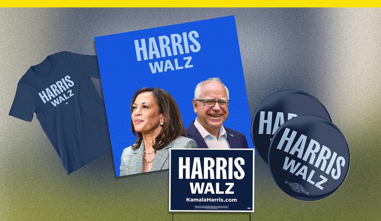
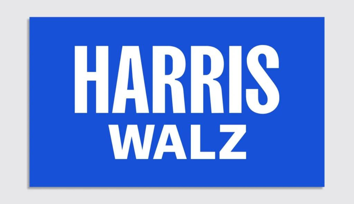
The Harris-Walz logo is here
Elon Musk’s super PAC is being investigated over this ad campaign
Climate visuals are changing and this ad shows how
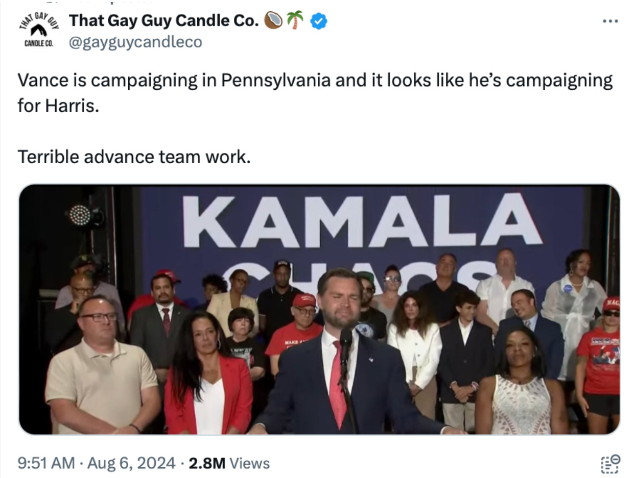
Scroll to the end to see: some really confusing campaign advance work 😕
The Harris-Walz logo is here
Before Vice President Kamala Harris announced on social media that Minnesota Gov. Tim Walz would be her running mate, her campaign had already updated its website with a new Harris-Walz logo. It’s a logo without any bells, whistles, stars, or stripes. Simple and minimalist, it comes in simple color palettes like black-on-white and white-on-blue. Some online commenters found the logo boring, but the new Harris-Walz branding shows how the VP is putting her own stamp on the campaign she inherited.
Harris’ longtime supporters might recognize the change as a reference to her first presidential campaign. When Harris ran for president during the 2020 campaign, she used a “Kamala Harris for the People” identity designed by the creative agency Wide Eye. With tall sans-serif type and a nontraditional color palette of purple, yellow, and orange, the branding was an intentional homage to Shirley Chisholm, a Black U.S. congresswoman from New York who became the first woman to run for a major party presidential nomination in 1972.
Chisholm’s campaign used all-caps logos and slogans, including “Unbossed and Unbought,”as she ran for the chance to represent Democrats and face off against then-President Richard Nixon. During Harris’s 2020 Democratic primary campaign, she drew on Chisholm’s branding with all-caps slogans of her own, such as, “Tough. Principled. Fearless.”
When Harris joined Biden’s campaign as his running mate in 2020, she assumed his patriotic branding. She maintained that visual language as she set out on her own presidential campaign two weeks ago, as her team quickly turned around a major rebrand in a matter of hours. The first “Harris for President” branding language was largely used as a way to communicate a sense of continuity in the sudden handoff from Biden to Harris.
The new Harris-Walz logo, on the other hand, visually communicates a fresh start. Though it doesn’t use the exact fonts from Harris’ 2020 logo, the tall lettering is a callback to her earlier campaign as well as a nod to Chisholm’s historic run. (The Harris campaign website calls the new logo fonts “Fearless Bold” and “Fearless Medium.”). I did not receive responses from the Harris campaign by the time of publishing.
Whereas “Kamala Harris for the People” was loud and bright, critics have compared the “Harris-Walz” logo to something you might see for a law firm or real estate agency. Counterintuitively, the new logo communicates the potential for the first female president in the most boring way possible.
It’s a simple logo that comes as Harris makes a safe-but-strong pick for running mate. In her announcement, Harris played up Walz’ credentials working across the aisle with Republicans to pass investments in infrastructure, and his record on issues that play to Democrats’ strengths, like abortion rights and gun-violence prevention. It’s a résumé that has the potential to play to both sides, with an under-branded logo that still manages to hint at the historic nature of Harris’ candidacy.
A message from Yello Media:
Politics in the front, pop culture in the back
Subscribe to my new free weekly newsletter Whig about politics and pop culture:
Elon Musk’s super PAC is being investigated over this ad campaign
Elections officials in two states have opened an investigation into America PAC, a political action committee created by X owner Elon Musk, following complaints that instead of registering people to vote as promised, it’s collecting their personal data.
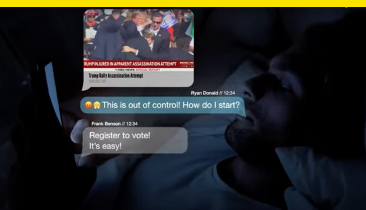
The PAC’s ad “Trump” shows a man in bed, his face lit by the glow of a smartphone, as he has a text conversation about the assassination attempt against Trump. “This is out of control! How do I start?” asks one man in the convo after his friend sends a video of the shooting. “Register to vote! It’s easy!” the friend responds.
The ad’s call to action is to register to vote by visiting the PAC’s site, but depending on what state you live in, the group directed users down two different paths.
Users with zip codes in states not expected to be competitive this fall were taken to a legitimate voter registration page for their state while those with zip codes in battleground states were not. Instead, these swing state voters were asked to enter their address, cell phone number, age, and personal information, without being directed to a legitimate voter registration site according to CNBC.
Now, the North Carolina Board of Elections and Michigan Secretary of State’s office are investigating, and the PAC’s site has since been redesigned and no longer includes links to register to vote. “Every citizen should know exactly how their personal information is being used by PACs, especially if an entity is claiming it will help people register to vote in Michigan or any other state,” a Michigan secretary of state’s office spokeswoman told CNBC.
The America PAC has spent more than $21 million on digital media, text message services, phone calls, and canvassing since June, Federal Election Commission filings show.
Climate visuals are changing and this ad shows how
For years, advocacy groups have depicted the effects of climate change with imagery of polar bears and melting icebergs.
Science Moms, a nonpartisan climate advocacy group, is trying a different approach. Instead of spotlighting animals thousands of miles away, the group asks viewers to consider the ways global warming might impact—or already be impacting—their immediate experience with the natural world. The ad emphasizes how a person’s favorite natural spaces to visit again and again, like campsites, trails, and beaches, could very well disappear for good.
The 60-second ad, “Climate change is taking the places we love,” opens with footage of family vacations in the woods and at the beach. “If you knew this was your last trip to your favorite family camp spot before it went away, how would you spend it?” the narrator asks. The ad then runs footage of hurricanes and wildfires paired with audio from news reports. The closing message is a call to action: “Stop unnatural disasters.”
It’s part of a new $2.5 million campaign from the group, which was founded in 2021 by climate researchers and scientists from the Nature Conservancy, the University of Arizona, Colorado State University, Columbia University, the National Center for Atmospheric Research, and elsewhere. The ad will air until September 30 in the swing states of Arizona, Georgia, Michigan, North Carolina, Pennsylvania, and Wisconsin, according to E&E News, an environmental news outlet owned by Politico.
Climate disasters are becoming more commonplace—and costly. In 2023, there were 28 weather- and/or climate-related events across the U.S. that each caused upwards of $1 billion in damage, the highest number since the National Oceanic and Atmospheric Administration began its tracking. There were some 55,500 wildfires (including the devastating firestorm on Maui last August) and three hurricanes that made landfall. Natural disasters in the U.S. are hitting coastal areas and areas prone to wildfires and drought especially hard.
The ad is part of a larger movement to tell new stories about a warming planet by showing the direct impact of climate change on people’s everyday lives, shifting from a far-away idea to a tangible issue for millions of us.
That approach squares with current studies around climate change communications. Best practice today is to show real people, as well as local and emotionally powerful impacts, according to climate photography resource Climate Visuals. (British climate change charity Climate Outreach runs the library.) Adobe suggests something similar. In a 2021 blog post, the design software company said good environmental photography should be local, capture the moment, and tell a story. Back in 2019 in an effort to convey “the scale of the impact,” The Guardian announced it would use fewer images of polar bears and more images that show “the direct impact of environmental issues on people’s daily lives.”
Science Mom’s message is that extreme weather events that affect you and your family are getting worse due to the link between extreme weather and the burning of fossil fuels. “What we’re seeing today is unnatural, and it’s putting the people and places we love in danger,” the group says on its website, which has links to sign up for its mailing list, to find a local group near you, or to learn more about climate change.
Images from the Arctic might suggest climate change is only something happening far away, but by bringing to mind family vacation spots, climate communicators can center the issue much closer to home. And by using the term unnatural disasters, Science Moms makes the argument that not only are extreme weather events not normal but also that there’s still a chance to turn the tide.
Have you seen this?
What Harris and Trump’s branding choices reveal about the 2024 election. The visual rhetoric coming out of the Trump and Harris campaigns shows it’s a brand-new race. [Fast Company]
Trump says Elon Musk will interview him Monday. “ON MONDAY NIGHT I’LL BE DOING A MAJOR INTERVIEW WITH ELON MUSK — Details to follow!” Trump wrote in a social media post. [NBC News]
Democrats are running newspaper ads in Trump's rally locations calling for debate commitment. The Democratic National Committee on Friday launched a new strategy to needle Trump over not committing to debating Vice President Kamala Harris in The Atlanta Journal-Constitution, The Arizona Republic, and other papers. [ABC News]
AIPAC used distorted photo of Cori Bush in $7 million negative ad blitz. Its recent mailers show images of Bush, who lost her Tuesday primary, with distorted features that make her forehead look bigger and elongate her features. [The Intercept]
J.D. for Kamala?? The background at Sen. J.D. Vance’s campaign event in Philadelphia this week at one point read “Kamala Chaos,” but you can only clearly read “Kamala.”
Want to build an Olympic brand? There’s an official how-to guide. The International Olympic Committee says its brand guidelines are “intended to help bring the Olympic brand to life – a visual identity inspired by our heritage and driven by our vision of building a better world through sport.” [Yello]
History of political design
Brought to you by Whig, my new newsletter about politics and pop culture. Subscribe here.
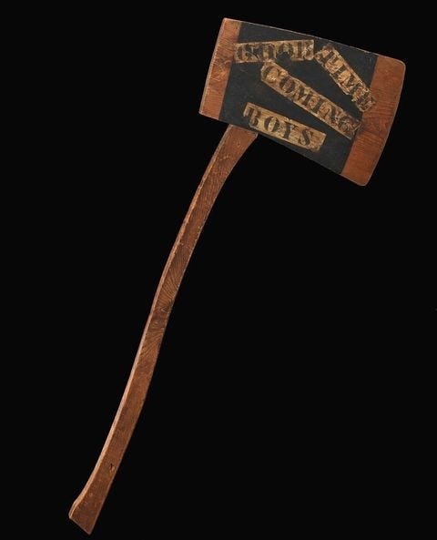
Lincoln parade axe (1860). Examples like this axe, a gift from Ralph E. Becker 101 years later in 1961 to the Smithsonian Museum of American History, was among the ephemera that helped reinforce Abraham Lincoln’s image as “the rail splitter.”
Portions of this newsletter were first published in Fast Company.
Like what you see? Subscribe for more:





This seems to be the font for HARRIS
https://www.lift-type.fr/shop/typography/sans-plomb/
Fearless sans 😅
I like the logo, but I think some effort could have gone into making the two different fonts more cohesive, for example, when it comes to the ink traps.