The hottest graphic design trends of the year include softened gradients and Y2K nostalgia, according to forecasts from companies like Adobe and Canva, but being on trend isn’t always what people are looking for.
Sometimes, the best graphic design is worse.
During the 2016 presidential campaign, Shannon Zenner, now an assistant professor of communications design at Elon University, saw a political ad that broke all the rules she learned working in advertising about what makes a “good” ad.
The ad was in support of then-candidate Donald Trump and put out by Great America, a political action committee. It started with a grainy, low-res image of men holding guns with red text on screen that was difficult to read warning about “an extreme ideology that wants to destroy America.” A voiceover asked viewers to call in to a 1-800 number with their opinion on how to stop ISIS.
“It repeats the phone number three times,” Zenner said. “That’s a 1970s, ‘80s local ad kind of thing.”
She wondered if this was how all the PAC’s ads looked, but after looking up other commercials put out by the group, she found they were well lit and professionally shot.
“This was incredibly intentional,” she said. “This isn’t a Hollywood ad.”
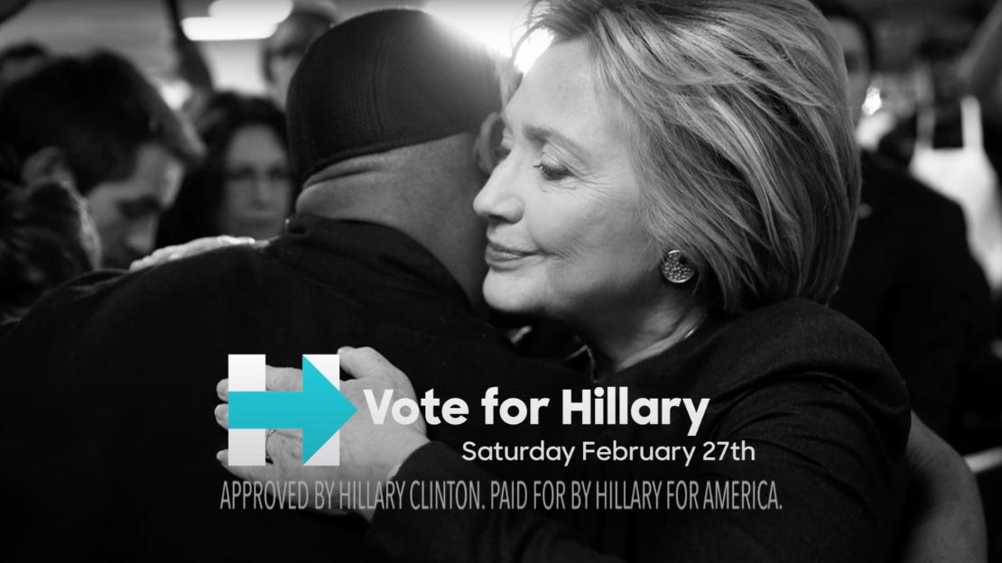
She compared the Great America PAC ad to Hillary Clinton’s 2016 “All The Good” ad, narrated by the voice of God himself, Morgan Freeman. Sure Clinton had one of the most recognizable voices in Hollywood, but Hollywood is the opposite of what some voters want.
Graphic design is my passion
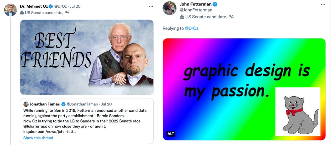
Bad design in politics can get you ratioed and dunked on, as Pennsylvania Republican U.S. Senate candidate and former television host Mehmet Oz lfearned when his Democratic opponent John Fetterman responded to a particularly bad Photoshop job of him with Sen. Bernie Sanders (I-Vt.). All it took was bad clip art and five words: graphic design is my passion.
Today, everyone’s a critic. Design has gone mainstream thanks to developments like home publishing software and in-app social media design tools, and former Pennsylvania steel town mayors can make jokes about graphic design on social media and know they’ll land.
But while the typical non-designer is more aware today of what makes design look contemporary and on-trend, “good” and “bad” is subjective, and in politics it’s more important to ask whether or not it’s effective.
“Bad design to me is a piece that is badly laid out,” said Brett Feinstein, a semi-retired political consultant who worked in Virginia Republican politics.
Like what you see?
Subscribe for more:
“It’s not about your aesthetic,” Feinstein said. “You’re not designing for yourself and you’re not even designing to please the clients. You’re designing for an audience that has a high barrier to cut through.”
For him, designing was about getting voters’ attention and making it easily readable, knowing that mailers he designed, for example, were likely going in the trash seven seconds after a voter got it.
“I had to make sure I lowered the barriers to reading it,” he said. “Keep it simple.”
Ugly design is purposeful, he said, like laying out a problem or showing your opponent with an ugly look and offering a solution or your candidate in a positive look.

“If I’m talking about my opponent in a negative way, I don’t want a happy glow,” he said. “Why am I going to give them a glamor treatment?”
Designing for politics involves producing a high volume of work in a short period of time, another factor in how political deliverables are created.
“When you see the really beautifully designed political mail, it indicates two things: it’s early in the cycle when it’s not that busy, or the firm’s not busy because they have the time to do it,” he said.
Some voters prefer “bad” graphic design
After spotting to low-res pro-Trump ad, Zenner, the assistant professor, studied preference for low-quality design for a study that was published in 2019.
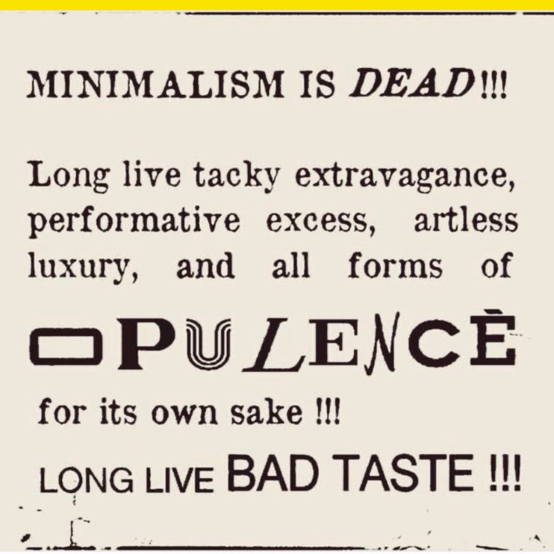
Her research showed two mock-ups for outdoor billboards for a fictional plumbing company to about 1,000 respondents. One billboard was clean and simple, designed to be read while driving, and the other was designed to look amateur, forgoing negative space to include an overabundance of information, all caps text, exclamation points, and multiple fonts.
Over a third preferred the low-quality design.
There was a correlation between older respondents and the low-quality ad, which Zenner thought might have to do with nostalgia. She also likened the authentic appeal of “bad” design to restaurants. “We think a restaurant is more authentic if it’s kind of a divey,” she said.
While some voters might be moved by design that looks modern and communicates progress, not all voters see that as authentic. It was one of the defining features of Trump’s campaign aesthetic, from its inconsistent signage and mismatched lettering on the MAGA hat to the look of its loud, garish small-dollar fundraising apparatus.
Trump the candidate wasn’t ~politically correct~, and his visual branding didn’t strictly adhere to a brand guide. While the Trump look may mark a new longer-term trend in U.S. political design towards something louder and more amateur looking, post-Trump voters might be looking for more dependable candidates with more disciplined visual branding.
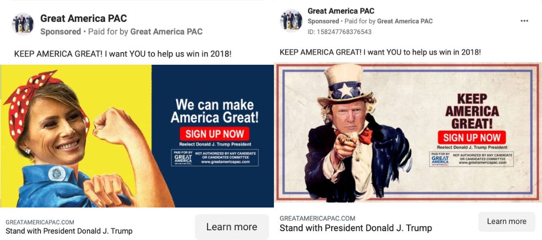
Great America PAC said it aired more than 20,000 television ads and sent 2.5 million mailers in 2016 in support of Trump, and a mix of visual styles helped ensure their work spoke to a wide swath of voters.
While the PAC still operates today, financial records compiled by the Center for Public Integrity show it’s no longer the force it once was and its founder, Amy Kremer, has moved on. She promoted the false claim Trump won the 2020 election, helped organize the Jan. 6, 2021 rally at the Ellipse, and started a new group called Women for America First. On Facebook, the group posts its own branded pink-and-blue graphics, and it’s reshared invitations from outside groups to events like a march against masks and a Trump birthday bash.
They’re ugly as sin, but does it matter? Effective political design might not win awards, but if it gets voters to act, it’s working.
“I always say good design has to be what works, but also what appeals to that audience that you’re speaking to,” Zenner said. “That ad might be ‘ugly’ for us as designers, but if it’s really functional, then maybe it’s actually really ‘good.’”


