


Is it just me or do the new Postal Service stamps look Republican?
Plus: This black star is a new symbol Europeans are using to make it easier to boycott American goods

Hello, in this issue we’ll look at the traditional slate of new USPS stamp designs and the limits of aesthetics to communicate politics, and how a major grocery store operator in Europe is making it easier for shoppers to buy European in the face of Trump’s tariffs and threat to take over Greenland.
Scroll to the end to see: a new billboard mocking Trump as Elon’s puppet🪆
Is it just me or do the new Postal Service stamps look Republican?
The viral “Republican makeup” meme now popular online pokes fun at female conservative self presentation. The joke is that heavy, mismatched foundation and overfilled eyebrows are a giveaway to a women’s conservative politics, and it speaks to a larger idea that aesthetics can communicate partisanship. If makeup can signal one’s politics, what about postage stamp design?
Generally, more traditional design is seen as conservative and more modern design as liberal. Of course there are exceptions, but a 2019 study on the perceived ideological leanings of typefaces found that respondents viewed serif fonts as more conservative and sans-serif fonts as more liberal. And when President Donald Trump returned to office in January, he signed an executive order on his first day back mandating classical federal architecture. “Federal public buildings should be visually identifiable as civic buildings and respect regional, traditional, and classical architectural heritage,” the E.O. read.
The U.S. Postal Service released its newest slate of postage stamp designs this month, and like bronzer applied to the face of a bottle blonde prepping for a hit on Fox News or our new federal architecture policy, the look of the new stamps seems to signal conservatism. A USPS spokesperson did not respond to an emailed question about whether these stamp designs were made during the current presidential administration, and the USPS noted in its press release the designs are preliminary and may change.
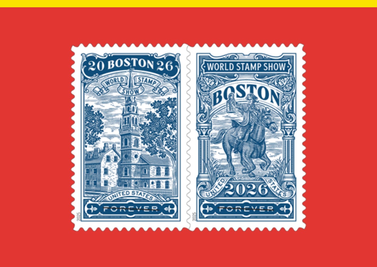
Ahead of the Boston 2026 World Expo, a convention for stamp collectors that falls on the 250th anniversary year of the United States, the USPS is putting out a pair of stamps for the occasion that celebrate Boston’s central role in the American Revolution. Designed by USPS art director Greg Breeding, the stamps use digital illustrations by North Carolina illustrator Dan Gretta of a “midnight rider” on horseback evoking Paul Revere, and the Old North Church, where lanterns were displayed — one if by land and two if by sea — to warn colonists the British were coming in 1775.
Gretta, who’s designed vintage-style packaging for cigar and whiskey brands, used the intaglio technique for his illustrations, which refers to the method of pressing paper into the incised lines of an engraved plate to create images that resemble the style of illustrations on currency. It’s intentionally old school, which makes sense considering the subject matter.
On their own, the Boston 2026 Stamp Show stamps don’t necessarily feel inherently Republican. After all, in celebrating America’s 250th anniversary, there’s likely to be plenty of traditional design. It’s when viewed along with the rest of the stamps that the USPS announced this month that it seems like there are possible trend lines.
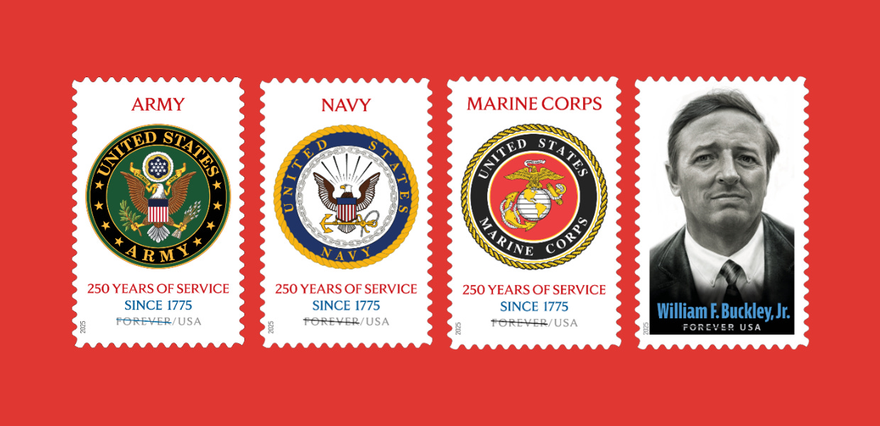
To mark the 250th anniversary of the first three U.S. military branches established by the Continental Congress — the Army, Navy, and Marine Corps — the USPS is releasing stamps for each branch designed with the branches’ more traditional seals as opposed to the contemporary logos they often use in their recruitment efforts. The sixth stamp announced in the new release is for the late William F. Buckley, Jr., the conservative journalist and author who founded the conservative magazine National Review and hosted the public affairs show “Firing Line” from 1966 to 1999.
With the federal government flagging content related to minority groups for deletion as part of its purge of diversity, equity, and inclusion, or DEI, it’s tempting to lump in these most recent stamp design decisions with other moves to remake the federal government’s visual output, but not so fast.
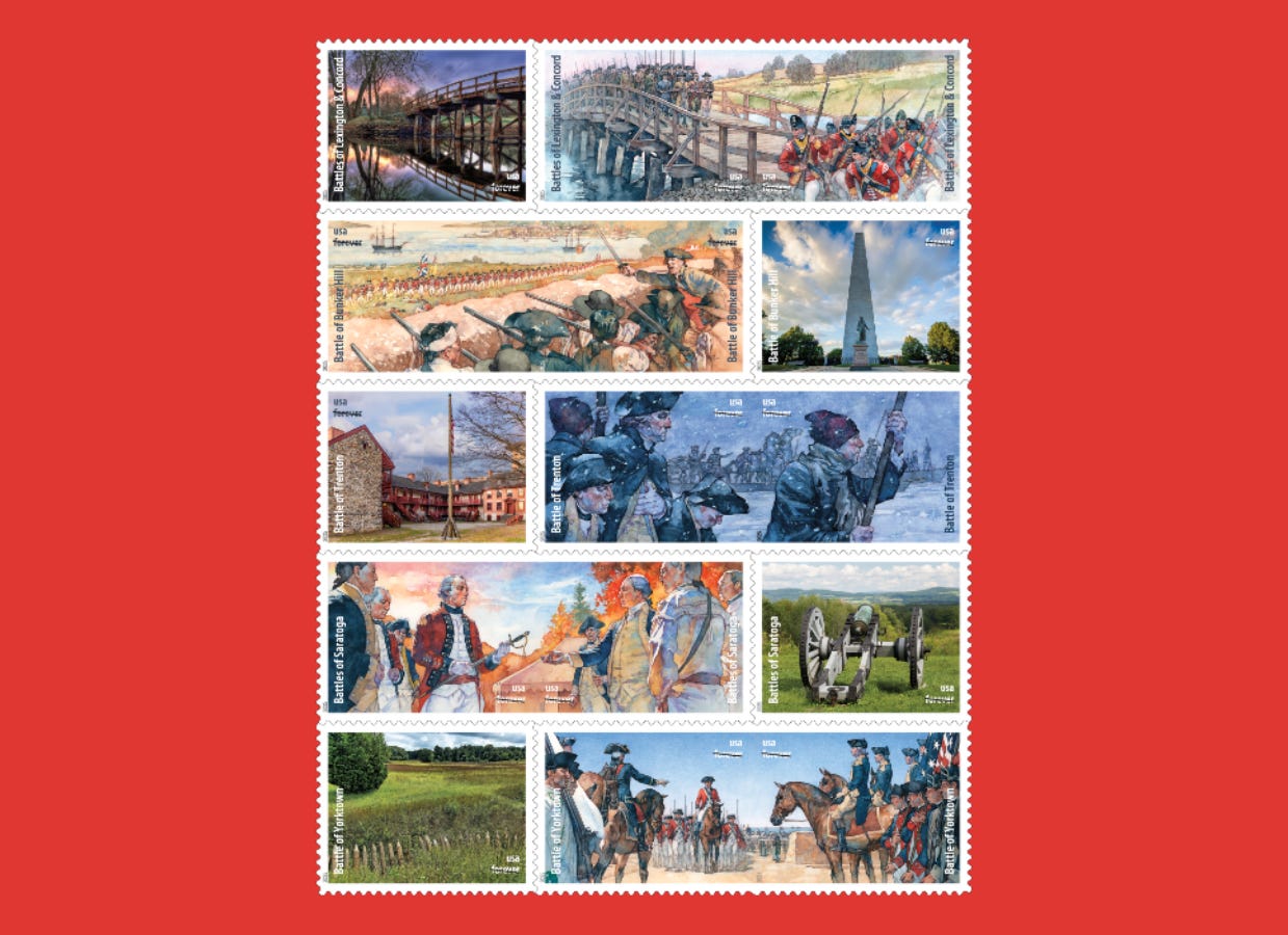
The lead time for postage stamp design is long, and for now, the USPS is still putting out stamps that celebrate the diversity of the multicultural democracy that is the United States. Stamp releases are scheduled next month for both “Battlefields of the American Revolution” (above) and “Powwows: Celebrating Native American Culture.” And the Buckley stamp isn’t just conservative DEI. This November would have been his 100th birthday, a fitting anniversary to mark with a stamp, and anyways, the National Review magazine he founded has been consistently critical of Trump. Buckley’s politics of principled conservatism stands in contrast to the modern-day Republican Party’s cult of personality around Trump for which the only organizing principle seems to be “Orange Man Good.” A MAGA stamp this is not.
Like judging a woman by her makeup or a book by its cover, there are limits to how much aesthetics can tell us about politics, particularly now in an era of evolving political orthodoxies. Today’s Republican Party isn’t the party of Buckley and neither is the Democratic Party static. Trump might not appreciate brutalist federal architecture, but has there ever been a automobile design as brutalist as the Cybertruck he brought to the White House grounds this week to hawk as a favor for first buddy Elon Musk? And in defending institutions, democracy, and the U.S.-led post-war world order, there’s an argument to make that today’s Democratic Party are the actual conservatives, the culture wars connotations of the word aside. What is standing up for the right to marry and paid family leave but family values?
In the end, stamps are symbols open to interpretation, like makeup, fonts, and architecture. The USPS’s latest slate of stamps may lean into tradition, but they’re also a reminder that tradition doesn’t belong to one party alone.
Previously in YELLO:

This black star is a new symbol Europeans are using to make it easier to boycott American goods
Denmark’s largest grocery store operator is introducing a new symbol to its electronic price tags to make it easier to shop local and avoid purchasing American goods. Starting this month, black stars will appear on price tags for European-produced groceries in stores across Denmark, Germany, and Poland run by the Salling Group.