


How the Harris campaign chose its fonts
Plus: These are the most common font pairings in design

Hello, in this issue we’ll look at the untold story of how former Vice President Kamala Harris’ campaign’s font book came together, and a study that looked at what fonts are paired together most often and why.
Scroll to the end to see: the logo designers were given in 2006 as a reference when creating a logo for a long-shot presidential candidate named Barack Obama ☀️
How the Harris campaign chose its fonts
Former Vice President Kamala Harris’ 2024 campaign brand identity put typography at its center, and it was a decision made in large part out of necessity. Lasting just 107 days, there was time for little else, but the short-lived brand still holds lessons for campaigns going forward about the power of type to communicate.
“Our brand identity was, of course, very much built upon strong typography. That was purposefully done,” Shar Biggers, the Harris for President deputy creative director, head of design, tells me. “There was not time to create an iconic-style symbol for a logo.”
After former President Joe Biden dropped out of the race, Biggers’ team designed 48 logos in four hours to create a temporary “Harris for President” logo the former vice president used until announcing her running mate. They then worked with the creative agency Wide Eye over the course of just five days to create a visual identity to be used for the remainder of the campaign.
Wide Eye founder Ben Ostrower tells me they “knew that it was going to be essential that we operate in a red, white, and blue color palette,” which was “not actually something that we, left to our own devices, would have done, but it was very clear that given the short runway of the campaign and the vice president’s progression in the public eye, we needed to lean into that very sort of patriotic red, white, and blue palette, very traditional presidential color palette.”
That made their font choices all the more important. “We knew whatever expression we were going to bring into the campaign was probably going to have to come through type,” he says.
They were drawn to tall, grotesque typefaces, like those Harris used in her 2020 campaign, which Wide Eye also designed for, and they worked with about half a dozen fonts that fit that description. The favorite was Sans Plomb, designed by the type foundry Lift Type and inspired by the condensed characters found on 1980s French motorway signs and lettering on house fronts.
There were, however, some eccentricities with the typeface that would need some slight editing. Lift Type customized the font for the campaign, including making oval punctuation square and adding additional weights to give the Harris team greater flexibility of use. The new version was christened “Fearless.”
Fearless was the campaign’s main typeface, but it was supported by two others, an elegant serif called Denton by Peregrin Studio for more ceremonial, traditional use cases, and a trustworthy, welcoming serif called Balto by Type Supply. They were chosen because they looked good separate from Fearless and could be used for longer form statements without a lot of decorative flourish. Different fonts for different purposes.
“We explored the fusion of all those typefaces, how they work and balance together,” Ostrower says. “We had it in the brand guide, in contrast to Balto and Denton, that we really only wanted them to use Fearless for four, five, six words max at a time, so really short and to-the-point statements that catch your eye and are inspiring.”
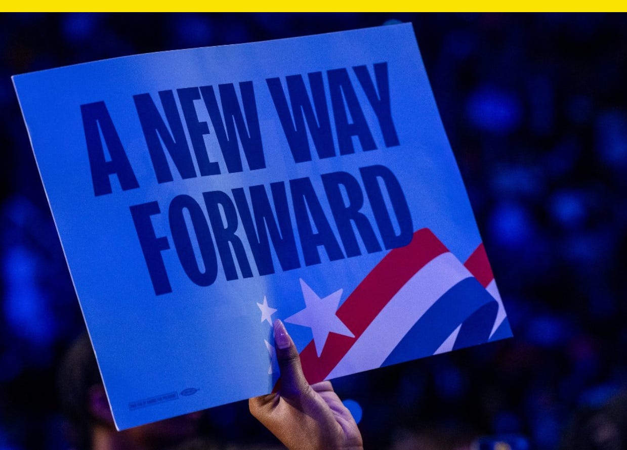
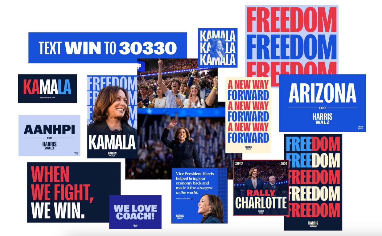
When We Fight, We Win. A New Way Forward. Freedom.
“I liked the radical, minimalist approach of this campaign. The fact that it dared to propose a more typographic approach,” Lift Type founder Romain Oudin tells me. “The logo, which might have been seen as simple, was in the end just one element in an overall visual system.”
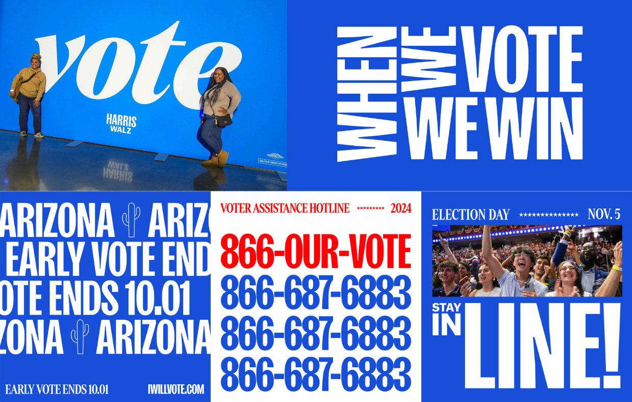
Freedom “was strong,” Biggers, the campaign’s deputy creative director and founder of the brand and design agency Saleah, says. “It was a characteristic we wanted to come across when people saw Kamala,” but Denton “did something that Fearless just didn’t do.” A popular lowercase “vote” graphic written in Denton was a favorite photo op for supporters.
“We didn’t want it to feel like we were yelling at you,” she says of the graphic. “People really loved that because it felt so warm.”
The Harris campaign branding became stronger over the course of the truncated campaign as Biggers and her design team got more language to use it with.
“One of the challenges we ran into is we loved having the typography-based brand, we absolutely loved it, but the struggle was we also didn’t have language,” Biggers says of the early days of the Harris campaign. “At that point, ‘A New Way Forward’ was not there. We had nothing.”
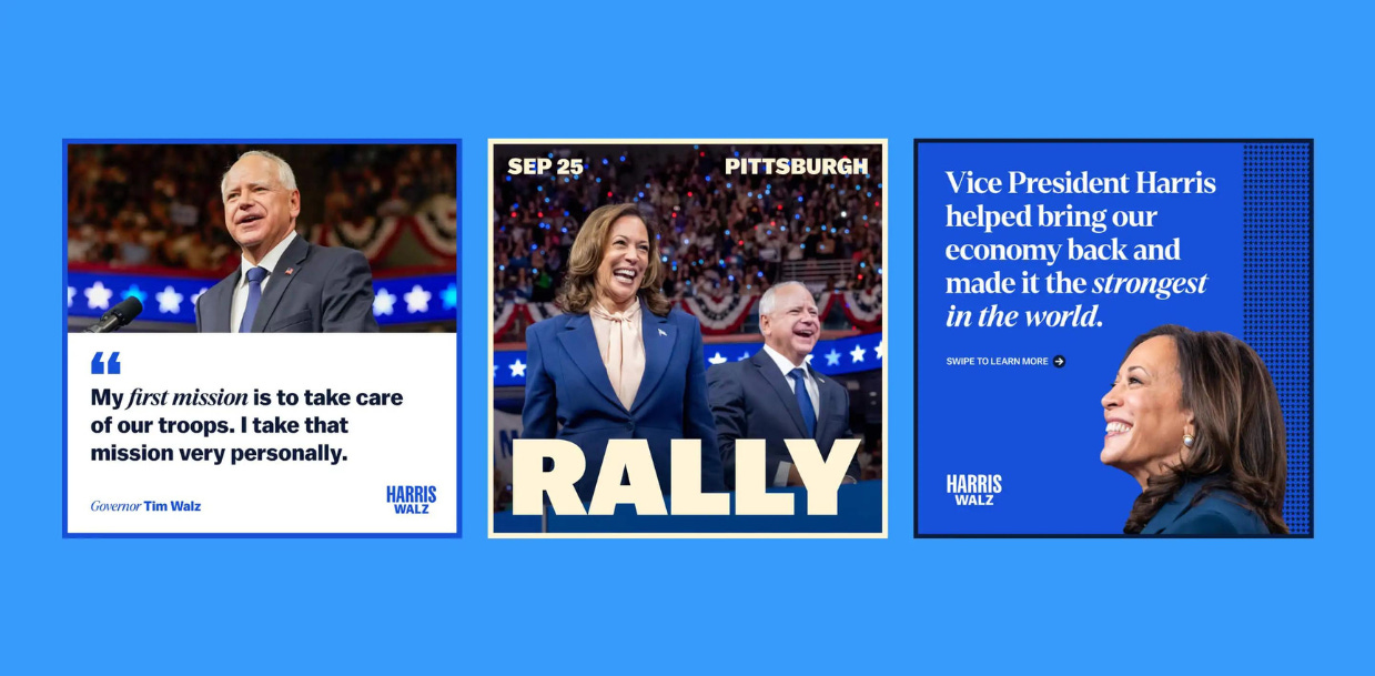
By Election Day, her team had more slogans and language to work with and in the end they designed three planes, four buses, two food trucks, more than a dozen state-specific and coalition sub-brands, hundreds of social graphics and digital ads, and nearly 1,000 placards in 13 languages.
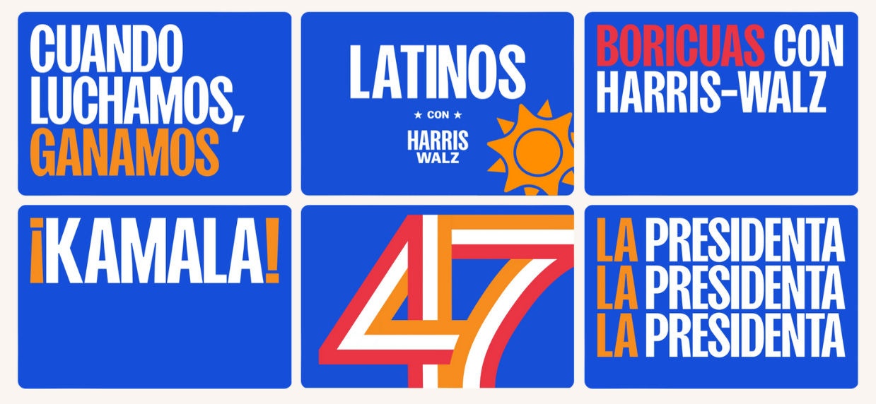
“I think we had the most fun when we got to the end of it because we were able to really loosen up a bit in a way I don’t think politics has ever seen before,” Biggers says, pointing to designs like a stacked, sideways “When We Vote, We Win” graphic. “It was pretty different.”
Political design trends tend to follow winners. The single-letter logos former President Barack Obama’s campaign popularized fell out of fashion after former Secretary of State Hillary Clinton used one of her own and lost. Meanwhile, President Donald Trump’s campaign’s MAGA Box has only grown more popular. But those eager to dismiss the Harris campaign’s type-forward strategy might do well to remember that after just 107 days, it was still just getting started.
Ostrower, the Wide Eye founder, compared typefaces to paint colors and said selecting them when designing a brand is “probably the biggest decision we’ll make.”
“So much of what a campaign is is communicating words and ideas and policies and concepts and the typefaces you select are going to impact the perception of all those things significantly,” he says.
Finding fonts that authentically reflect the candidate and her or his voice, then, should be a top priority.
Previously in YELLO:

These are the most common font pairings in design
Science just vindicated your font choices.