How NASA's branding its future with two logos at once
Plus: Here's how they updated the Obama O logo for the 15th anniversary of Obama's 2008 win
Hello, in this issue we’ll look at…
What it looks like when NASA uses its “meatball” and “worm” logos together
Why NASA credits fashion and music with popularizing its logotype
What NASA looks for when approving a project with a musician
Scroll to the end to see: The 15th anniversary edition of the Obama O logo.
Welcome to YELLO, a newsletter about politics, art, branding, and design. Was this email forwarded to you? Subscribe here:
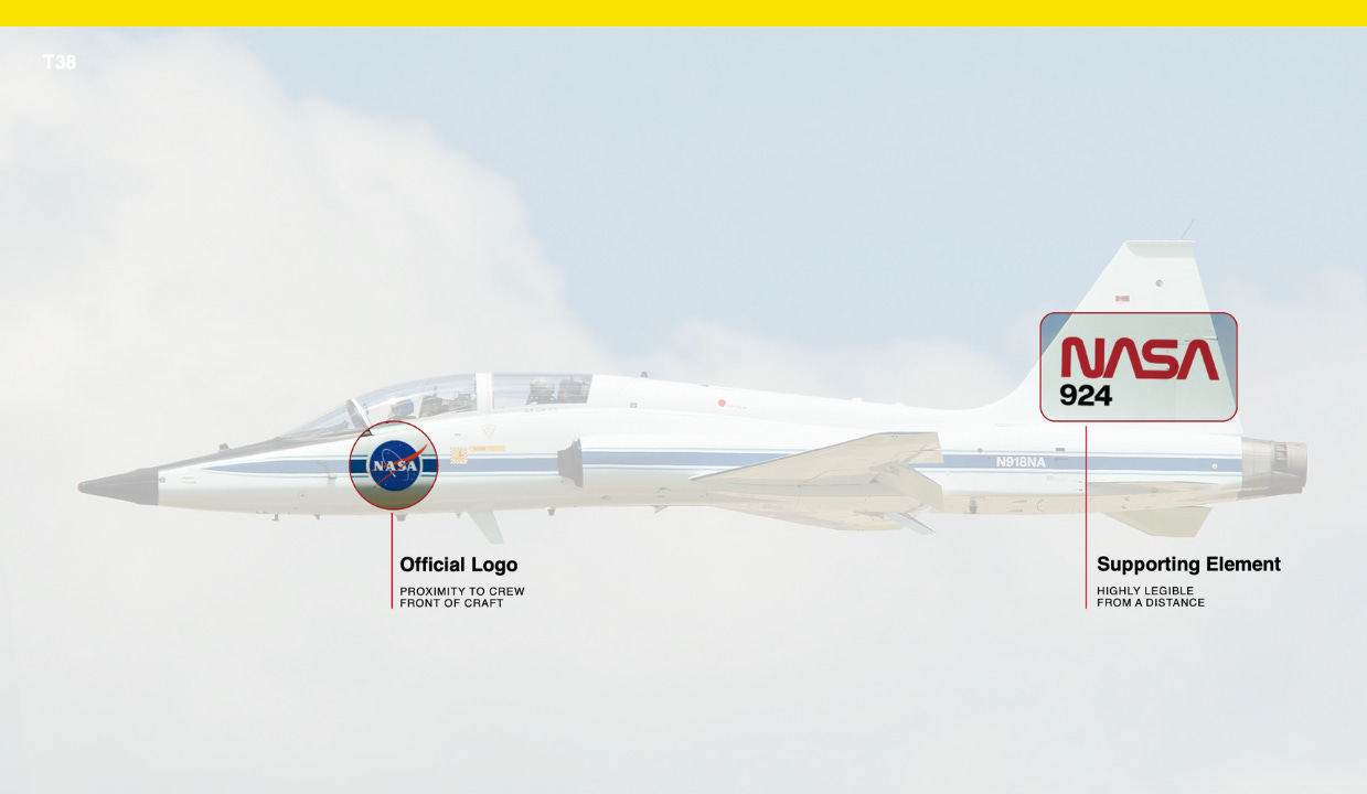
NASA’s “worm” and “meatball” logos have divided the agency in the past, but increasingly, they’re appearing together. As it embarks on its Artemis era, NASA’s been using two logos at once.
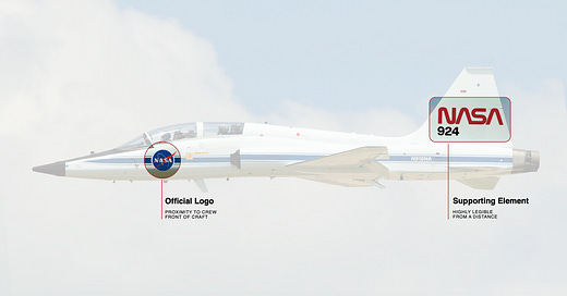
Technically, the meatball logo is the official logo, or the “NASA Insignia,” as it’s named in the agency’s online brand guide. The worm logo, which was NASA’s logo from 1975 to 1992, is the “NASA Logotype” and listed as a supporting element.
“Aesthetically, some might say they come from different planets,” NASA creative director David Rager said Monday during a panel at NASA headquarters in Washington, D.C., about the worm logo with its co-designer Richard Danne. “But we found with just the right balance they compliment each other fantastically.”
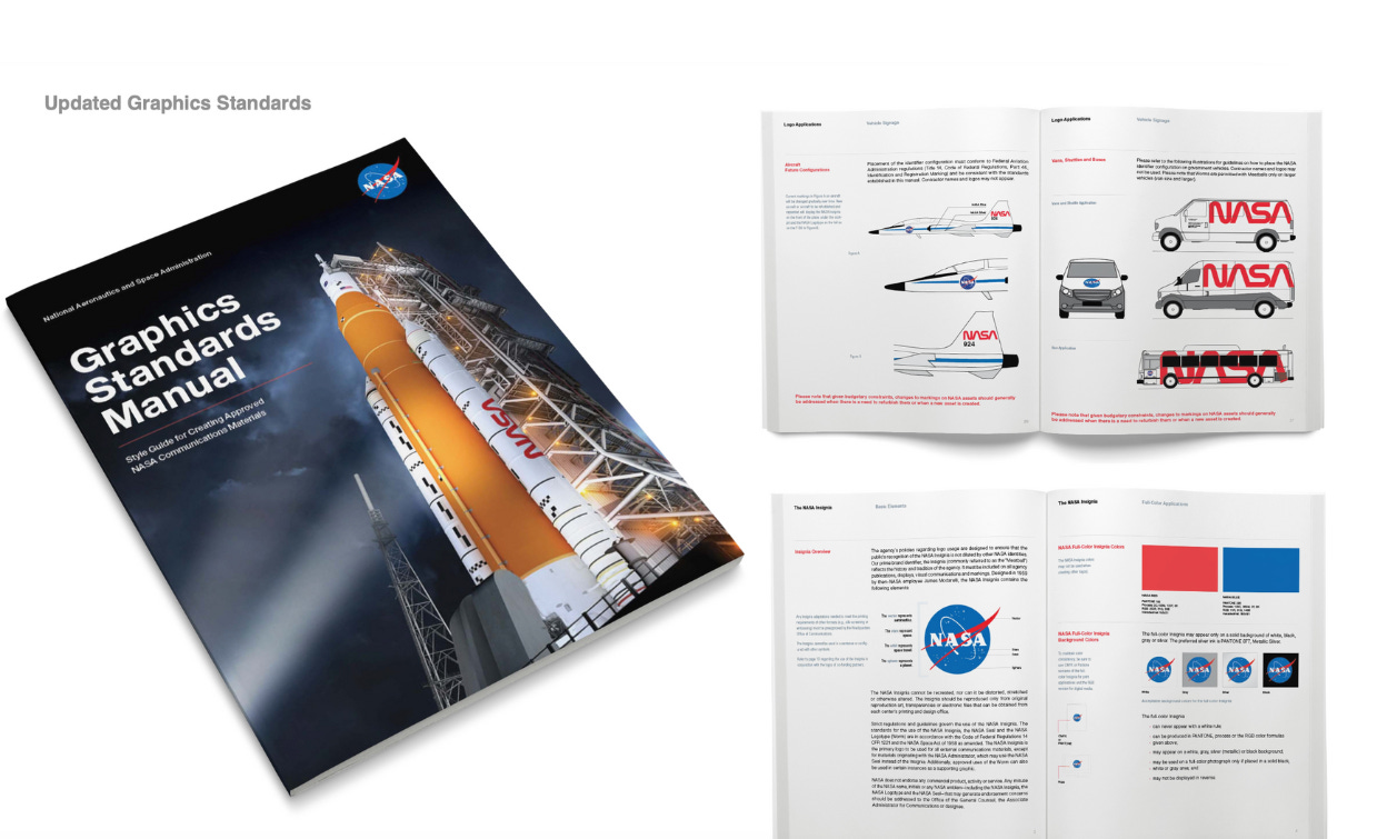
Rager was part of the team that brought the worm logo back in 2020, for the first manned spacecraft launch from the U.S. since 2011. “From there we looked to see how these two incredible logos could co-exist harmoniously,” Rager said. The agency has since updated its graphics standards manual, “and have been gradually implementing it over the past few years,” he said.

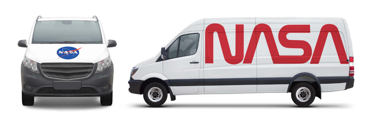
On NASA jets or vans, the two logos work together by rendering the more simple logotype across the jet tail or on the side of the van, big and easy to recognize from far away, while the insignia goes near the jet’s cockpit or the hood of the van. It’s perhaps a lesson for any organization or government agency juggling multiple visual identities: don’t toss out the vintage, heritage logo or seal, but for applications that could benefit from a simpler, more modern logo, let that logo do the talking.
“In my business, sometimes we’ll do some design and say this is great, you’ll be able to see it from a million miles away,” said Michael Bierut, a partner at Pentagram. “You don’t have to see many logos from a million miles away. You have to see this logo from a million miles away,” he said of the worm logo.
Bierut said he’s on the record calling the meatball logo “a terrible, terrible, terrible logo,” but he’s since revised his thinking because of what it represents, “the culture of esprit de corps, a group of people who are coming together to complete a mission,” he said, similar to military branches that also use insignia logos.
“That insignia represents an allegiance to you, your colleagues, and the mission you’re serving,” he said. On the other hand, the sleek, modern logotype is so simple a four-year-old can draw it. “If you’re talking about seizing the imagination of the next generation, the generation after that, that sort of capacity to inculcate them in the excitement and reduce it to a simple shape like that is just really thrilling,” he said of the worm logo.
The way Bert Ulrich, NASA’s entertainment and branding liaison, sees it, “both the worm and the meatball have a place.”
“I think there might have been a little bit of a mistake to completely eradicate one over the other,” he said.
When the worm logo was unceremoniously dropped in 1992, the agency’s then-administrator said “slowly it will die … never to be seen again” to employee applause. The design has since gained a cult following.
Why NASA credits fashion and music with popularizing its logotype
“Fashion houses started coming to us wanting to use the worm,” Ulrich said, recalling a time in 2017 when he had to ask NASA’s legal department about allowing Coach to use the worm logo “in a vintage way.”
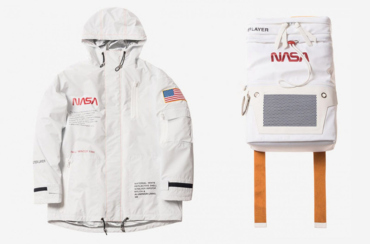
It appeared as a patch on a letterman jacket in Coach’s pre-fall season “Space” capsule collection, and the following year, designer Heron Preston Johnson released a line for NASA’s 60th anniversary on his eponymous label. Ulrich credited the designer with helping to put the worm logo back on the map, and it’s since popped up elsewhere.
“Balenciaga started using our logos,” he said. “Dior recently did something with us, but then at the same time, we’re at Wal-Marts, we’re at Targets. We don’t discriminate.”
NASA allows its logo to be used free of charge, but collaborators must get their designs approved and follow agency guidelines. That’s helped NASA branding proliferate pop culture, as has the agency’s embrace of high and street fashion, from working with the creative agency Oxcart Assembly for their Artemis I launch last year to announcing a partnership with Prada for Artemis III in 2025. Musicians are also eager to use NASA symbols.
What NASA looks for when approving a project with a musician
Julia Heiser, who manages artist merchandise at Amazon Music, said artists want to collaborate with NASA on a near-daily basis, but the agency is selective about how its logos are used.
“The logo should not just be put on a product that has nothing to do with what the music is about,” she said. “It’s not just to financially gain. If we start with what is the right song, music, title, track, tour that is leading to this — and then you have artists like Ariana Grande who literally writes a song called “NASA” — and then we look at the design and see how does it fit in with what we’re trying to accomplish so it doesn’t feel just hodge podge, slapped together.”
She said she looks at things like the meaning of the lyrics, whether they specifically reference space (Kid Cudi’s Man on the Moon albums) or are about “exploring something outside of us.”
“Oftentimes we’re just very mindful about following all the rules,” she said.
Danne, who co-designed the worm logo with the late Bruce Blackburn, said it’s been “rewarding” to see his work brought back and he credits its absence with its resurgent popularity.
“Through all of this, even when it was rescinded, it only got more popular,” Danne said. “Maybe when you take it away it gets more valuable. It seems that’s the way it happened.”
Have you seen this?
Meta bars political advertisers from using generative A.I. ads tools. Facebook owner Meta is barring political campaigns and advertisers in other regulated industries from using its new generative AI advertising products, a company spokesperson said on Monday. [Reuters]
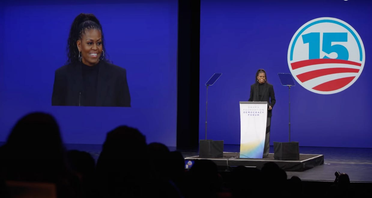
Here’s how they updated the Obama O logo for the 15th anniversary. Former President Barack Obama and former first lady Michelle Obama spoke last Friday at the Obama Foundation Democracy Forum in Chicago to celebrate the 15th anniversary of his 2008 victory, and backdrop showed a special “15” Obama O logo.
Archaeologists discover electoral campaign inscription inside Pompeii house. This is my Roman Empire. Archaeologists have unearthed an inscription encouraging voters to elect a specific candidate to political office. [Smithsonian Magazine]
🔒 YELLO subscriber exclusive:
History of political design
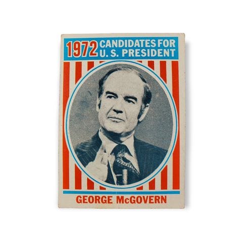
George McGovern trading card (1972). Topps released sets of cards in 1972 picturing U.S. presidents and presidential candidates.
Thanks for reading! ⭐📨
Like what you see? Subscribe for more:

