How candidates rebranded for 2024
Plus: The Harris campaign is so confident about her debate performance they keep cutting ads from her closing statement
Hello, in this issue we’ll look at…
How candidates rebranded for 2024
The Harris campaign is so confident about her debate performance they keep cutting ads from her closing statement
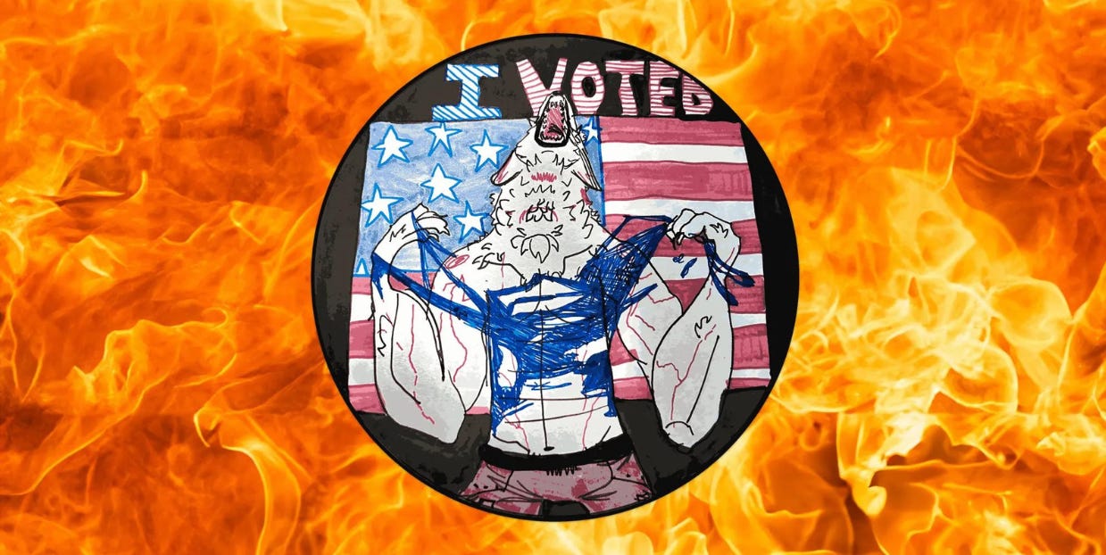
Scroll to the end to see: this year’s spookiest “I Voted” sticker 🐺
How candidates rebranded for 2024
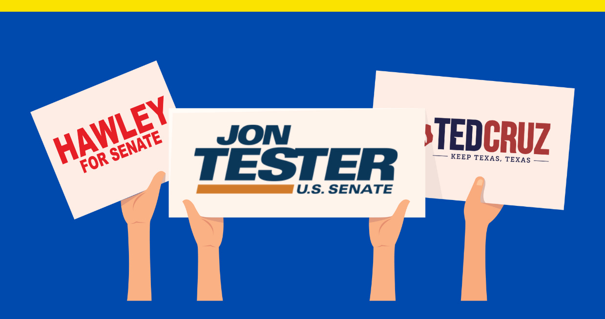
Last year I looked at some incumbents who had and hadn't rebranded for their reelection campaigns and primary fights (to see part 1, click here). There was a trend towards “borification” as campaigns simplified their logos, something that some candidates have continued into this year. Here are how five candidates updated their old logos for 2024:
Sen. Ted Cruz (R-Texas)
Sen. Ted Cruz (R-Texas) kept his 2018 campaign logo for his reelection, but he updated the tagline from “Tough as Texas” to “Keep Texas, Texas.” It’s a reminder that this year is Cruz’ first campaign since the COVID-19 pandemic triggered a flood of newcomers to the state (Texas grew by nearly half a million people last year, more than any other state). Don’t California my Texas means keep Texas Republican. The flame teardrop icon Cruz uses inside the Texas map appeared as a standalone design element during his 2016 presidential campaign.
Sen. Josh Hawley (R-Mo.)
At first glance, Sen. John Hawley’s (R-Mo.) 2024 logo seems like a simplification and downgrade so obvious I can’t help but wonder if the guy who wrote a book called Manhood thought graphic design was a little too ~dandy~ and asked for a logo that looked like it was made in Microsoft WordArt with absolutely no thought, the wearing basketball shorts in the middle of the winter and pretending you’re not cold of campaign logos, if you will. And maybe it is, but Hawley’s campaign is also selling a JFK-style poster with the font, suggesting that like designers for Vice President Kamala Harris, his team decided to drop the single-letter design element popular in campaign design in the late ‘00s and through the ‘10s that shows up in their old patriotic Hawley H logo for a new, simple wordmark that references history.
Sen. Amy Klobuchar (D-Minn.)
The logo for Sen. Amy Klobuchar (D-Minn.) stuck out during the 2020 presidential campaign for its hearty serif at a time when nearly every other campaign used sans serifs. The font’s called Mackay, and like Klobuchar’s fondness for photos with groups of beefy men, may it always be a part of the Klobuchar brand. Klobuchar also kept her long-running green-and-blue color palette. She uses green as a tribute to one of her political mentors, the late Sen. Paul Wellstone (D-Minn.)
Kari Lake
The former TV news host never did concede her 2022 loss for Arizona governor, but she has recycled the logo for her U.S. Senate run this year. The burgundy red color is a reference to the color of the state’s old license plate design, and the star separating her name appears on the state flag.
Sen. Jon Tester (D-Mont.)
No Democrat is more vulnerable this cycle than Montana’s Sen. Jon Tester. He won in 2018 by about 18,000 votes and brought back his logo six years later for what could be an even tougher race. His campaign has multiple lockups of its logo, including one that breaks out the farmhouse from the mountain landscape illustration into its own standalone icon.
The Harris campaign is so confident about her debate performance they keep cutting ads from her closing statement
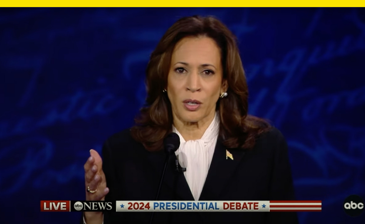
If it were up to the Harris campaign, I’d bet they’d love nothing more than to run last week’s debate in full on loop across TV and digital until Election Day. Since they can’t, they’re making ads from it instead.
In the 30-second “All Americans,” released Friday, Harris says “as a prosecutor I never asked a victim or a witness are you a Republican or a Democrat. The only thing I asked them: are you ok? And that’s the kind of president we need right now, someone who cares about you and is not putting themselves first.”
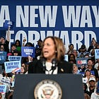
Other sound bites from Harris’ closing statement, about being “a president for all Americans” and about charting “a new way forward” are also included in the spot.
The campaign’s live focus group of undecided battleground voters found the lines tested as some of Harris’ strongest, the campaign told ABC News, which first reported the ad.
An earlier ad released last week titled “Leadership” includes Harris saying “there are two very different visions for the country, one that is focused on the future, one that is focused on the past,” and another 30-second spot released Saturday titled “Prosecutor” uses other lines from Harris’ closing statement. “I started my career as a prosecutor,” Harris says. “I've only had one client. The people.” To emphasize her point, the ad includes a clip of Trump saying at a rally earlier this year, “I don’t care about you, I just want your vote.”
The new ads show two things: 1. the Harris campaign feels good about their candidate’s debate performance and 2. they view her closing statement — that the election is a choice between two visions for America and only hers is forward- and people-focused — as one of their most convincing arguments.
Have you seen this?
Trump after shooting incident: "I will NEVER SURRENDER!" Trump said in an email to his fundraising list Sunday after an apparent second assassination attempt against him that his "resolve is only stronger after another attempt on my life." [Axios]
Kamala Harris to join Oprah in Michigan for "Unite for America" livestream event. The event will be filmed at an undisclosed location in Michigan Thursday, according to campaign staff. [CBS News]
Michigan’s “I Voted” sticker will be a jacked werewolf Hulk Hogan-ing his shirt apart. Nearly 500 entries were whittled down to nine finalists, which were whittled down to a single winner as voted on by the citizens of Michigan: A totally jacked werewolf ripping his shirt off and howling into the sky in front of an American flag with the words “I Voted” on top. Hell yeah. [Vice]
Trump had to front $145,000 to secure a rally space in Arizona amid reports he left an unpaid bill at the same venue in 2016. “In accordance with City of Tucson policy implemented after the 2016 campaign visits of then candidates Donald Trump and Bernie Sanders, we now require users at the TCC to pay all costs associated with public safety response, so that taxpayers do not have to shoulder these expenses,” the City of Tucson’s City Manager’s Office said. [Business Insider]
History of political design
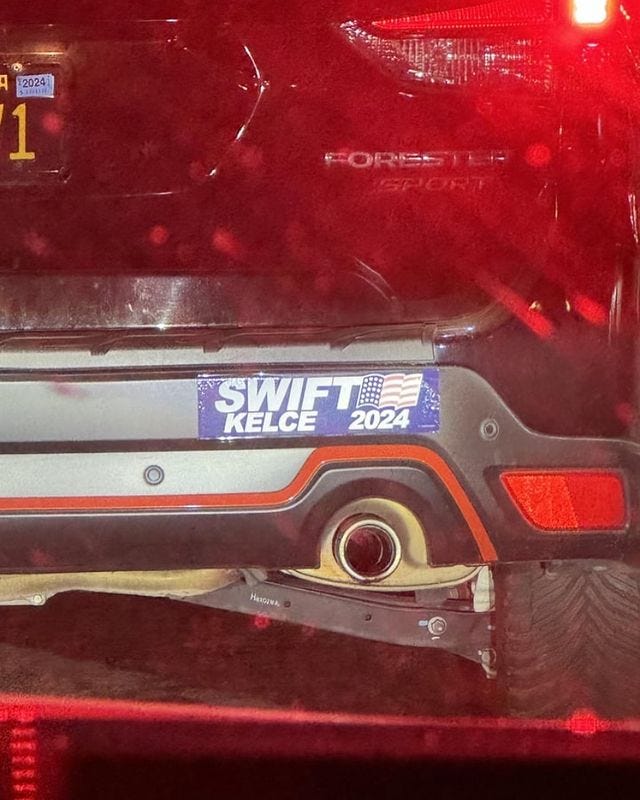
Swift-Kelce bumper sticker (2024). Usually when we see celebrity-themed campaign logos they use the old Reagan-Bush logo as the template, so it’s refreshing to see someone play around with the Bush-Cheney logo for a change.
Like what you see? Subscribe for more:
Politics in the front, pop culture in the back.
Subscribe to my new newsletter Whig:

