


How Bernie Sanders' logo ushered in a new era of democratic socialist design

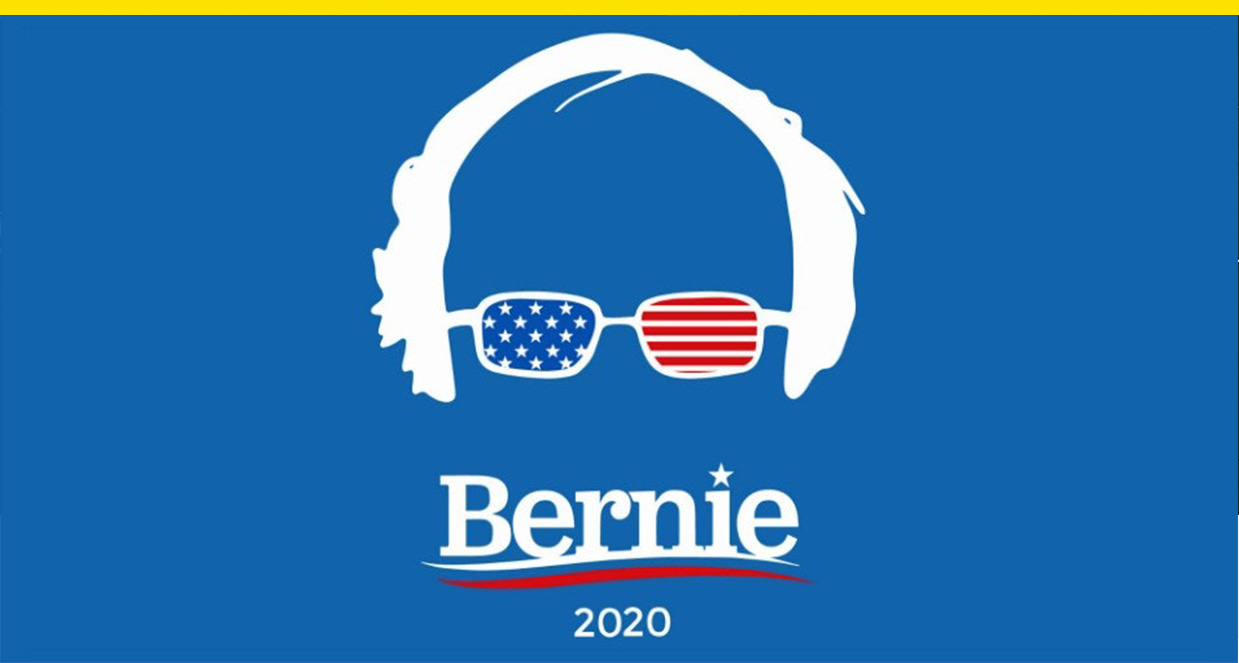
Bernie Sanders’ campaign logo is one of the defining visual representations of socialism for many Americans, but look a little closer, and it rejects some of the most well-known tropes of socialist design. The standout color of socialist images is red, while the Bernie wordmark is most often set in blue. The wavy lines in Sanders’ logo are reminiscent of a toothpaste brand, and they stand in stark contrast to the sharp angles and shapes seen often in socialist posters. While socialism is sometimes described by critics as un-American, Sanders’ logo is pure Americana.
Sanders’ branding attempts to introduce a new kind of visual vocabulary for democratic socialism, one that deviates from the popular image of what socialism is supposed to look like. It imbues his candidacy with a sense of familiarity and accessibility, and suggests his ideas are as American as it gets, despite detractors who say otherwise. “It’s important to remember Bernie Sanders at the time, first of all, was not as widely known a figure as he is now,” said Ben Ostrower, founder of the creative agency Wide Eye, who designed Sanders logo in 2014, before the senator announced he was running for president. Plus, Ostrower adds, “The label ‘democratic socialist’ wasn’t in the public vocabulary.”
When Sanders’ team reached out to Wide Eye in late 2014 about designing a logo for his Senate reelection campaign, they wanted something that would connote the idea of a movement, “not just a political movement, but the idea of a wave that can sweep over our politics,” Ostrower said. It’s a familiar request from political clients. “The conversation was pretty straightforward,” he said. “The senator has never really had branding that has been his. It’s always been very ad hoc and his national profile has gone up.”
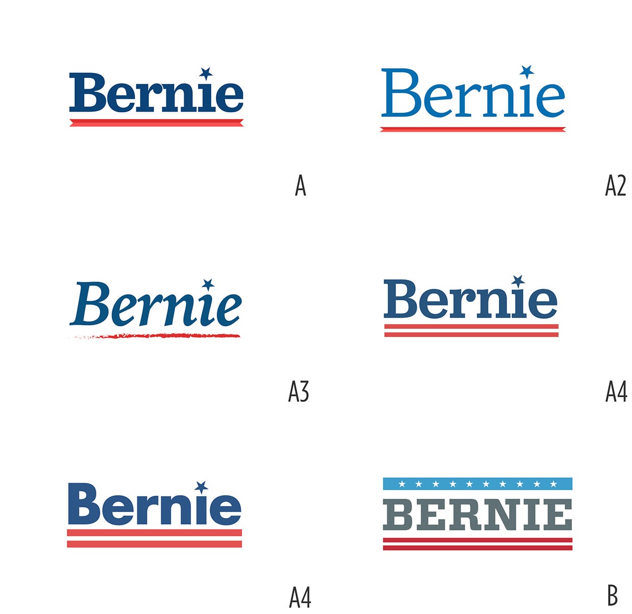
Rejected logo designs from Bernie Sanders’ Senate reelection campaign. Credit: Wide Eye
The wavy lines in the Sanders wordmark were pulled from the agency’s “logo trash can” of scrapped designs, and were originally a concept for a congressional candidate that was never used. Ostrower declined to name the candidate it was first designed for, but said it’s common that they try out abandoned ideas for new projects. For the font, Ostrower flipped through different typefaces to set “Bernie” in and especially liked Jubilat, a slab serif from the type foundry Darden Studio that he described as “a little bit throwback-y,” “incredibly friendly,” and the “glue” that held the logo together. “There’s a real sort of Brooklyn quality to it without sacrificing any Americana,” he said.
Thinking about colors, the decision to make the logo red, white, and blue “wraps the idea of this movement in the most patriotic imagery that you can come up with,” Ostrower said, and it “actually sort of reclaims this idea that these are very American ideas.” Still, Wide Eye was careful about how it used color. “We had a real sensitivity [that] you couldn’t put the star in red,” he said. Although socialist-leaning policies have increased in popularity among Democrats over the last several years, socialism is historically unpopular in the U.S., and a red star might have been too on the nose.
All told, the logo was squeezed into the agency’s end-of-the year workload and was made in less than a week. It first appeared on Sanders’ website around March 2015, and Sanders announced his presidential campaign the following month.
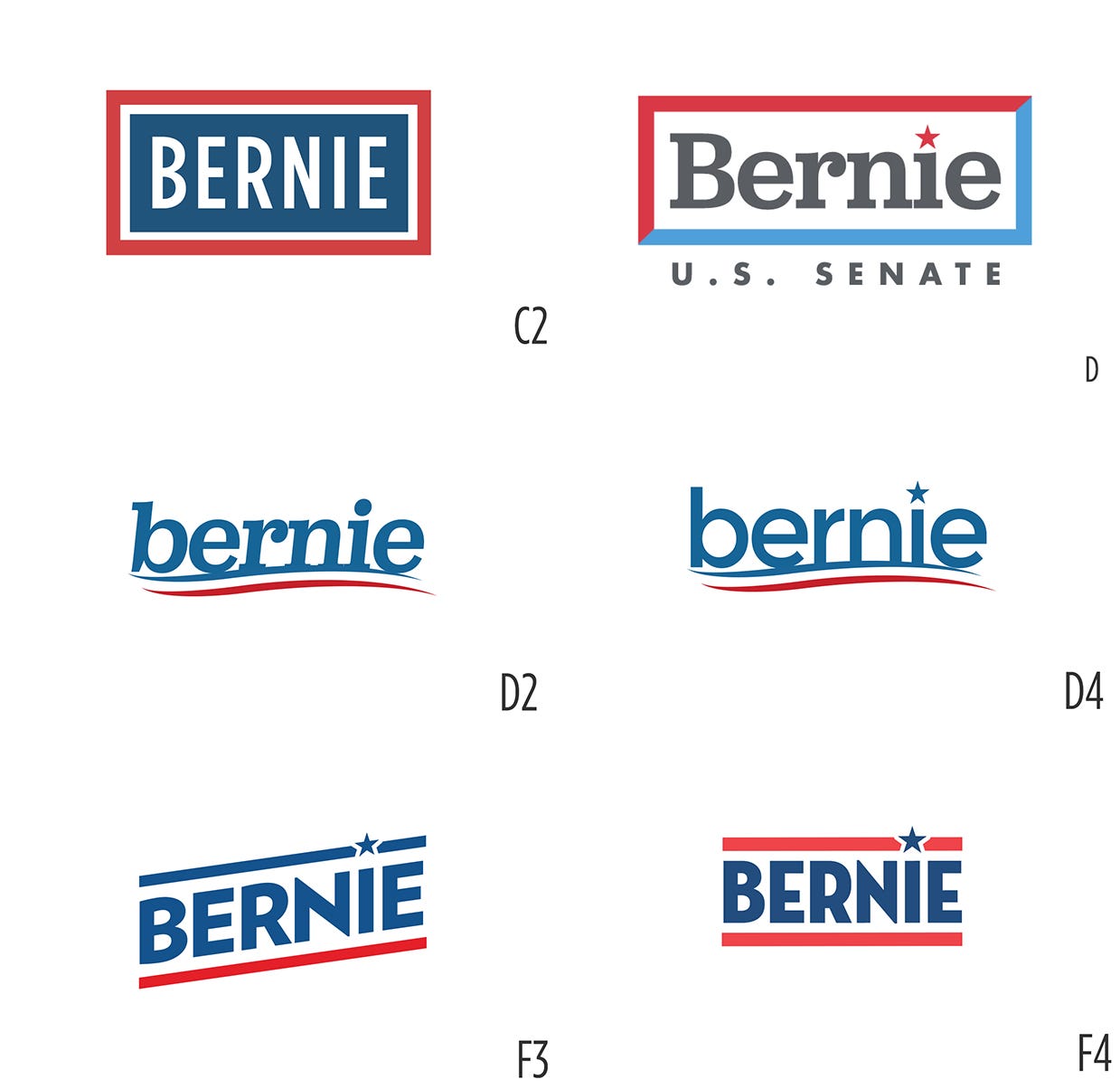
Rejected logo designs from Bernie Sanders’ Senate reelection campaign. Credit: Wide Eye
What is popularly recognized as socialist-style design was developed in Russia and the Soviet Union in the early 20th century, but it can be difficult to generalize because it evolved over decades, said Robert Bird, the director of graduate studies at the University of Chicago’s Department of Slavic Languages & Literature. “This kind of geometrical shorthand, very dominated by the color red, is what most people immediately think of,” he said.
Images appeared in posters and childrens’ books, and popular topics included promoting public health or patriotism, praising leaders, supporting war efforts, and criticizing capitalism. They often featured simplified, emblematic images of hands, fists, and bodies breaking out of chains to emphasize a popular movement, collective action, and solidarity among the proletariat. Posters typically included few or sometimes no words.
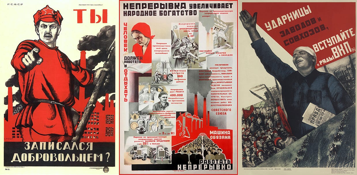
From left to right: poster encouraging enlistment in the Red Army by Dmitry Moor from 1920, “The continuity increases the wealth of the people” poster from 1930, and poster aimed at women who worked in factories and farms from 1932.
To the Western eye, accustomed to the connection between commerce and visual culture, the classic soviet style looks strange because it advertised a political movement rather than consumer products. “It’s not directed at selling something,” Bird said.
The style was used in posters and art in Eastern Europe, China, North Korea, Cuba, and Vietnam and was even at times influenced by Western abstraction and cartoons. It seeped into American consciousness too, first through art from the Works Progress Administration, the New Deal-era agency that included a public art component—and later in posters for punk music and radical movements of the 1950s and ’60s like the Black Panthers.
In the Nordic social democracies that Sanders points to as models, politicians don’t shy away from making visual connections to socialism, although their branding is different from the socialist design of a century ago. Leaders like Swedish Prime Minister Stefen Löfven, a member of the Social Democratic Workers’ Party, and Danish Prime Minister, Mette Frederiksen, a member of the Social Democrats, both used the color red and rose emblems, a popular socialist symbol around the world, in their campaigns.
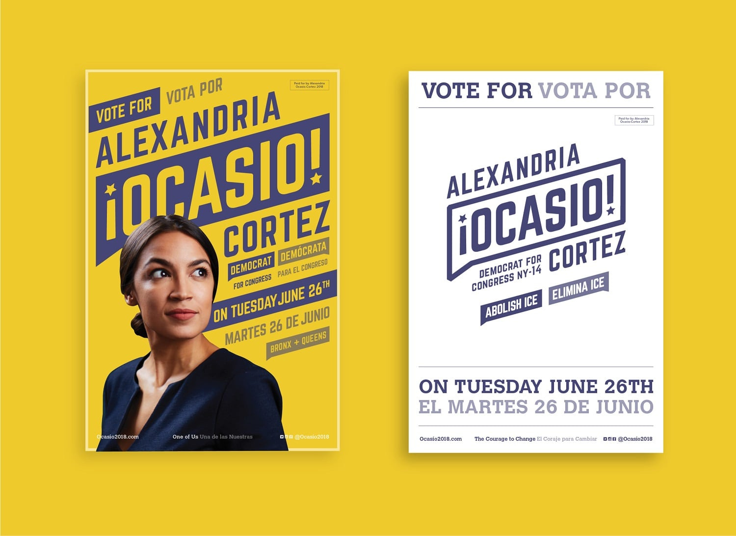
Alexandria Ocasio-Cortez’s 2018 identity.
In the United States, democratic socialists are developing their own visual culture. The Democratic Socialists of America, or DSA, put a modern spin on traditional socialist design with cartoon-style images, such as Sanders with a raised fist or of groups of people building together. Meanwhile, Rep. Alexandria Ocasio-Cortez, who identifies as a democratic socialist, used purple, yellow, and blue in her 2018 campaign materials and advertising, which was inspired by references like boxing posters and the United Farm Workers, a movement for workers’ rights that started in the 1960s.
“We didn’t really look at socialist influences,” said Scott Starrett, co-founder and creative director of the New York City agency Tandem, who designed the visual identity for Ocasio-Cortez. “People point to that angled typography, but we were actually taking that from boxing and luchadora posters, and we didn’t actually think of the implications of it through trying to convey socialist imagery.”
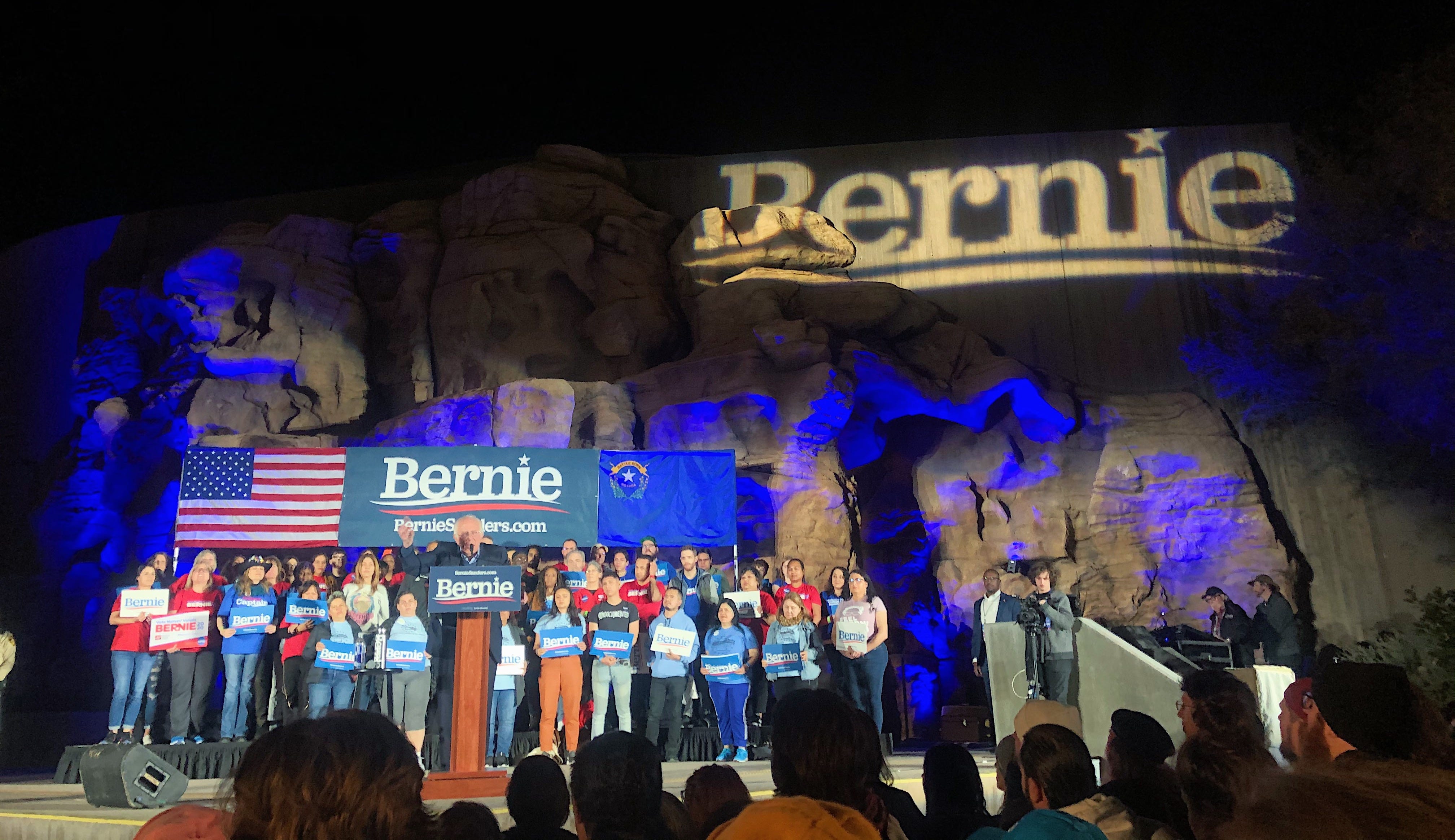
Sanders speaks to supporters in Las Vegas in February. Credit: Hunter Schwarz
With just two democratic socialist candidates in positions of national prominence in the U.S., the sample size is small, and both took different approaches to design, so it’s difficult to suss out any design trends, Starrett said. “I don’t think that there’s any shame with aligning yourself with the democratic socialist movement, but it doesn’t necessarily carry a visual style at this time,” he said. “I don’t know that there are necessarily brand elements that have identified themselves.”
If anything, the fact that democratic socialists are branding themselves in new ways that look nothing like the socialist-inspired branding used in the past by radical movements suggests what polling already tells us: Socialism might still have a ways to go before it’s mainstream, but it’s no longer as fringe as it once was.
This story is a collaboration between Yello and Eye on Design, a publication from AIGA that covers the world’s most exciting designers and the issues they care about. You can subscribe to the newsletter here.
This article originally appeared in AIGA’s Eye on Design.