How bad is Spotify's 2021 Wrapped visual branding really?
The theme of this year's campaign was embracing the unknown
Hi, I’m Hunter and I curate the Yello newsletter, Twitter, and Instagram. Subscribe to get the latest in visual politics delivered to your inbox:
Spotify released its 2021 Wrapped feature last Wednesday showing users their most-played music of the year, and not everyone was happy with its visual design.
The copy was cringe (“While everyone was trying to figure out what NFTs were, you had one song on repeat”) and I’m still not clear on what exactly an “audio aura” is, but mine was “energy and bold.” Creative Bloq called it “a design nightmare.”
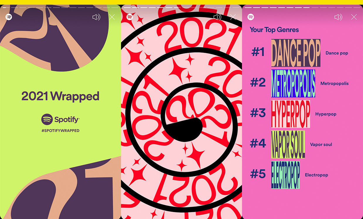
The bar charts for top genres caused the most consternation. They smooshed the text of especially long genre names beyond readability, inspiring this “graphic design is my passion” meme:
Luckily, Spotify provided labels next to the charts in case you had trouble making out, say, “progressive house” or “brutal death metal” as your No. 5 genre. Or you can also tilt your phone, as Reddit users pointed out.
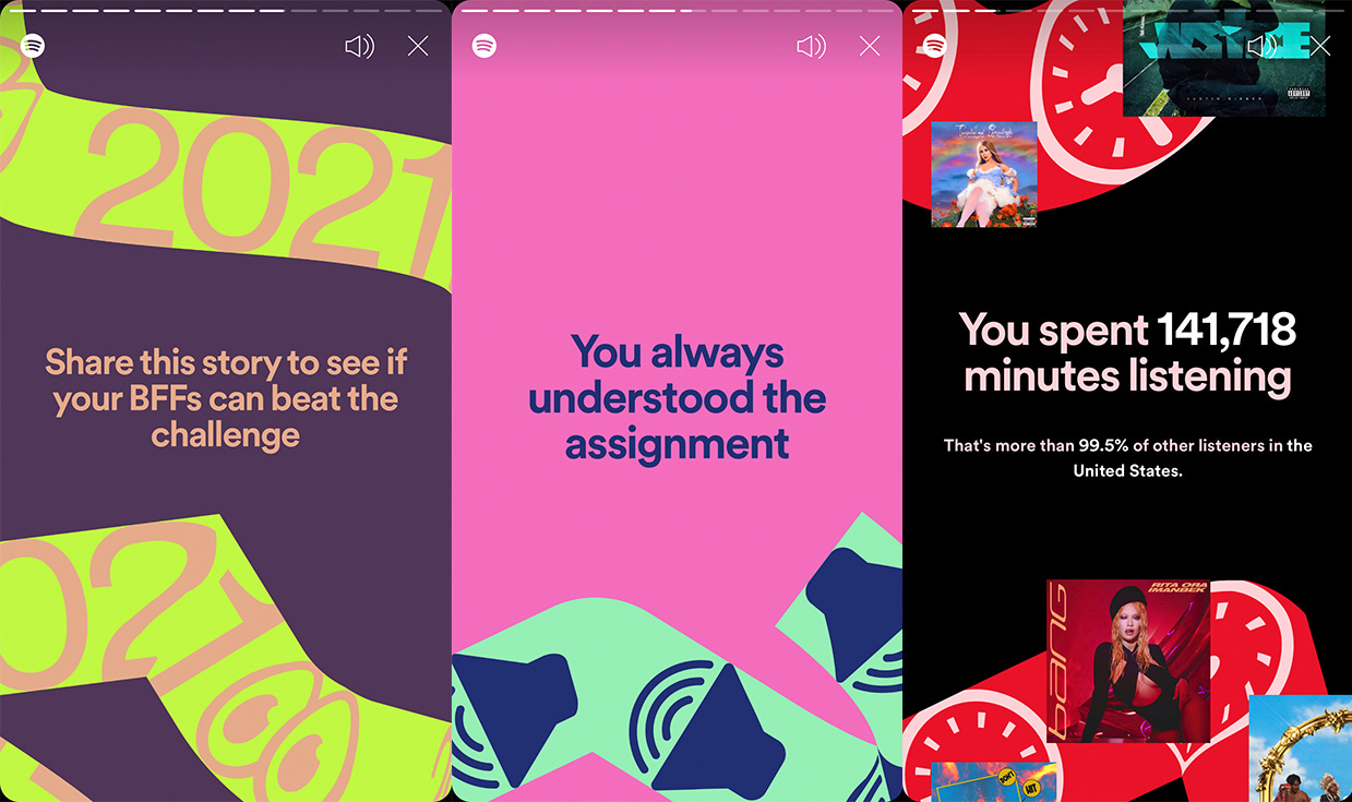
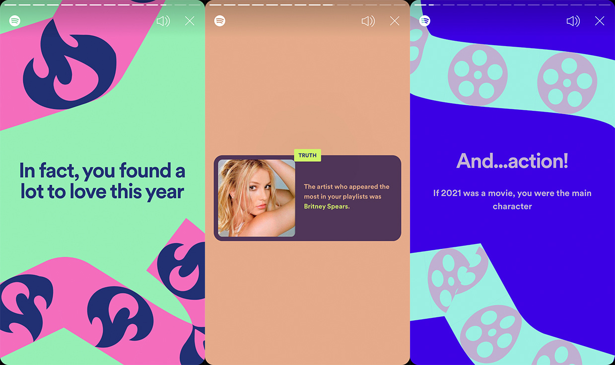
The visual anchor for the campaign, though, is a ribbon feature that snakes across the screen and houses text and images, like audio or clock icons.
The ribbon “gives us an additional layer of storytelling in every piece of creative,” said Rasmus Wangelin, Spotify’s global head of brand design, in an interview with the company’s blog. “You can, let’s say, have an artist image with copy, but you can also have things inside of this ribbon to enhance the story and go deeper with an insight.”
Designed like an Instagram Story, Spotify Wrapped is meant to be screenshot and shared, and this year’s look spawned imitators, including Rep. Debbie Lesko (R-Ariz.), who tweeted a #BidenWrapped graphic hitting President Joe Biden for his “Top Crisis.”
Wangelin called Wrapped “probably the biggest project we do every year” and said his team starts working on it in June.
“We have to start that early in order to land the design direction so that we can then build an extensive tool kit that will be used by all of our partners and agencies globally,” he said.
Customized by user data, it’s a project that needs to be scalable, and every year looks different. The 2019 campaign used repetition of artist photos and top genre bar charts arranged like skyscrapers. In 2020, they went with gradients and kaleidoscope effect on artist photos.
“Every year has a slightly different theme,” Wangelin said. “And it’s important for us on the design front to make sure that whatever design we create matches the sentiment of the way we’re talking about the year conceptually.”
The concept for 2021 was embracing the unknown, he said.
“This year, people around the world started to embrace the unknown in many ways, so we wanted every piece of creative to feel unique,” Wangelin said. “At the same time, consistency is always important for a large campaign like Wrapped, and the playful ribbon does a good job at creating unique articulations while tying together the work as a whole.”
The chaotic visual branding for this year’s Wrapped might not be your cup of tea, but it did its job as a viral marketing campaign. With a distinctive look that stood out on social media and translated into a meme format, it’s like a pop song engineered for TikTok, loud, messy on purpose, and meant to be shared.
K, but what’s your audio aura?
Yello is better with friends. Forward this email or share the post:


