Hello, in this issue we’ll look at…
Here’s Minnesota’s new “Unity” flag
What design by community looks like
What the Star of the North means to Minnesota
Scroll to the end to see: the brand new recreation of the first jeans ever sent into Levi’s for replacement.
Welcome to YELLO, a newsletter about politics, art, branding, and design. Was this email forwarded to you? Subscribe to see more:
Here’s Minnesota’s new “Unity” flag
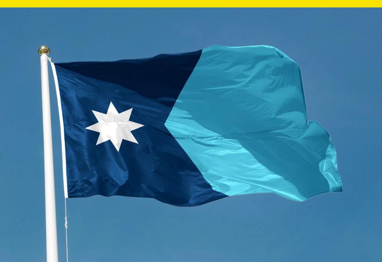
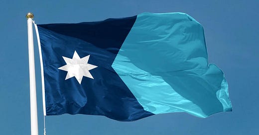
After thousands of submissions and months of deliberation, Minnesota will soon have a new state flag. Designed by Andrew Prekker, a 24-year-old artist, writer, and lifelong Minnesotan, the “Unity of Minnesota” flag beat out three other designs to become the official flag. Minnesota’s Emblems Redesign Commission spent months wading through submissions, whittling them down to a select few.
Prekker’s design features a blue swallowtail shape that evokes the outline of Minnesota on the hoist end. The flag prominently features a North Star, a reference to the state’s French-language motto, “L’Étoile du Nord.” Prekker said the design was meant to emphasize the state’s most unique features. Ted Kaye, a vexillologist at the North American Vexillological Association (NAVA), called the design “distinctive.”
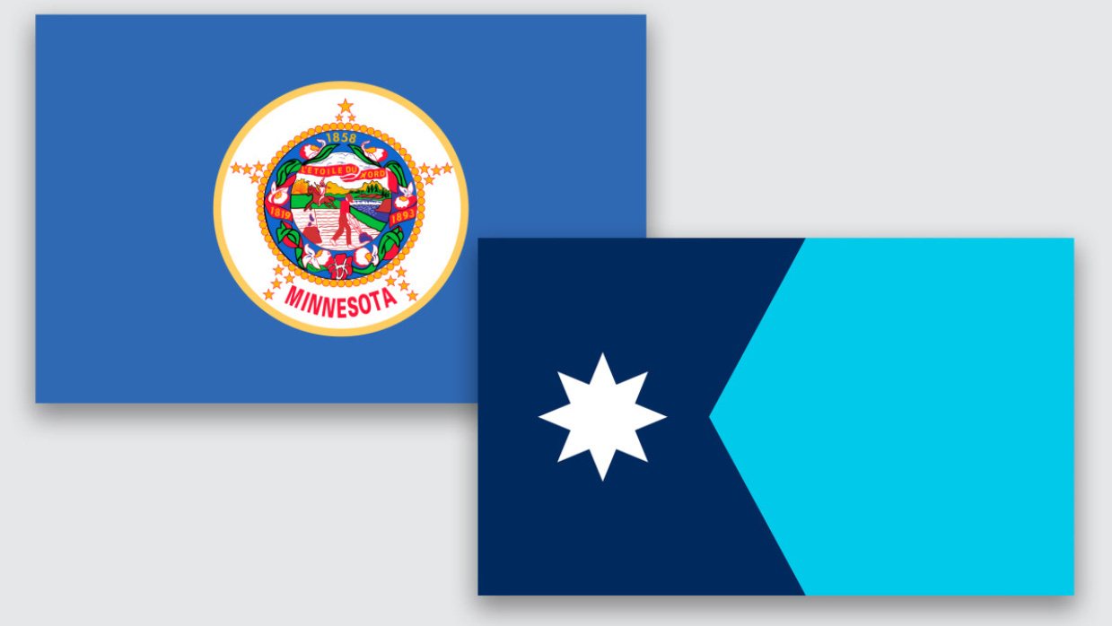
For Minnesotans who prefer a flag that follows NAVA’s guide to good flag design—simple and distinctive, with meaningful symbols, just a few colors, and no lettering or seals—the proposed “Unity of Minnesota” design will be an improvement from the current flag, which is one of some two dozen U.S. state flags that simply depicts the state seal. In Minnesota’s case, it shows a farmer and Indigenous man on horseback in a scene that’s been criticized as racist.
The flag has never been a particularly popular or widely adopted symbol, and it once finished sixth from last in a NAVA survey of North American state and province flags—hence the push for a rebrand. As Prekker said in an official statement, part of his flag’s appeal is that its distinctive star has the potential for branding and merchandising.
The process for selecting a new flag has been a sprint, though years in the making (a “Minnesotans for a better flag” Facebook group Prekker joined was started in 2009). This May, the state voted for a commission to overhaul the flag and seal, and the commission began meeting in September with a mandate to deliver new designs by New Year’s Day 2024. The process involved more than 2,000 submissions and public comments.
There were commonalities in many of the flag designs submitted, suggesting some symbols resonate more broadly than others. The colors green, blue, and white appeared across many designs and on all the finalists, and the Star of the North was far and away the most popular symbol. Stars appeared in 84 percent of the submissions, compared to about 14 percent that featured a loon.
On Tuesday, the commission voted on variants of the chosen design to determine its final details. A total of 166 different kinds of stars were submitted, and the group settled on an eight-point version that evokes the shape that appears on the floor of the Minnesota Capitol rotunda.
“I don’t want to call this design by committee—it’s design by community,” artist and designer Luis Fitch, who chairs the committee, told me.
What design by community looks like
The politics of redesigning state symbols can be fraught. Just look to pushback on a Republican-led effort to redesign the state flag in Utah and stalled efforts to introduce a new Kansas license plate because some said it looks too similar to New York’s. Designing civic symbols to represent diverse communities is inherently challenging, and with something as subjective as design, you’ll never be able to please everyone.
“What I learned was I needed to be as transparent and democratic as possible,” Fitch says.
Tensions sometimes simmered at commission meetings. During one meeting, a speaker could be heard on a hot mic criticizing someone as a know-it-all. In another, discussions over whether the commission had the power to translate the state’s French-language motto on the state seal to English or Dakota became a point of contention. “We don’t have the authority to change the motto,” Minnesota state Rep. Bjorn Olson, a Republican and nonvoting member of the commission, argued at the time. Ultimately, the commission settled on a seal depicting a loon (the state bird) with red eyes, rising from water, and the Dakota phrase that the state derives its name from: Mni Sóta Makoce, meaning Land Where the Waters Reflect the Clouds.
What the Star of the North means to Minnesota
One thing commissioners could all seem to agree on: They didn’t care much for the opinions of outsiders, balking at a news report about reactions to a display of the finalist flags at the Mall of America. Not unlike how New Yorkers might dismiss what Midwesterners in Times Square think about their city, Minnesotans weigh the opinions of their neighbors far above those of tourists. State flag design, it turns out, is a family matter.
Flags “literally stake a claim to space and land,” finalist Sarah Agaton Howes said when introducing her flag design, which was made in the style of Native loom work. Proponents of redesigning unpopular state flags see their work as beneficial for both civics and business. A flag can be a tool to boost a state’s shared identity and pride, and also its brand. But there will inevitably be critics. While some will simply not like the new design as a matter of personal preference, others will see it as an attempt to erase history. Disagreements over graphic design can be mapped onto preexisting political arguments over progress versus conservatism.
Luckily for Minnesota, its state motto has proven a powerful symbol. The state’s first governor, Henry Sibley, picked “L’etoile du Nord” as Minnesota was then the northernmost state, and it endured. Polaris, the star that doesn’t move, is symbolism rooted in history and heritage, but it also points a path forward. A symbol with the potential to span partisan differences, perhaps? Fitch is a fan, since “we already own the Star of the North, and there are so many beautiful stories and analogies associated with it.
“If you follow that particular star, you land in Minnesota,” he says. “It tells us where we are right now, and it can help guide us to the future.”
This story first appeared in Fast Company.
Have you seen this?
Adobe abandons $20 billion acquisition of Figma. Under pressure from regulators, Adobe calls off its plans to acquire a leading competitor. [The Verge]
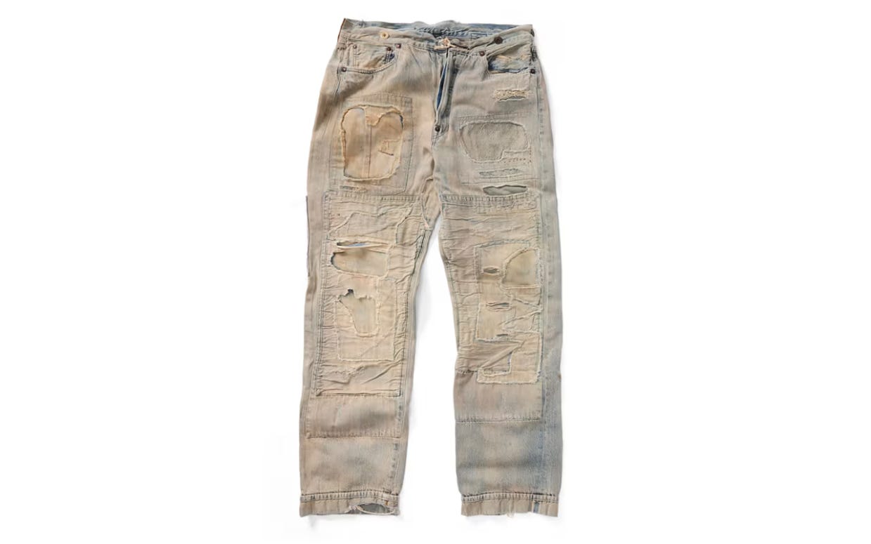
Levi’s is recreating the first pair of jeans ever sent to the company for replacement. In 1917, an Arizona hard rock miner named Homer Campbell became the first person to take Levi’s up on its promise for “A New Pair Free If They Rip.” Campbell wore a pair of the brand’s 501 jeans for six days a week (every day but Sunday) for three years, and he sent his absolutely trashed jean into Levi’s headquarters in San Francisco with a handwritten note. [Hypebeast]
Judge allows removal of Confederate statue at Arlington National Cemetery amid protests. The removal was temporarily halted amid a complaint from protesting groups. The removal of the Confederate memorial is congressionally mandated to be removed by Jan. 1, 2024, according to the Army National Military Cemeteries. [ABC News]
History of political design
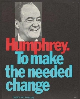
Citizens for Humphrey poster (1968). Hubert Humphrey today bc Minnesota ⭐❄️🦆
Thanks for reading! ⭐📨
Was this email forwarded to you? Like what you see? Subscribe for more:

