Do fonts have a political party?
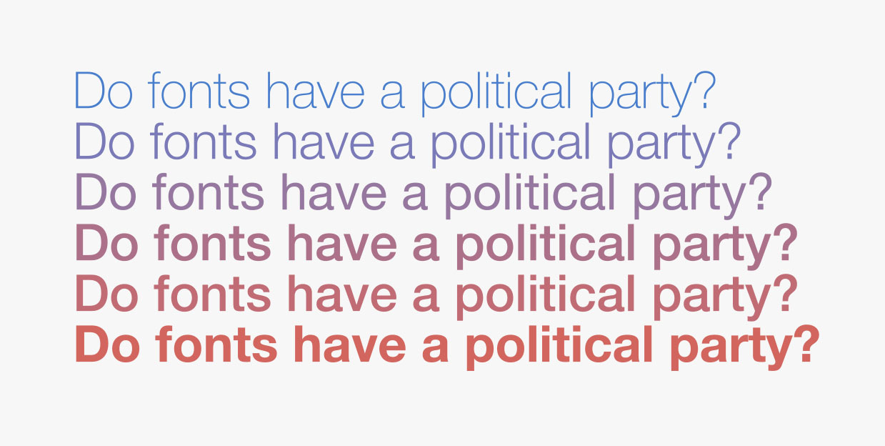
Different fonts communicate different messages. Some bold fonts shout at you, while the right script font evokes elegance. Helvetica is viewed as confident and modern; Comic Sans is the internet’s biggest typographic joke. Typefaces have all kinds of personalities, but can they also have a partisan ideology?
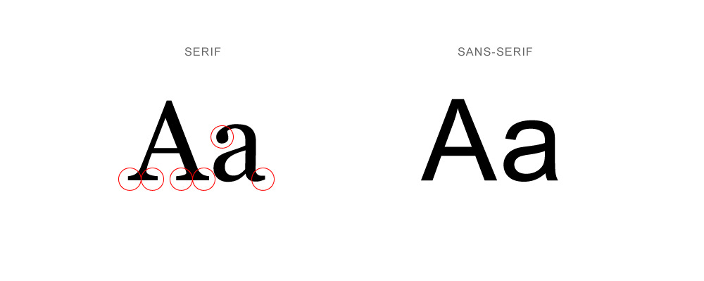
It was a question Katherine Haenschen had during a local state race in Virginia in 2017 when she noticed something odd about a candidate’s signage. In her liberal college town of Blacksburg, Va., the candidate used signs with block sans-serif type and the color teal, while out in a rural area he used completely different branding, with fire-engine red and serif type.
Credit: 97th Floor
“I assumed it was unauthorized. Why would you have a different sign?” Haenschen, an assistant professor at Virginia Tech, told Yello in an interview. “And then I looked, and it was paid for by the campaign.”
She wondered whether the candidate was trying to appeal to different voters with different logos. “So we decided to test it,” she said.
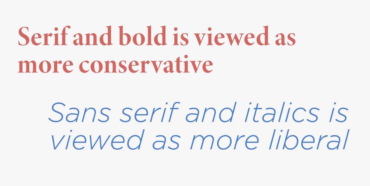
It turns out we do perceive typefaces to have ideological leanings, according to the research Haenschen conducted with fellow Virginia Tech assistant professor Daniel Tamul. They found serif and bold is rated as more conservative, while sans serif and italics is rated as more liberal, per their study “What’s in a Font?: Ideological Perceptions of Typography,” published in the journal Communications Studies in December.
The Virginia candidate, who Haenschen declined to name, was onto something by using sans serif in a college town and serif in the country. And he ended up ousting an incumbent and winning in a landslide, she said.
The results of the study made sense, Haenschen said, because “the idea of a serif being more traditional, and we often align traditionalism and conservatism, versus san serifs being more modern, more new, and those traits being more aligned with liberalism.”
Subscribe to Yello for the latest news on the culture, branding, and visual rhetoric of politics, delivered each week:
The study also found our own partisanship affects how we view fonts.
“Republicans tend to view all fonts as more conservative and Democrats tend to perceive all fonts as more liberal,” she said.
How the research was conducted
The research included two surveys. The first tested perceptions of the serif Times New Roman and the sans serif Gill Sans — typefaces that were chosen for their neutrality and lack of pre-existing connotation. They were shown in regular, bold, and italic weights and respondents were asked to rate their ideological perception of the font when it was used to spell out the phrase “The quick brown fox jumped over the lazy dog.”
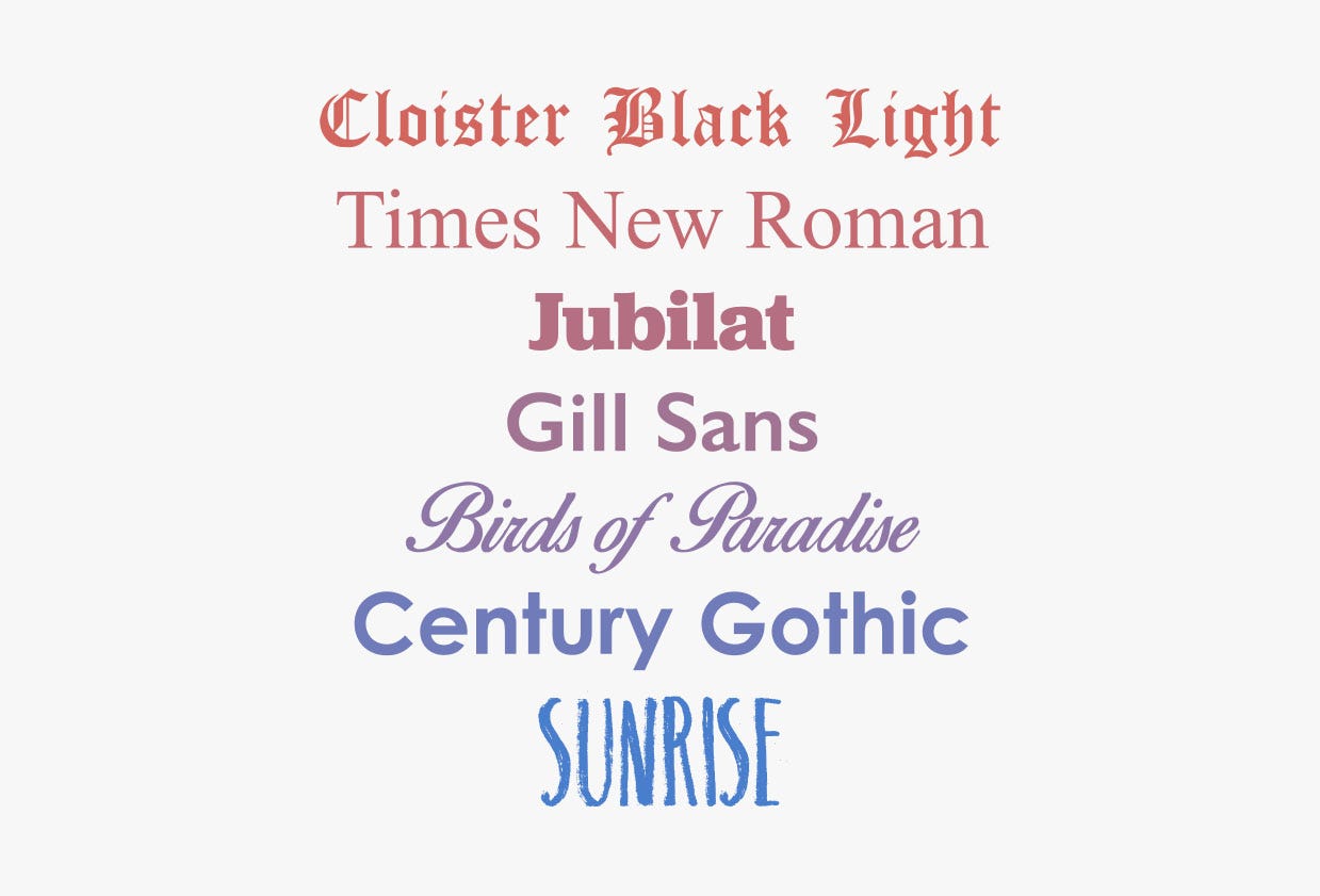
The typefaces used by Virginia Tech researchers to test the ideological perceptions of fonts.
A second survey added in the slab serif Jubilat, which is the typeface used by Sen. Bernie Sanders’ campaign (I-Vt.); Century Gothic, a sans serif that’s an approximation of the Gotham typeface used by former President Obama’s campaign; and three display typefaces: the blackletter Cloister Black Light, the script Birds of Paradise, and Sunrise, which has a hand-drawn, cartoony look. Respondents saw the type used in the phrase “A large fawn jumped quickly” and the name “Scott Williams,” chosen for its commonality.
Here’s the typefaces’ ideological rating, charted out from liberal on the left to conservative on the right:
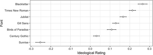
The mean ideology rating of fonts with standard error bars
The blackletter Cloister Black Light was viewed as the most conservative, while Sunrise was far and away seen as the most liberal. One interesting finding was that Republicans actually tended to view Cloister Black Light as less conservative than Democrats or independents did, which the study suggested might have been related to the conscious or subconscious association of blackletter type with major newspapers like the New York Times or Washington Post, which use blackletter in their logos and are frequently targeted by President Trump.
You’ll notice the two initial typefaces tested, Times New Roman and Gill Sans, aren’t actually that far apart.
“If you look at the amount of difference, we’re not talking about a groundbreaking amount of difference,” Haenschen said. “We’re not talking about the DSA (Democratic Socialists of America) versus the Tea Party here.”
Still, in letterform we perceive ideology.
Sans serif reigns supreme
Our political perception doesn’t neatly line up with actual campaign type choices, however. In fact, American politics today is largely a sans-serif affair, even among Republicans. On Trump’s campaign homepage, for example, there’s not a serif to be found.
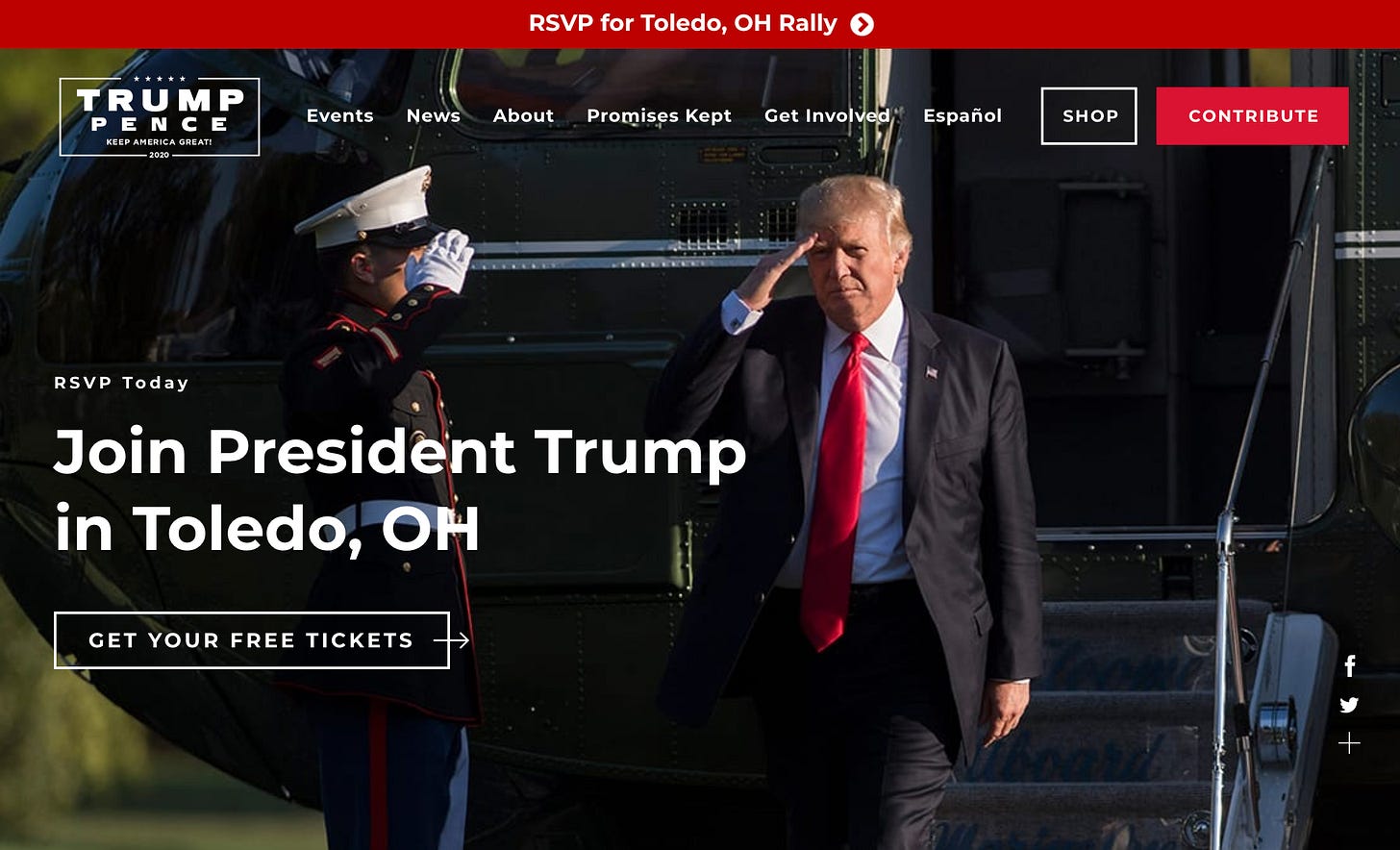
It’s not just Trump. The majority of the Republican presidential field in 2016 used sans-serif type, as did a majority of Republican congressional candidates in 2018. According to the Center for American Politics and Design, or CAPD, which tracked congressional candidate logos in the midterms, 68% of Democrats and 62% of Republicans used sans-serif type.
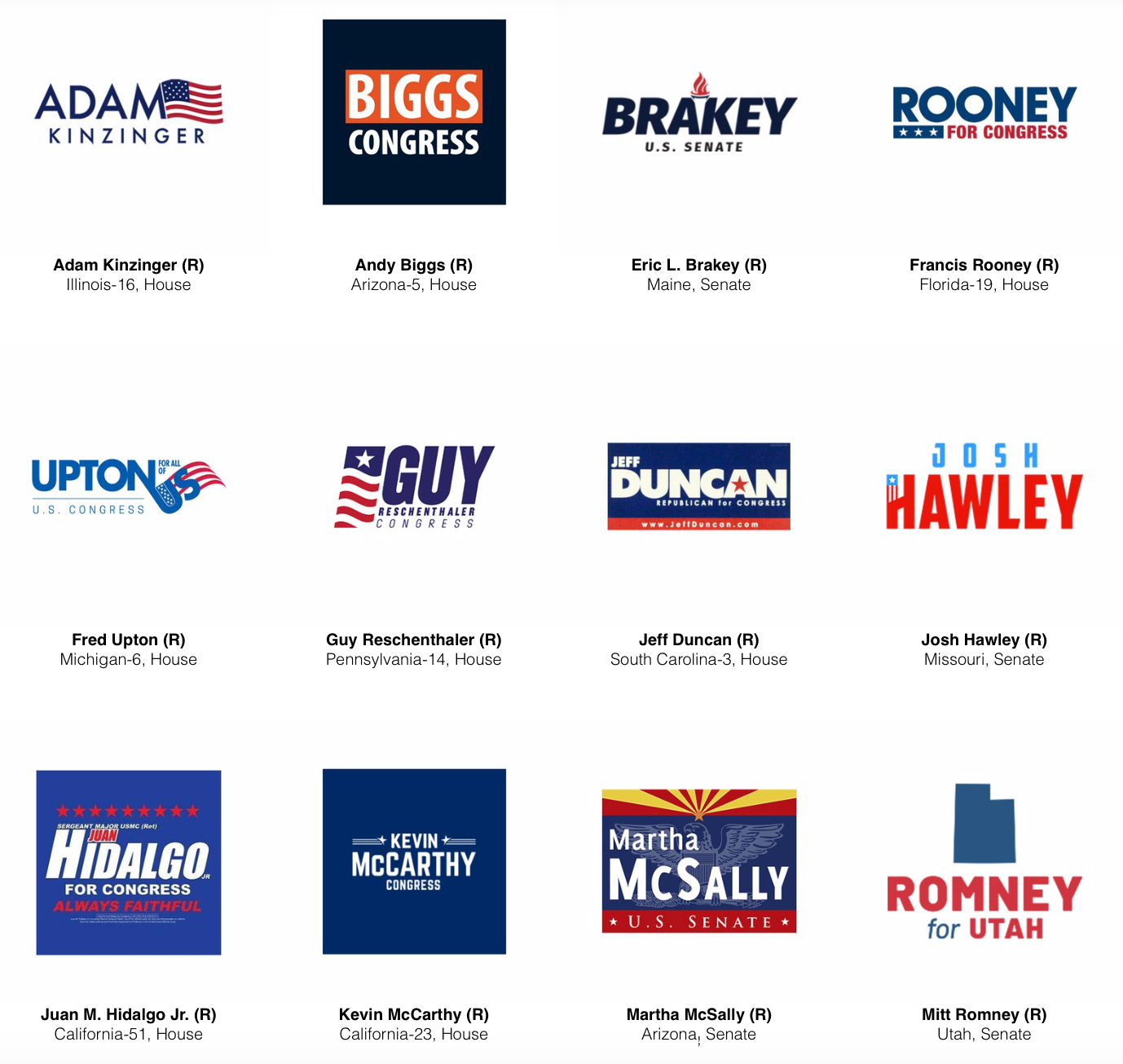
Examples of 2018 Republican congressional candidates who used sans-serif type in their campaign logos. Credit: via CAPD
The san serif Futura was popular with candidates of both parties in the 1950s and ‘60s, and used almost exclusively as part of Richard Nixon’s 1972 re-election campaign identity. After Nixon resigned in 1974, however, Futura and sans-serif type fell out of fashion in political design. San serif didn’t make a comeback until the 21st century, with George W. Bush and Barack Obama.
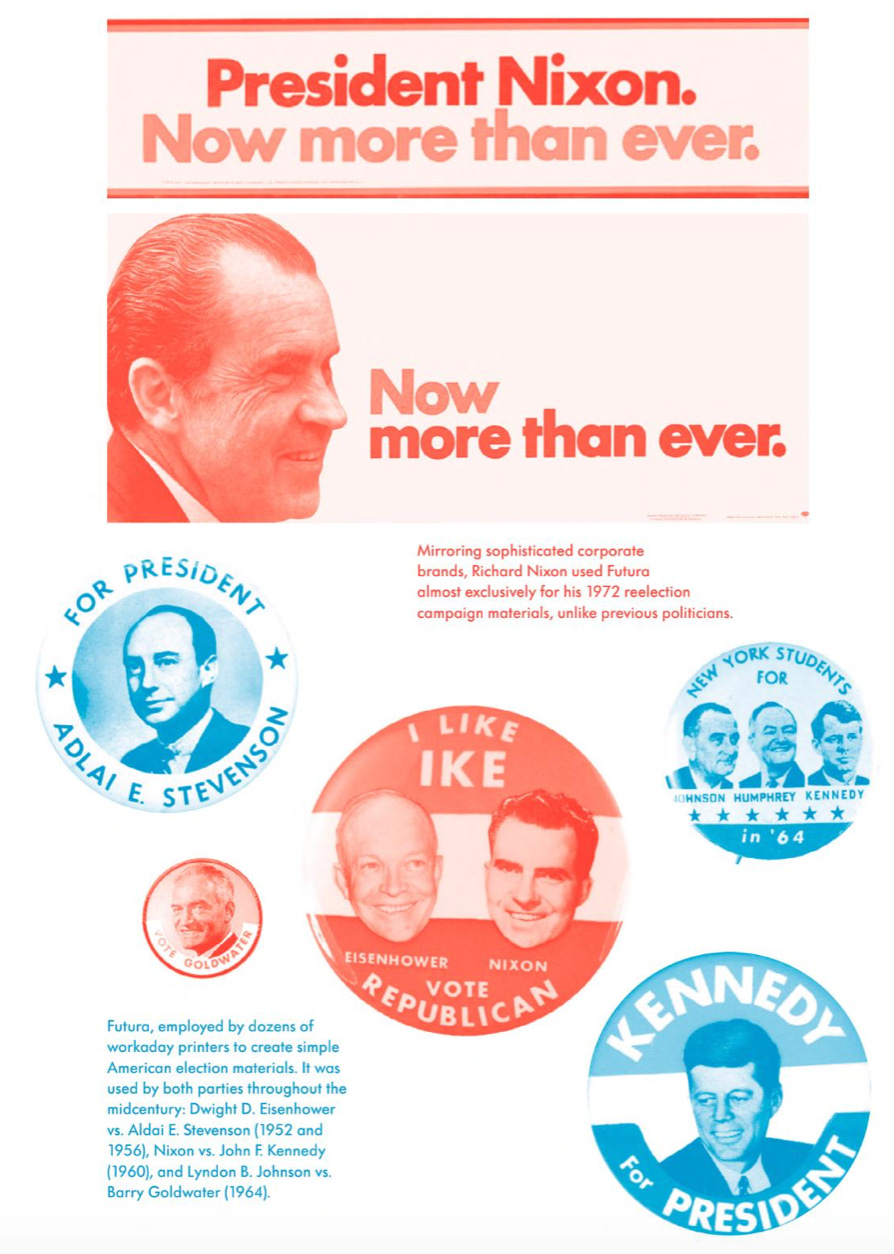
Examples of midcentury political design that used Futura. Credit: via “Never Use Futura” by Douglas Thomas
"I think obviously the success of Obama’s campaign really affects the way people have been using typefaces post-2008,” said CAPD co-founder Susan Merriam, of the Obama campaign’s use of Gotham.
“I think people think of sans serif as being more futuristic, modern,” she said.
For an industry that’s inherently forward looking, using futuristic, modern fonts could communicate the progress and promises about the future that candidates talk about on the campaign trail.
Read more: [How 2020 Democrats could rewrite the rules of political typography]
Politics also doesn’t exist in a vacuum, and mainstream design trends influence political ones. Fashion brands like Yves Saint Laurent, Balenciaga, Burberry, and Balmain have dropped their serifs, and in 2015, Google did the same, unveiling the sans-serif wordmark we know today.
Politics is an image-conscious industry and type, Professor Haenschen said, is a major part of that.
“What I think it means for practitioners is font choice matters,” she said. “It’s conveying things.”

