Do campaign logos matter? This survey says yes.
Plus: See the brand guide for the 2024 Democratic National Convention
Hello, in this issue we’ll look at…
Do campaign logos matter? This survey says yes.
See the brand guide for the 2024 Democratic National Convention
With a logo like AOC’s, Ted Cruz is hoping to win over Democratic voters
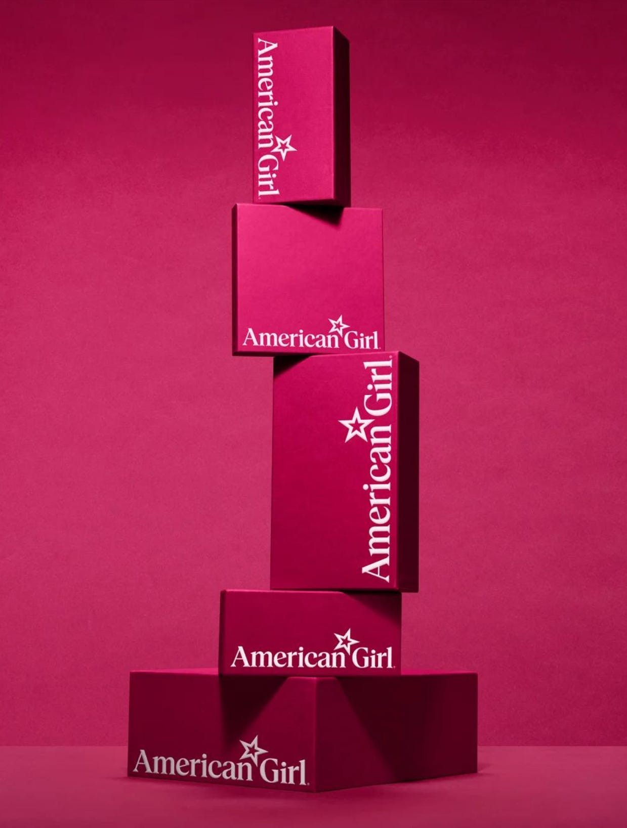
Scroll to the end to see: What American Girl named its main color as part of its first major brand refresh 🇺🇸
Do campaign logos matter? This survey says yes.
Campaign logos can go a long way in influencing voters’ perception of candidates, a new survey found.
The Center for Campaign Innovation tested 10 campaign logos from 2022 U.S. House candidates that were modified by changing the candidates’ names and removing any identifying information about party and state.
The logos were shown to 1,046 registered voters who were asked whether they had a favorable or unfavorable view of the candidate based on the logo alone, and respondents were asked to describe the logos using pre-selected attributes like “fresh,” “exciting,” “moderate,” “experienced,” “boring,” and “extreme.”
The survey found a spread of nearly 10% between the most and least favorable logos, suggesting a significant role that visual design plays in voter perception. Design elements also went a long way in determining the types of attributes voters gave to certain logos.
“I was surprised at how significant the effects were,” Eric Wilson, a Republican digital strategist and director of the Center for Campaign Innovation says of the favorability score. “I always thought about logos tactically—how do they work as a favicon, on collateral, etc.—but never from the perspective of the messages voters took away from them. I didn't even consider the possibility that there might be persuasive effects. But we found that a logo can affect favorability, drive preference, and shape voters' perceptions of a candidate.”
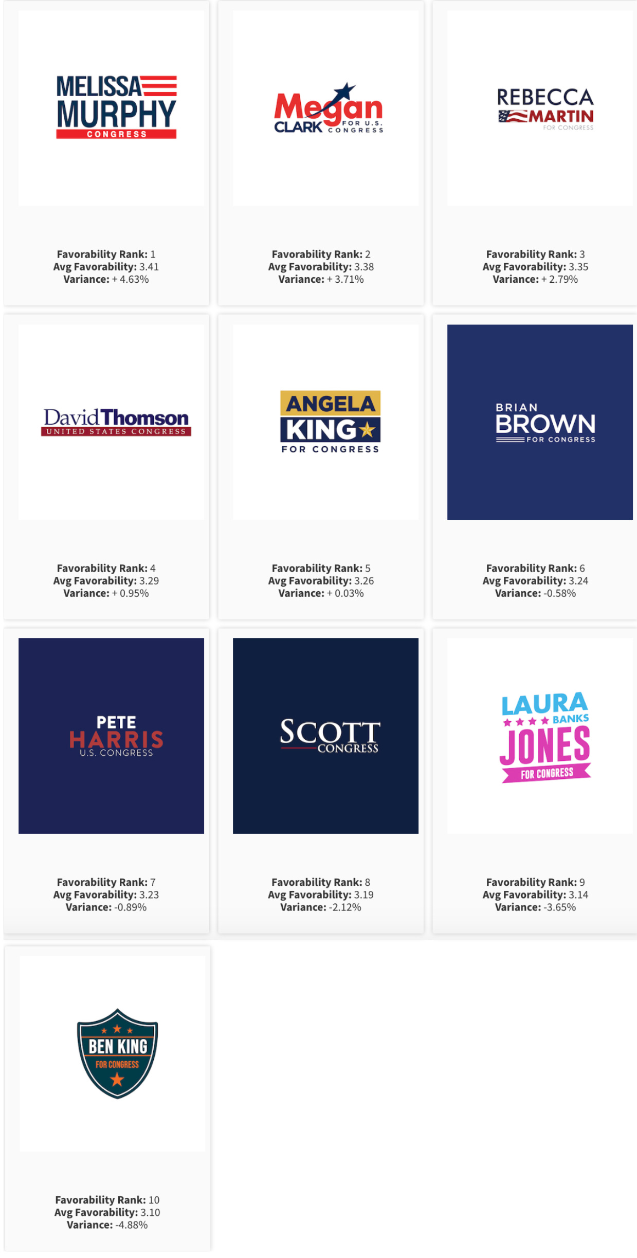
Here’s the 10 logos that were tested, ranked from most to least favorable:
There’s a clear preference for logos that used red, white, and blue and elements from the flag. The most highly rated logo, for a candidate named “Melissa Murphy,” was an adaptation for a logo used by Lisa Scheller, a Republican who ran for a seat in Pennsylvania. Along with the top-rated logos for “Megan Clark” and “Rebecca Martin,” they all stuck with tropes of traditional campaign design without looking dated. The top three logos all used sans-serif type, and respondents called the “Megan Clark” logo with its swooshing star element “fresh,” “exciting,” and “moderate.”
Meanwhile, two of the logos that didn’t use red, white, and blue were the lowest rated. The blue and pink “Laura Banks Jones” logo that used an AOC slant was seen by respondents as “extreme,” which suggests how significantly the slant design and out-of-the-box colors read far left, while the blue and orange shield logo for “Ben King” was called “moderate” and “fresh” but people just didn’t seem to like it.
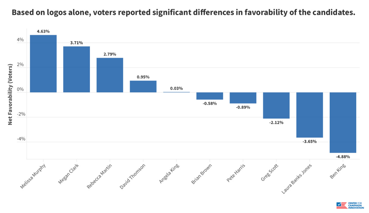
While designing a campaign logo that doesn’t look like a typical campaign logo might help it stand out from the crowd, it seems voters prefer logos that clearly look like they’re for a political campaign.
“My biggest takeaway is to stick with the red, white, and blue color palette,” Wilson says. “There's clearly an expectation on the part of voters about the colors a campaign logo should have.”
He also recommends that campaigns with resources should test different logo variations with voters to find the best option.
The most common attribute assigned to logos rated in the middle of the favorability score was “boring,” but many of these boring logos were also considered “moderate,” so it depends on what candidates are going for, really. Many of these logos used serif fonts that look dated.
None of the tested logos used design inspired by former President Donald Trump’s logo, which has grown increasingly popular as a way for Republican candidates to signal their alignment with him.
When asked to guess the party affiliation of the candidate logos, respondents were right just half the time, but the results showed voters who identified as Democrats and Republicans were more likely to highly rate logos from their own party. There’s a partisan language to campaign design and partisans definitely pick up on it.
See the brand guide for the 2024 Democratic National Convention
With 101 days to go until the 2024 Democratic National Convention in Chicago, organizers launched a revamped version of their convention site demconvention.com.
Art direction, design, and web development for the site was done by Wide Eye Creative, and the site is available in English and Spanish with up-to-date accessibility features that accessibility advisor Robin Jones helped craft.
“The website will serve as the hub for the 50,000 guests who will descend upon Chicago this summer to renominate President Biden and Vice President Harris,” says DNCC senior communications director Matt Hill. “Everyone from delegates and volunteers to sponsors and members of the media will be able to access up to date information regarding all things convention.”
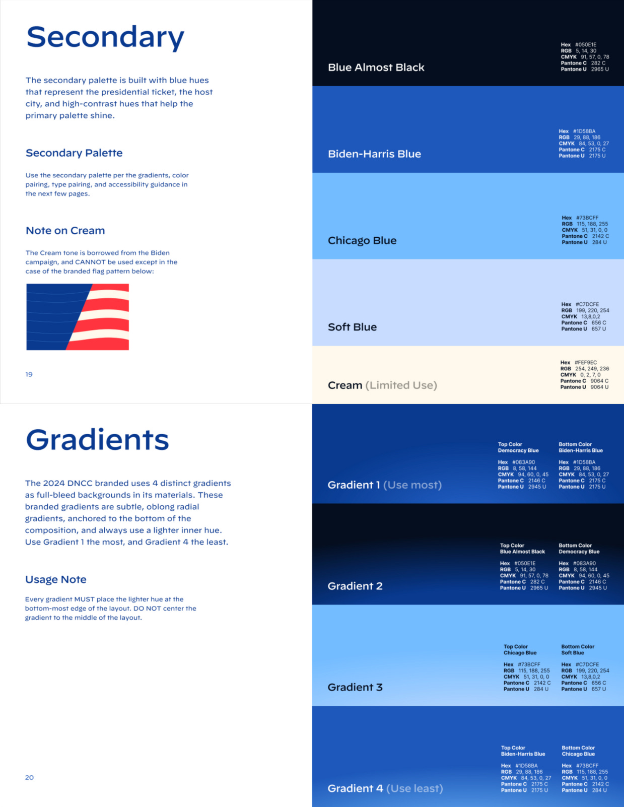
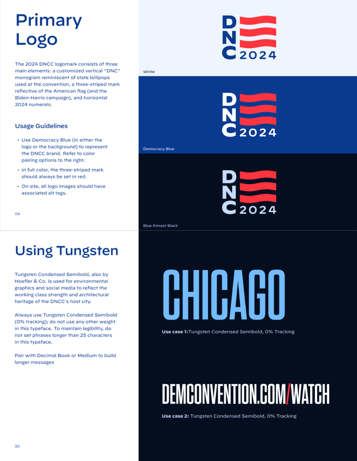
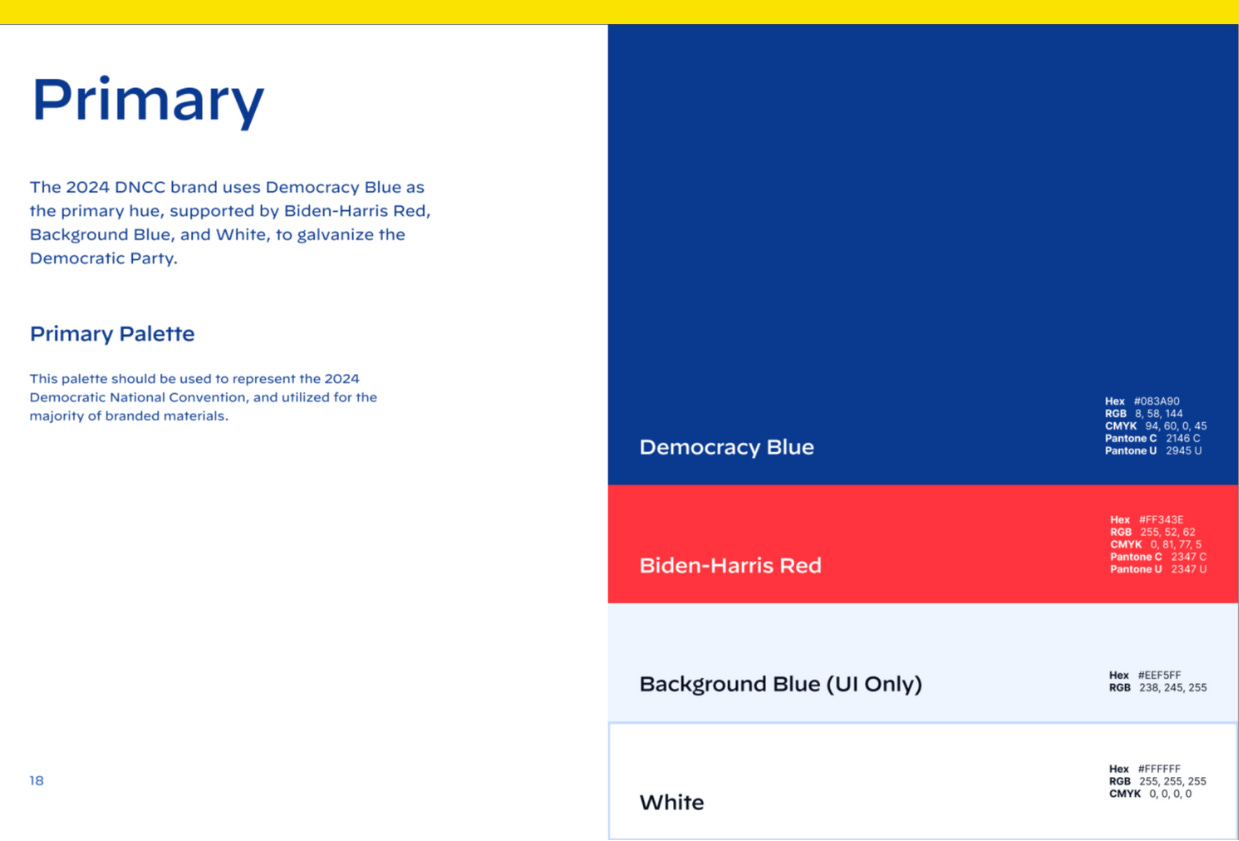
The primary color palette uses “Democracy Blue” and “Biden-Harris Red,” and the secondary palette includes four additional shades of blue (“Chicago Blue” was borrowed from the Chicago flag) and a cream tone used by the Biden campaign that can only be used in convention branding when part of a branded flag pattern, according to the brand guide. The primary logo, which puts President Joe Biden at the center, uses a vertical stacked “DNC” monogram, like the vertical state delegation signs seen at party conventions.
Hoefler & Co.’s Tungsten Condensed Semibold is used for environmental graphics and on social media “to reflect the working class strength and architectural heritage” of the convention host city, per the brand guide, and it’s limited to phrases no longer than 25 characters. Use Decimal Book or Medium for longer messages, it says.
“This new website showcases our commitment to meeting Americans where they are, and building the runway for President Biden and Vice President Harris to share their story of progress, hope, and possibilities with the American people,” Hill says.
With a logo like AOC’s, Ted Cruz is hoping to win over Democratic voters
Sen. Ted Cruz’s (R-Texas) X account is heavy on culture wars, with plenty of recent posts on campus protests and RTs from libsoftiktok and endwokeness. It’s a funhouse mirror view of what you think Democrats are like when you’re hooked up to a steady diet of nothing but Newsmax and the Blaze, with a few exceptions, including his pinned post, a campaign ad called “Democrats for Cruz.”
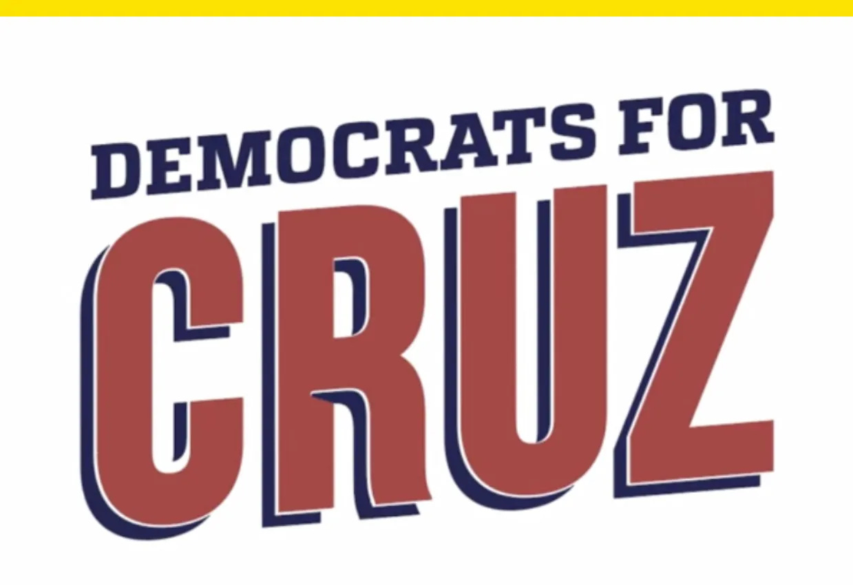
The ad, which ends with a title card that shows a “Democrats for Cruz” logo slanted upwards like Rep. Alexandria Ocasio-Cortez’s (D-N.Y.) logo, has interviews with five Democrats who say they’re voting for Cruz, like former Laredo Mayor Pete Saenz and Danny Dominguez, a Democratic sheriff from Presidio County who was Cruz’s guest at the State of the Union.
“I have 108 miles of border but in the last two years, border security has gone out of control,” says Dominguez, who says he’s voting for Cruz “for standing with law enforcement.”
Ads with endorsements from outpartisans can be highly effective, but it’s a new tactic for Cruz. He faced a surprisingly tight race in 2018, beating Democrat Beto O’Rourke with just 50.89% of the vote, so peeling off Democratic voters in his race this year against former Tennessee Titans player and Rep. Colin Allred (D-Texas) could be vital.
Cruz is reaching out to voters across the aisle on a “Cul-de-Sac Tour” of Texas suburbs. “I try very much to have my focus be on the policies and substance rather than going into the gutter with personal or character attacks,” he told the Wall Street Journal after one such stop in Cypress outside Houston. “This is really a mechanism to get into different communities and have real conversations with real people.”
Whether voters buy Cruz’s bipartisan pitch remains to be seen, but Allred was rated the most bipartisan member of Texas’ congressional delegation by Common Ground Committee, a group that promotes reducing polarization, which may say something about why Cruz is pivoting to the center.
Cruz is facing a complaint filed with the Federal Election Commission by watchdog groups who accuse him of breaking campaign finance rules related to payments made to his Truth and Courage PAC by iHeartMedia, which distributes his podcast “Verdict with Ted Cruz.”
Have you seen this?
Investor convicted in Trump Media insider trading case. A federal jury in New York on Thursday convicted investor Bruce Garelick of insider trading in the stock of a shell company ahead of its announcement in October 2021 that it would merge with Trump Media. [NBC News]
Remnants of a legendary typeface have been rescued from the River Thames. Doves Type was thrown into the water a century ago, following a dispute between its creators. [Artnet News]
American Girl’s rebrand is full of clever, doll-sized details. American Girl’s brand refresh is happening at the perfect time: when Millennial parents who grew up with the dolls are buying toys for their own kids. The brand has used color inconsistently over the years, but it’s been standardized with “Pleasant Berry” and a primary color palette dubbed “Berry Patch.” [Fast Company]
Apple apologizes for iPad “Crush” ad that “missed the mark.” The company says “we’re sorry” after its ad was seen as dismissive by the creatives Apple typically tries to court. [The Verge]
Trump is reportedly considering joining TikTok. Here’s why that may be tricky for him. The Trump campaign is discussing whether the benefits of joining outweigh criticism he might face for being one of the few high-profile Republicans on the app. [Yello]
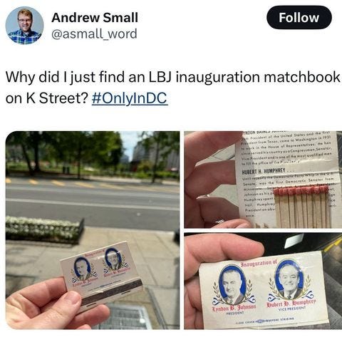
History of political design
Lyndon Johnson inauguration matchbook (1965). Who out here is dropping their historic matchbooks on K Street?
Like what you see? Subscribe for more:



Thanks for sharing!