Did NYC fix its subway map design dilemma?
New York City could be getting a new subway map based on a 1970s classic
New York City could be getting a new subway map based on a 1970s classic.
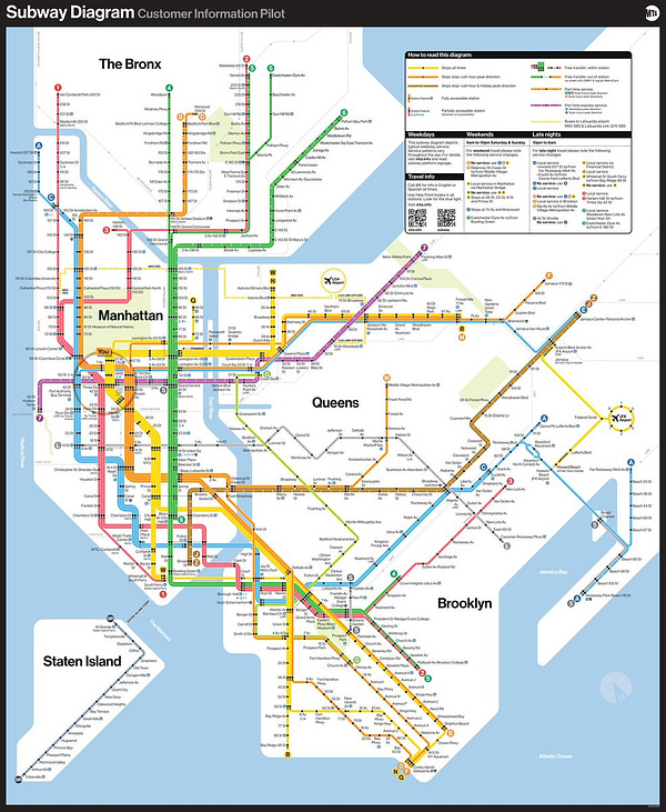
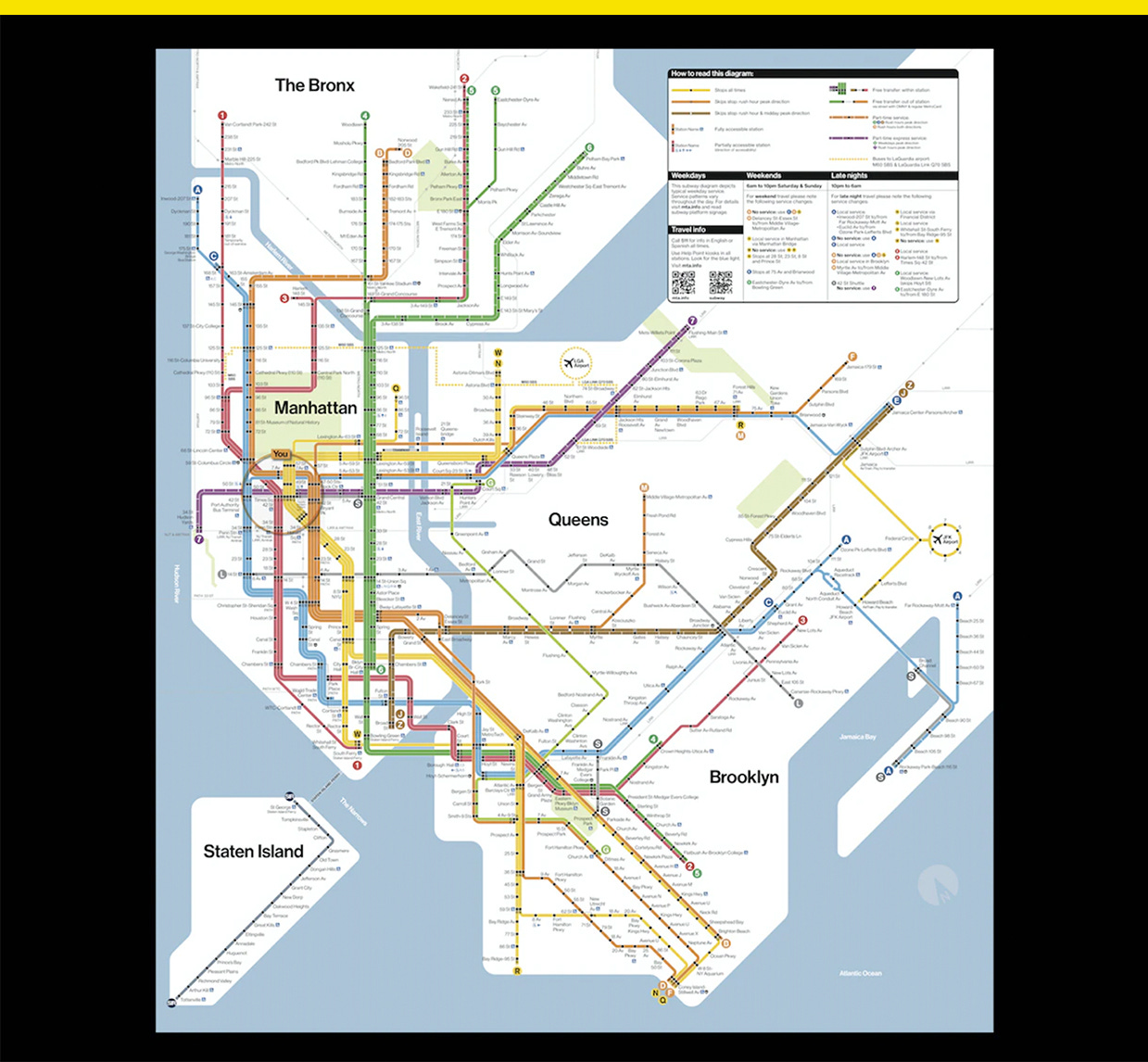
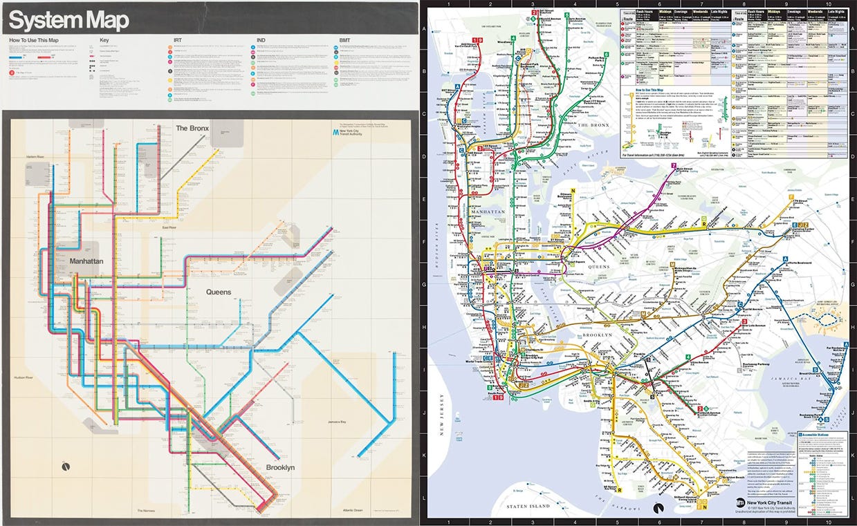
The Metropolitan Transportation Authority is testing out a new design (above) inspired by famed Italian designer Massimo Vignelli’s modernist map used from 1972 to 1979 (below left), but with some tweaks.
There were elements of Vignelli’s map that were criticized for confusing riders. The simplified straight lines looked great, but along with map distortions made in crowded areas like downtown Manhattan, they made it difficult to judge distance and geography. Vignelli’s map was replaced in 1979 with a new map by Michael Hertz that’s been the basis for maps used ever since.
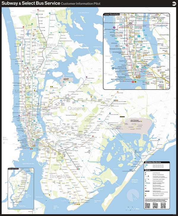
The new map still has the same problem as Vignelli’s, with parts of the city heavily distorted to show how subway lines interact with each other. MTA’s fix is to post it next to a more geo-realistic map of the city overlaid with subway and bus lines to give riders a true-to-life comparison.


For now, the new map is being introduced “gradually so people can get used to it,” MTA chief customer officer Sarah Meyer told the Wall Street Journal, and it’s posted in just nine stations in temporary self-adhesive vinyl. Riders can give their feedback via a QR code.
See more >> [New York City just got rid of its last payphone]
Subscribe to 𝘠𝘌𝘓𝘓𝘖. You’ll never look at politics the same way again:
Here’s what you get for supporting:
SEE IT FIRST: Get every issue of the newsletter delivered to your inbox two hours early.
SEE IT ALL: Never miss a thing. Get every story I publish delivered directly, with no paywalls and access to the full archive.
SEE IT FOR YOURSELF: Get access to exclusive, subscriber-only stories.


