America250 got a rebrand and new logo
How do you rebrand a celebration two-and-a-half-centuries in the making?
Welcome to YELLO, a newsletter about politics, art, branding, and design. Subscribe to see more:
Hello, in this issue we’ll look at…
Why U.S. Semiquincentennial Commission needed a new logo
How designers balanced the need for celebration and commemoration
The puzzle the new logo solves
Scroll to the end to see: the new Spice Girls stamps they’re getting in the U.K.
America250 got a rebrand and new logo
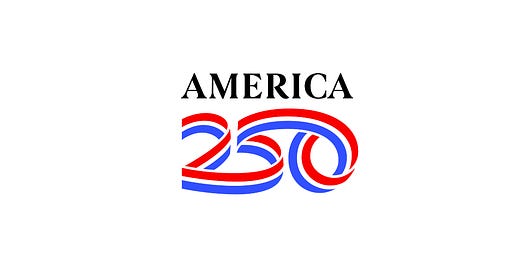
A ribbon of red, white, and blue curls into a 250. Above it, America is spelled out in a classy serif font.
America’s 250th birthday party has a new logo—and it couldn’t come at a more complicated time.
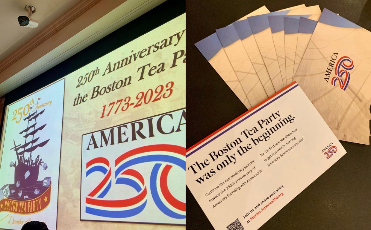
Last month, fresh branding for America250, the nation’s semiquincentennial celebration happening in 2026, made its debut at a naturalization ceremony at Boston’s Faneuil Hall. The logo was printed across a card that invited 338 of America’s newest citizens to share their American stories.
For Rosie Rios, chair of the U.S. Semiquincentennial Commission, the logo is an opportunity to help people engage with a national anniversary celebration at a moment when it might be needed most. “It’s not just an event, it’s a feeling,” Rios says.
But how to capture that feeling in a logo?
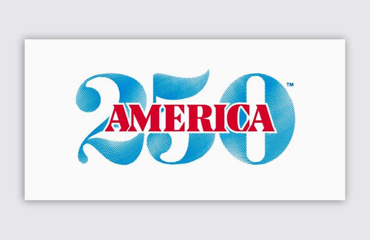
The original visual identity for America250, adopted under previous leadership, wasn’t working. It wasn’t well suited for small sizes on smartphones. It used a currency-style typeface and tried to make the phrase “This Is Our Semiquin” happen. “The font is kind of a currency font, which I really loved,” Rios, a former U.S. treasurer, says, “but what we came to realize is just like this commemoration and celebration, it has to be for all people.”
In other words, the old logo was too buttoned up. It was a Georgetown cocktail party when what they needed was a state fair. So the commission turned to Chermayeff & Geismar & Haviv, the New York City design firm behind the Bicentennial logo, looking for something with more movement and personality.
How designers balanced the need for celebration and commemoration
The firm’s celebrated logo for 1976 used red, white, and blue stripes bent into a cone and arranged to create a star from negative space. The text “American Revolution Bicentennial 1776-1976” circling the mark was added to make it seem more formal and governmental. For 2026, the commission was hoping for a modern sequel.
The challenge was to create a mark that could feel at once festive, dignified, and institutional. It had to connote both celebration and commemoration. “They’re different concepts,” says Sagi Haviv, a partner at the firm. “How do you come up with an idea that sums up both?” Searching for a big idea, he and his team kept coming back to the concept of a ribbon, for its physical pliability and because of how ribbons are used to signify causes. The ribbon was flexible; it could be both fun and formal.
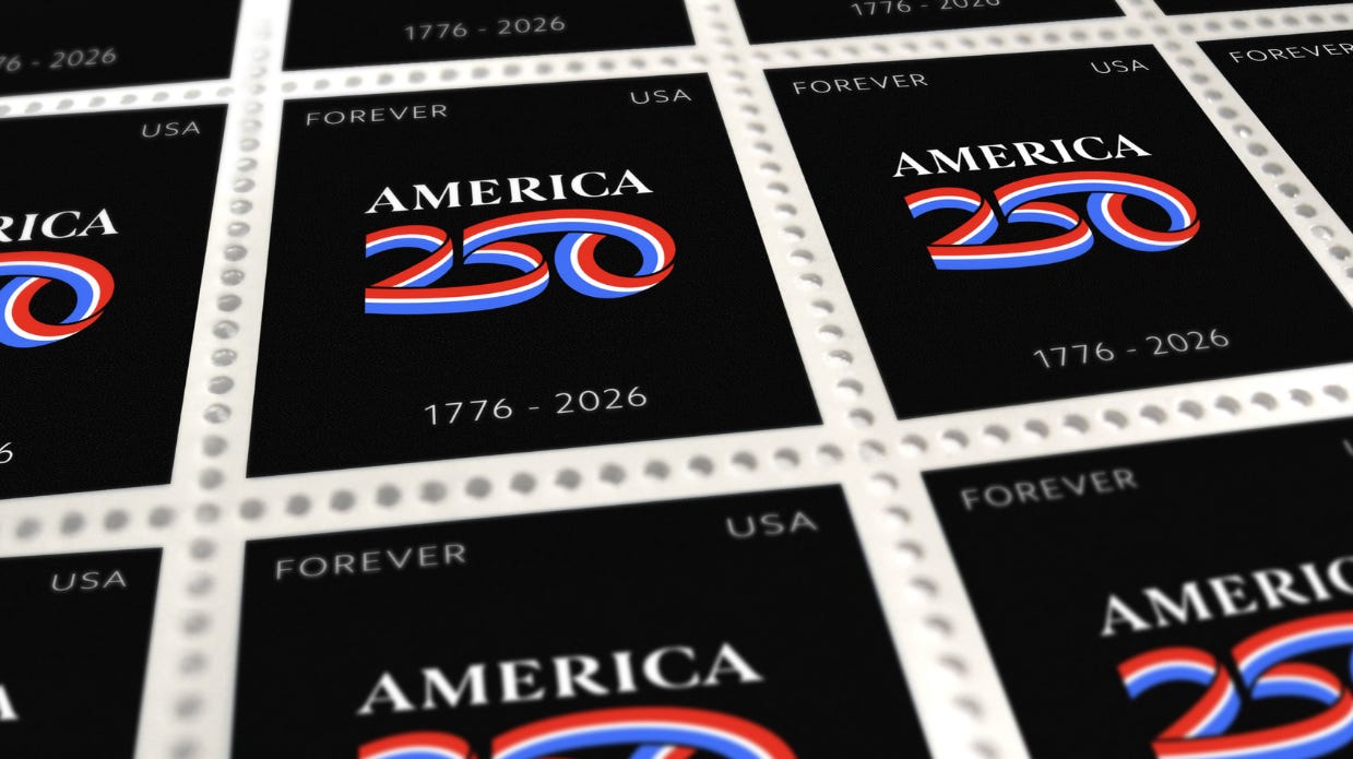
In the new logo, “America” is written out in custom serif type and “250” is formed with a looping red, white, and blue ribbon. It’s soft, not hard. “This is flowing, fluid, dynamic, and kind of human made,” Haviv says. “It’s not some geometric circles or square; it’s a human gesture almost and it’s all one continuous line.”
While the logo’s designers believe in the power of a logo, they are also keenly aware of its limits. In 2024, the state of the American brand is in question. An ABC News/Ipsos poll released last month found three-fourths of Americans believe the country is headed in the wrong direction, and in some ways, that parallels the problems the firm faced when designing the Bicentennial logo.
The puzzle the new logo solves
“Things were pretty bad then too,” says Tom Geismar, who worked on both the Bicentennial and America250 logos. From Vietnam and Watergate to high unemployment and interest rates, “it was worse than anything we have right now,” Geismar says of the moment in which the bicentennial logo was designed. “It was a difficult time, but we were trying to look at a broader picture.”
Ultimately, the Bicentennial logo became a symbol for an event that helped the nation come together after an era of undoing. “The Bicentennial celebrations were balm,” author Erik Barnouw wrote in Tubes of Plenty, a book about television and culture in America in the 20th century. “As old glories were remembered, nightmares faded.” Could a new logo half a century later come to represent an occasion that similarly brings about national healing?
Brian Collins, the founder and chief creative officer at the design agency Collins, considers the new logo as successful despite the difficulties of the assignment. “I think this is a terrific and, frankly, an absolutely necessary improvement,” Collins wrote in an email. “It perfectly resolves a complex puzzle: How do you celebrate our country’s 250th birthday using visual metaphors that have, for many, come to mean divisiveness.”
Noting the Bicentennial logo was created before a time when the colors red and blue had partisan connotations, Collins says those earlier designers were “not burdened with the divisiveness those colors now represent.” By embracing those colors smartly and enthusiastically, though, and by punctuating the graphic with letter-spaced serif typography, the new America250 logo “is a visual antidote to the loss of collective patriotism that Americans once felt more readily and a reminder it is still very much present,” he says. “It is perfect.”
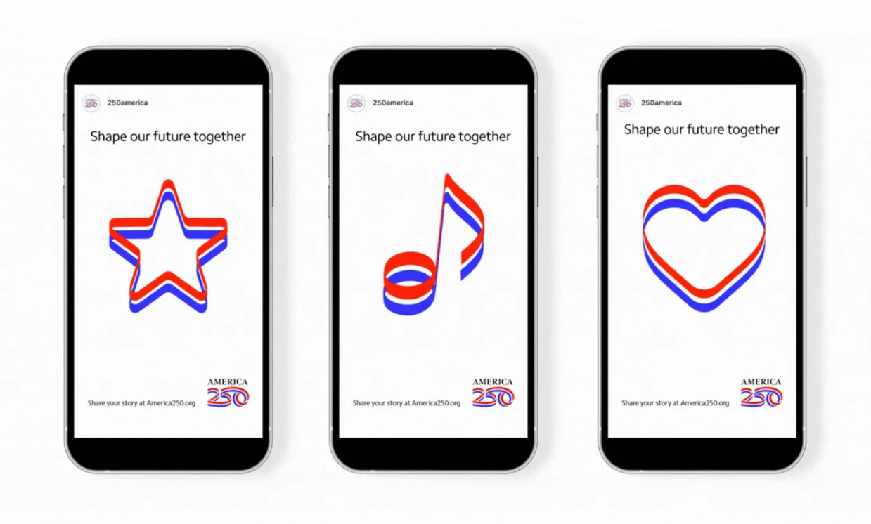
At the 250th anniversary of the Boston Tea Party, the new logo appeared on LED screens and event staff vests. It will continue to pop up at events leading up July 4, 2026, and in mock-up images imagining how the logo could be extended to a larger, nationwide campaign, Chermayeff & Geismar & Haviv offered its ideas. The red, white, and blue stripes are used to create shapes like stars, hearts, and the Statue of Liberty’s torch in social media graphics, or as lines connoting motion in outdoor posters. The firm also created state-specific lockups for local or state commissions to use in their own events.
“This is not a short-term endeavor,” Haviv says. “This is not an ad campaign, this is not a piece of marketing—this is something that is meant to endure.”
This story first appeared in Fast Company.
Have you seen this?
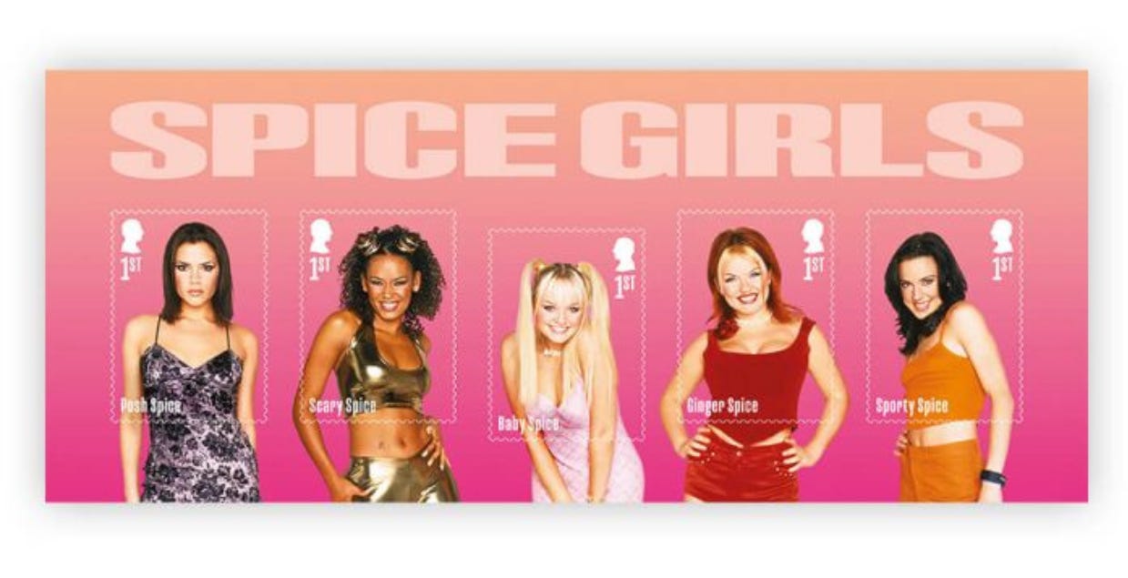
Spice Girls to feature on commemorative set of stamps in the U.K. for 30th anniversary. Royal Mail is issuing a set of 15 stamps celebrating the Spice Girls. It is the first time Royal Mail has dedicated an entire stamp issue to a female pop group. [BBC]
The Met is selling a George Washington portrait to fund its new acquisitions. The Metropolitan Museum of Art in New York is auctioning a 1795 portrait of George Washington by artist Gilbert Stuart that could make $2.5 million. [Artnet News]
Democrats launch Jan. 6 newspaper ad campaign in Iowa as Trump visits. The Democratic National Committee advertisements consists of full-page ads in local papers serving the two cities Trump plans to visit on the anniversary of the Jan. 6 riot at the U.S. Capitol: Newton and Clinton, Iowa. [NBC News]
ICYMI:
History of political design
Bicentennial U.S. postage stamp (1971). The U.S. Postal Service issued 113 commemorative stamps honoring the Bicentennial over a six-year span, according to Mystic Stamp Company.
Thanks for reading! Like what you see? Subscribe for more:

