7 maps that show what climate change means in the U.S.
Plus: here's the first logo from California's U.S. Senate race
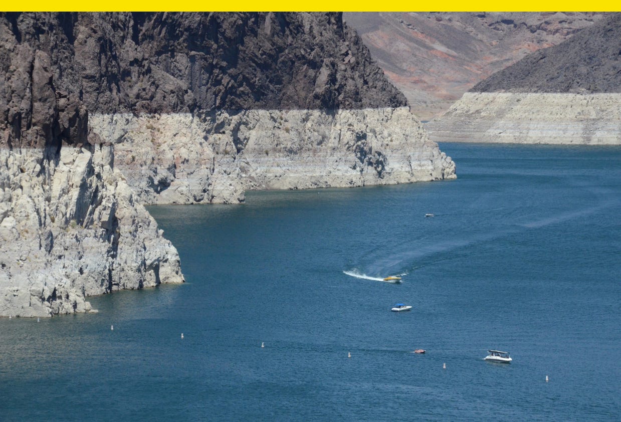
Climate change news is usually bad, but there was some good news this week: a U.N. report released Monday found the ozone layer is healing and could be restored in the coming decades. Still, there’s a lot to be done.
Climate change is transforming the U.S., and it’s expected to continue to affect where Americans live, grow our food, and even how we defend ourselves.
Here are maps that show the ways climate change has and is expected to continue to impact the U.S.:
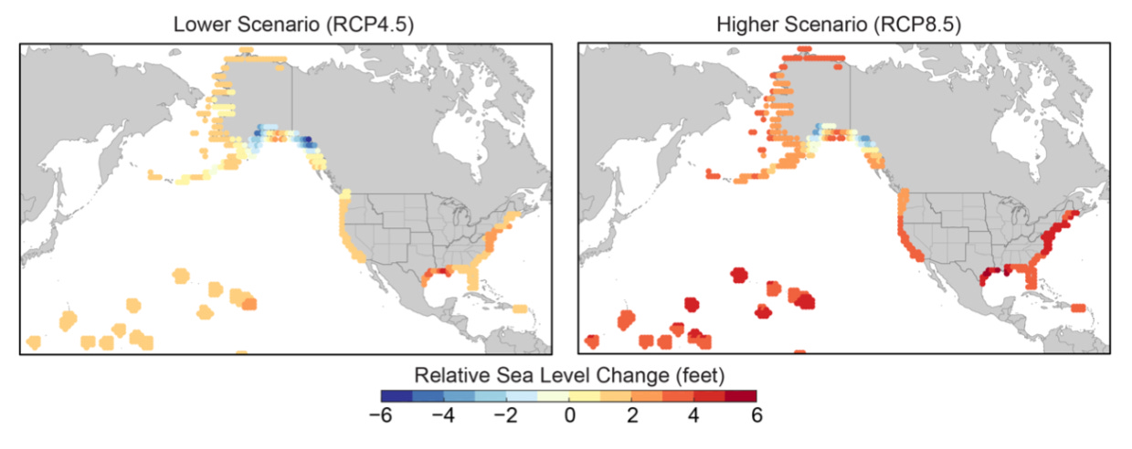
1. Projected relative sea level change in the United States by 2100
Sea levels have risen about eight inches since the beginning of the 20th century because of melting glaciers and ice sheets, according to NASA, and they’re rising faster now than they used to. Researchers predict that by 2100, the sea could rise anywhere from one foot to as much as six feet along parts of the U.S. coastline.
In California alone, as much as $10 billion in existing property could be underwater by 2050, according to the state’s legislative analyst’s office.
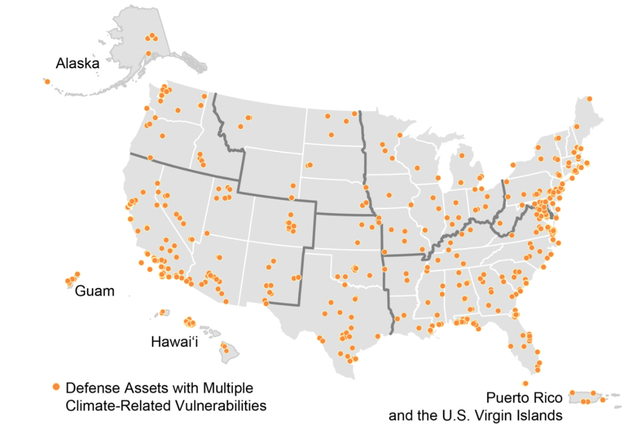
2. Weather and climate-related impacts on U.S. military assets
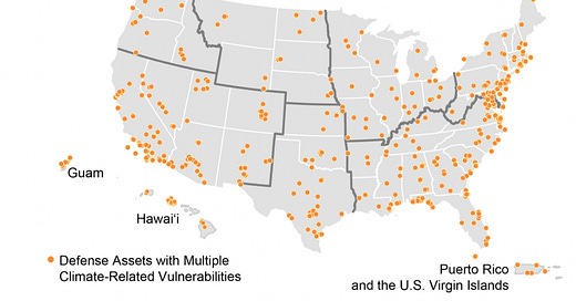
Climate change is a national security issue. The Department of Defense found climate-related impacts would affect U.S. military installations in all 50 states and territories including Puerto Rico and Guam, according to a report released in 2018.
The most common effect was drought, followed by wind, and non-storm surge related flooding. The report cited flooding at the West Point Military Reservation in New York and the U.S. Naval Academy in Annapolis, Md., as examples of damage military assets have already faced.
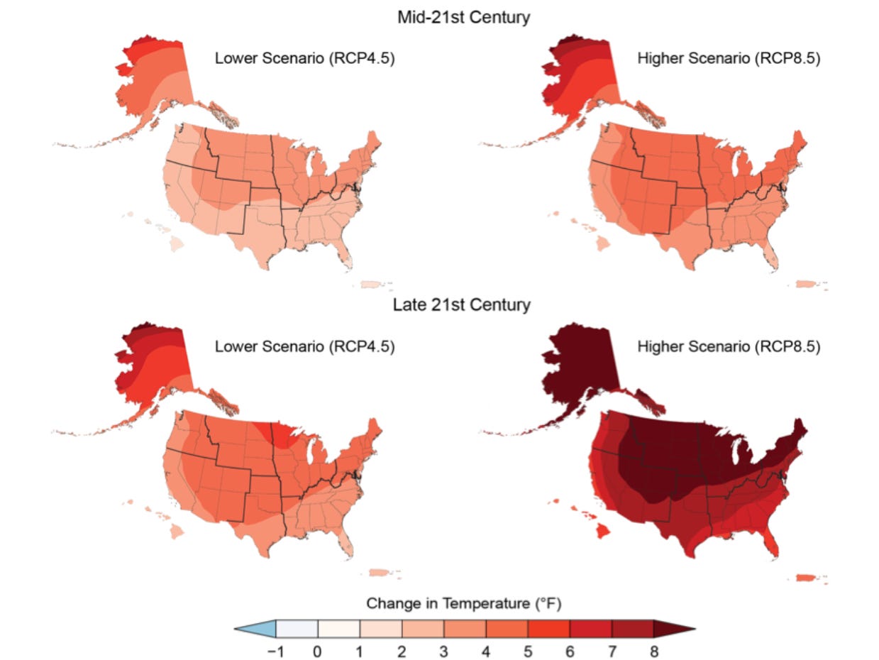
3. Projected changes in U.S. annual average temperatures
Summers are going to get hotter. Annual average temperatures throughout the U.S. are projected to increase by as little as one to two degrees in most of the continental U.S. by the middle of the century, and as much as eight degrees in Alaska and much of the northern U.S. by the end of the century.
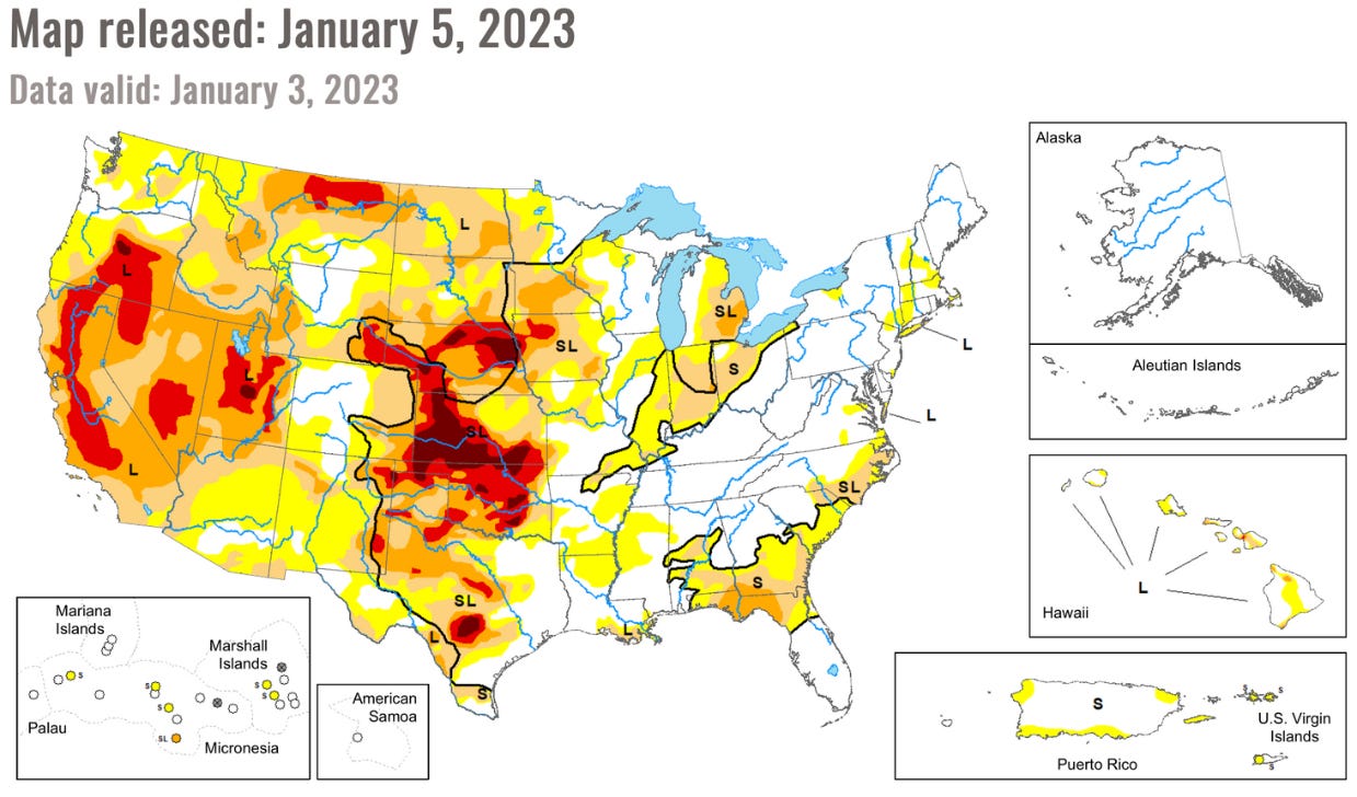
4. The U.S. Drought Monitor’s map of areas in drought
Much of the U.S. began 2023 in a drought. This map from the University of Nebraska-Lincoln’s National Drought Mitigation Center shows areas in yellow for “abnormally dry,” with oranges for moderate and severe drought and reds for extreme and exceptional drought. The Western U.S. has been in a mega drought now for more than two decades, and beginning this month, Arizona and Nevada had to cut their water usage.
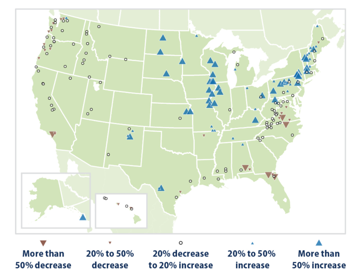
5. Seven-day low streamflows in the U.S. from 1940-2018
From 1940 to 2018, the amount of water carried by rivers and streams, known as streamflow, has generally fallen in the West and Southeast and risen in the Midwest and Northeast. Increased streamflow can cause erosion and flooding, and decreased streamflow affects animals and electricity production.
6. Farm crop yields projections for 2040-2060 under moderate emissions
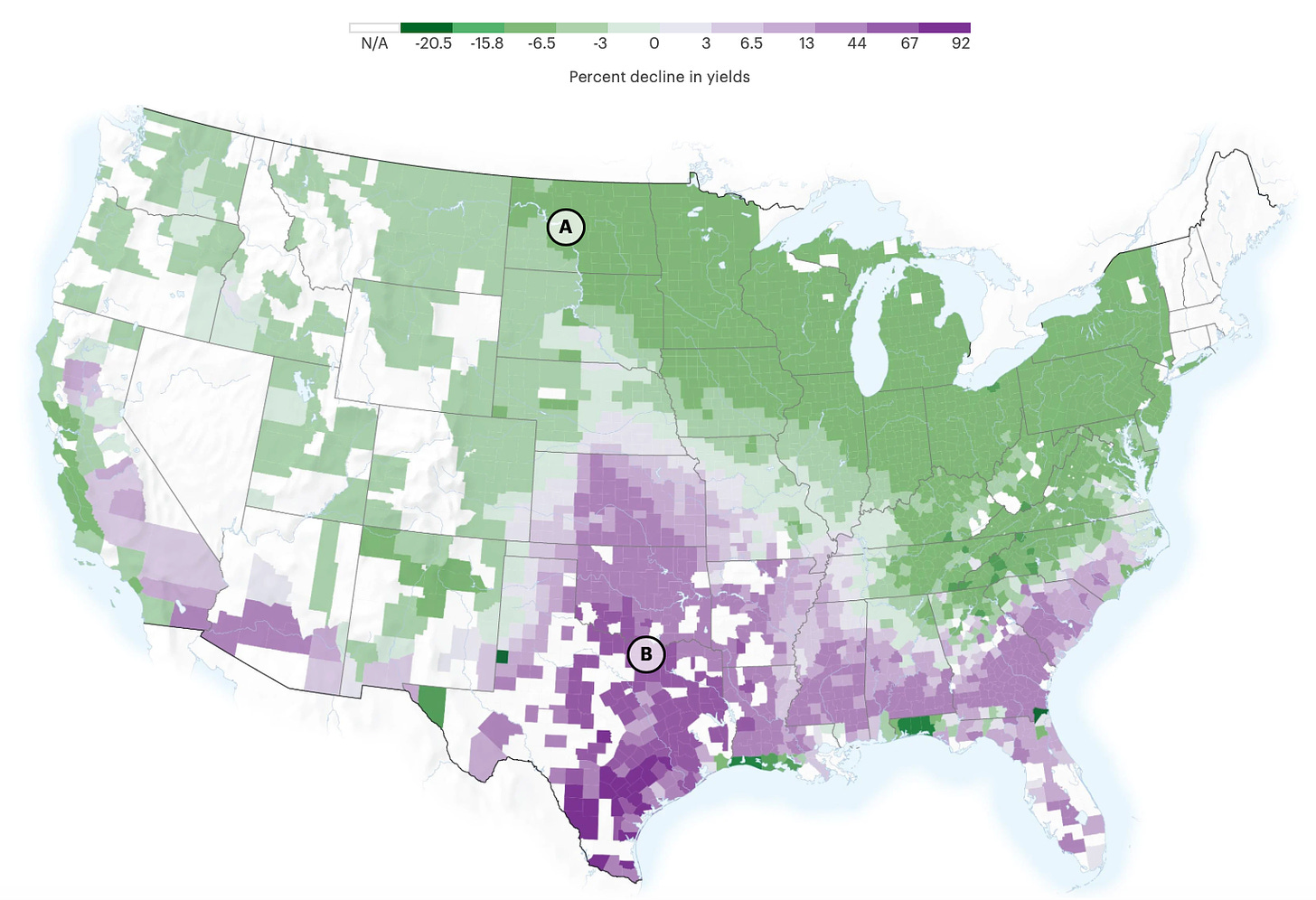
Changes in temperature will affect where food will be grown. By the middle of the century, production will move northward, including A) North Dakota, where more warmer days will allow for higher yields. Meanwhile in the south, yields are expected to drop, with B) parts of Texas and Oklahoma projected to see a more than 70% reduction, Propublica found.
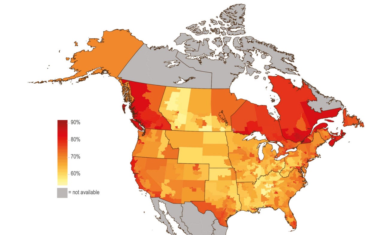
7. Estimated percent of adults who think Earth is getting warmer
The U.S. is unique among 25 countries surveyed about acceptance of global warming influenced by ideology. Republicans are less likely to believe in climate change than Democrats, and one study found partisanship about belief around climate change has grown since 2008.
The good news, though, is that majorities of Americans believe in climate change across the country, and younger generations don’t view the issue as partisan. Millennials are more concerned about climate change than older generations and political affiliation isn’t as strong a factor for their belief, according to a report from the Intergovernmental Panel on Climate Change, a U.N. group.
Have you seen this?
Rep. Katie Porter (D-Calif.) is running for Senate. The Orange County Democrat announced her campaign today in what could be a crowded primary for Sen. Dianne Feinstein’s seat. Feinstein hasn’t yet announced she’s retiring. Porter’s logo uses a sans-serif font and her site was designed by the firm Middle Seat, which previously worked with Sen. John Fetterman (D-Pa.) and Massachusetts Gov. Maura Healey.
A life-sized portrait of Abe Lincoln is coming to the National Portrait Gallery. The 1865 portrait by W.F.K. Travers was created from life and it’s headed to the museum’s America’s Presidents exhibition beginning Feb. 10. [Smithsonian]
What campaign branding looked for U.S. presidents before they became POTUS. People always forget Trump toyed with the idea of running for president in 2000 for the Reform Party.
Social media is changing. What does that mean for politics? As Facebook’s parent company chases the metaverse and Twitter adapts to its new owner, political professionals are trying to figure out the best way to campaign on social media. [𝘠𝘌𝘓𝘓𝘖]

